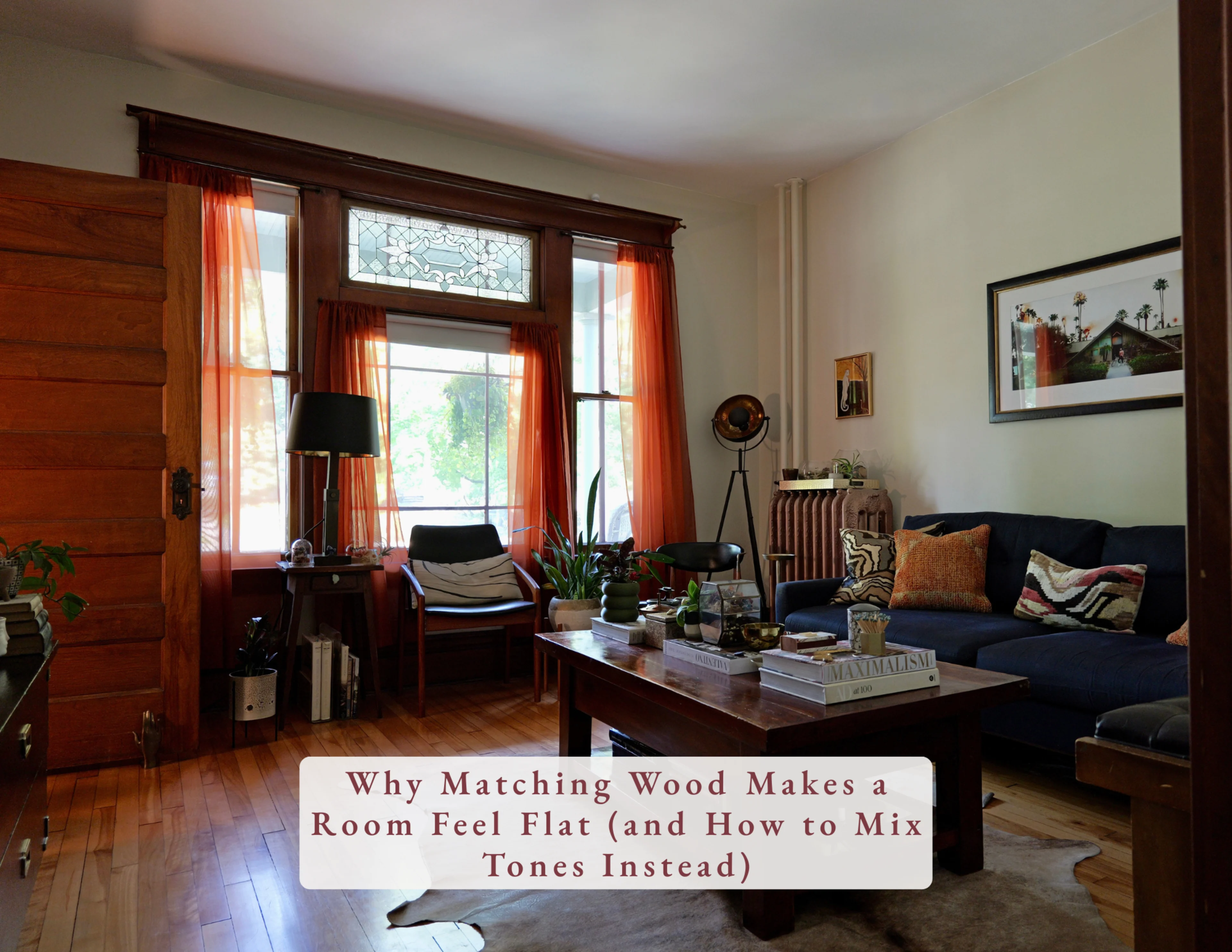
When every piece of wood in a room matches, something goes missing. The floors, the coffee table, the side tables and the trim all blend together, and the room goes flat. Your eye has nowhere to land, so it doesn’t move.
Mixing wood tones adds a little tension, the good kind. It gives your eye a reason to travel around the room, from the floor to a chair to the trim around a doorway. That’s what makes a space feel collected over time instead of bought in one trip.
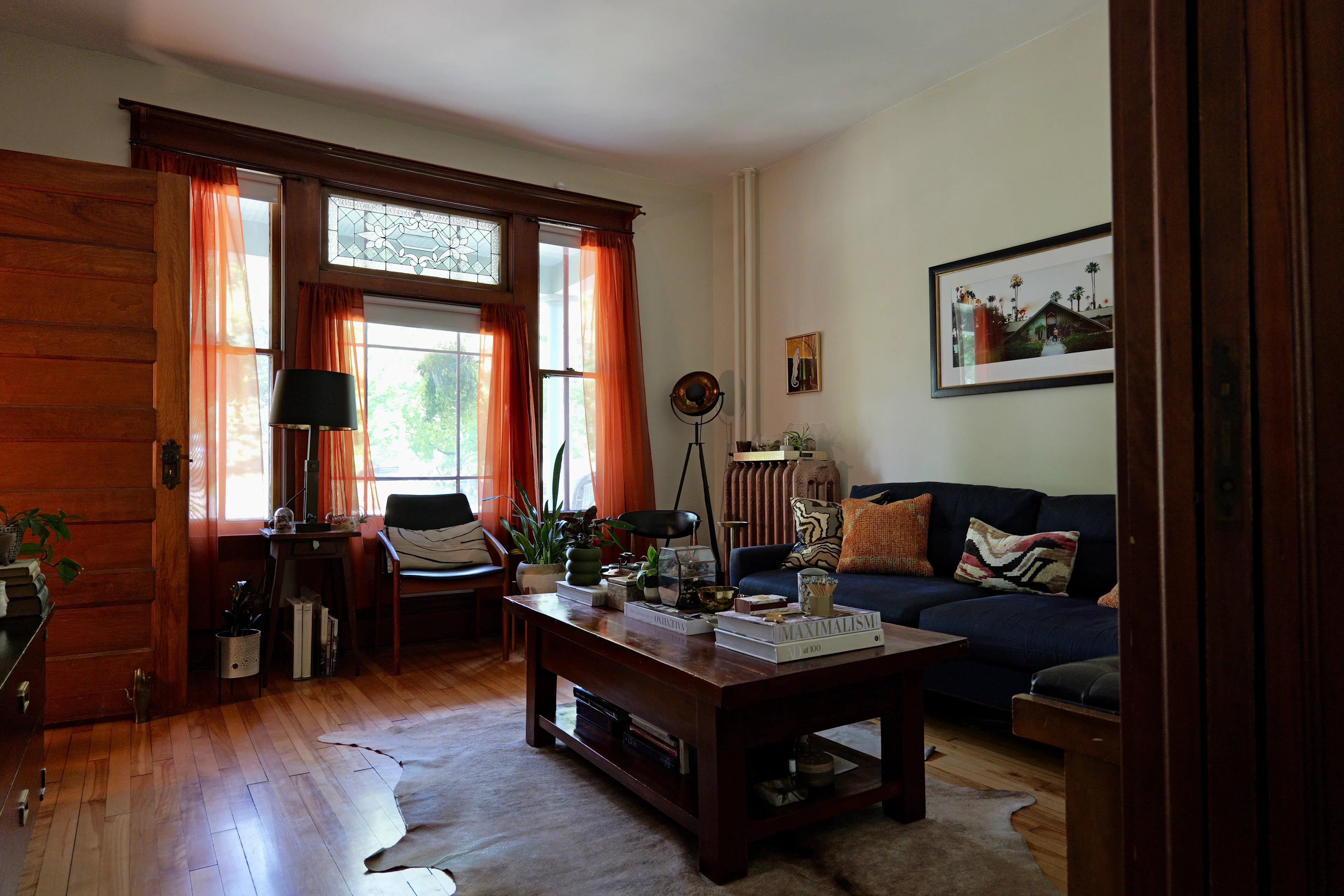
I live in a house from 1906 with the original stained trim, light honey floors and a lot of vintage furniture. Nothing matches, and that’s on purpose. Here’s how I think about it.
Start with your lead tone
Every room needs one wood that does most of the talking, and it’s usually the floor. Everything else is chosen in relation to it.
In my living room, the light honey floors lead. From there, I count at least five more wood tones: the golden door, the deep brown window trim, a vintage chair with teak arms, the little antique side table in front of the window, a vintage Dan Johnson chair with a walnut frame and brass arms, and the dark coffee table. None of them match, but they all sit in the same warm family, and the dark coffee table anchors the middle of the room so the lighter tones have something to play off of.
Repeat each tone at least twice
One lonely piece of wood can look like an accident. Two or three pieces in the same tone look like a plan. If you bring in a dark wood table, echo it somewhere else: a picture frame, a lamp base, chair legs, a little box on a shelf.
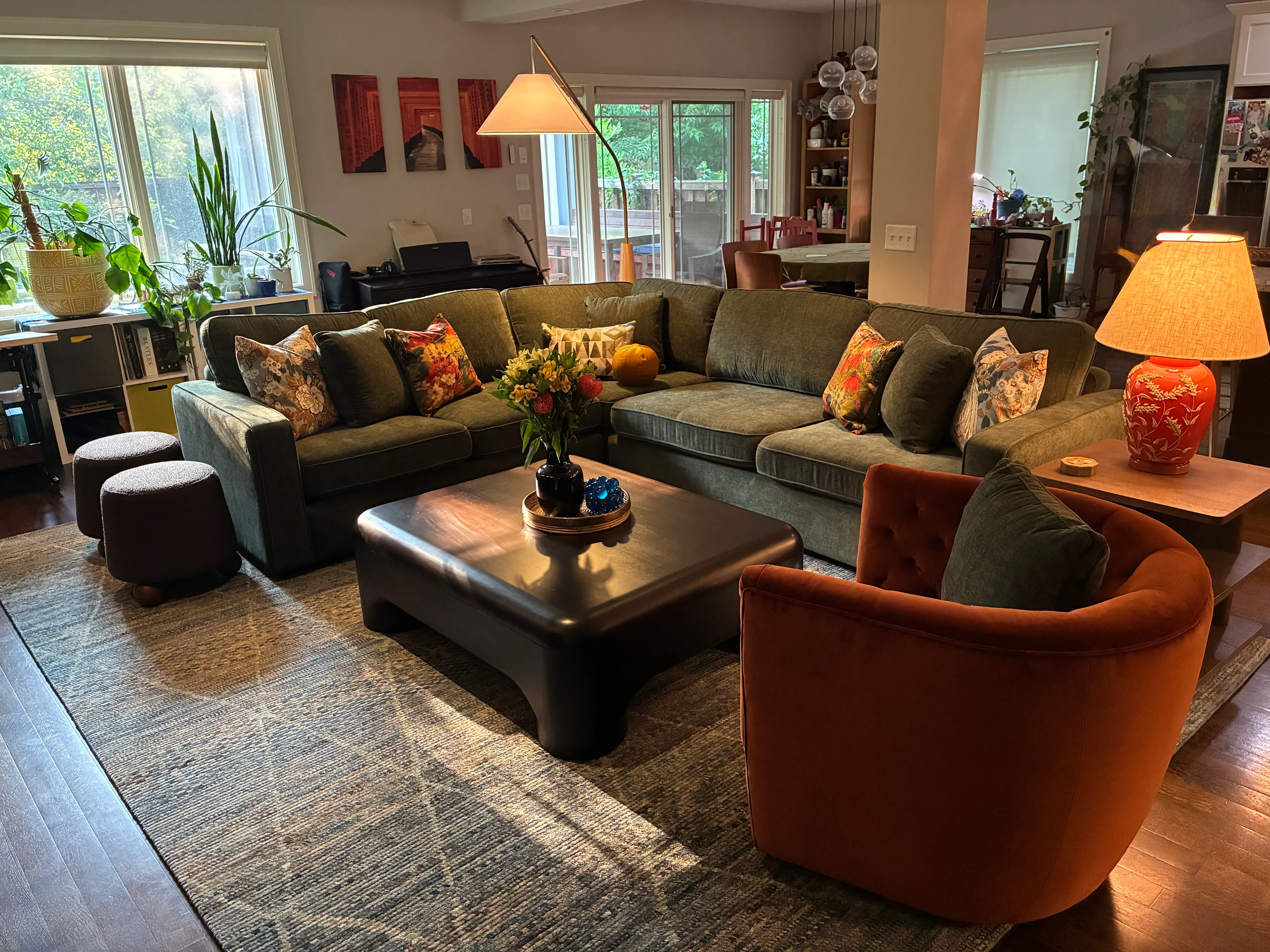
In a recent client’s living room, the dark brown finish repeats three times: the sculptural coffee table, the side table and the round wood feet on the poufs. The floor lamp’s natural wood base adds one lighter note, so the dark tones don’t feel heavy.
Pay attention to undertones
This is where most mismatches happen. Wood has an undertone, just like paint:
Warm: red, orange or yellow
Cool: gray or ashy, like a whitewashed or weathered finish
Neutral: balanced browns
You don’t need everything to share an undertone, but you want them to feel related. A quick trick: hold a white piece of paper next to the wood. It makes the undertone much easier to see.
Go for contrast, not “almost”
This is the big one. Two woods that are almost the same color look like a mistake, like you were trying to match and missed. Two woods that are clearly different look intentional.
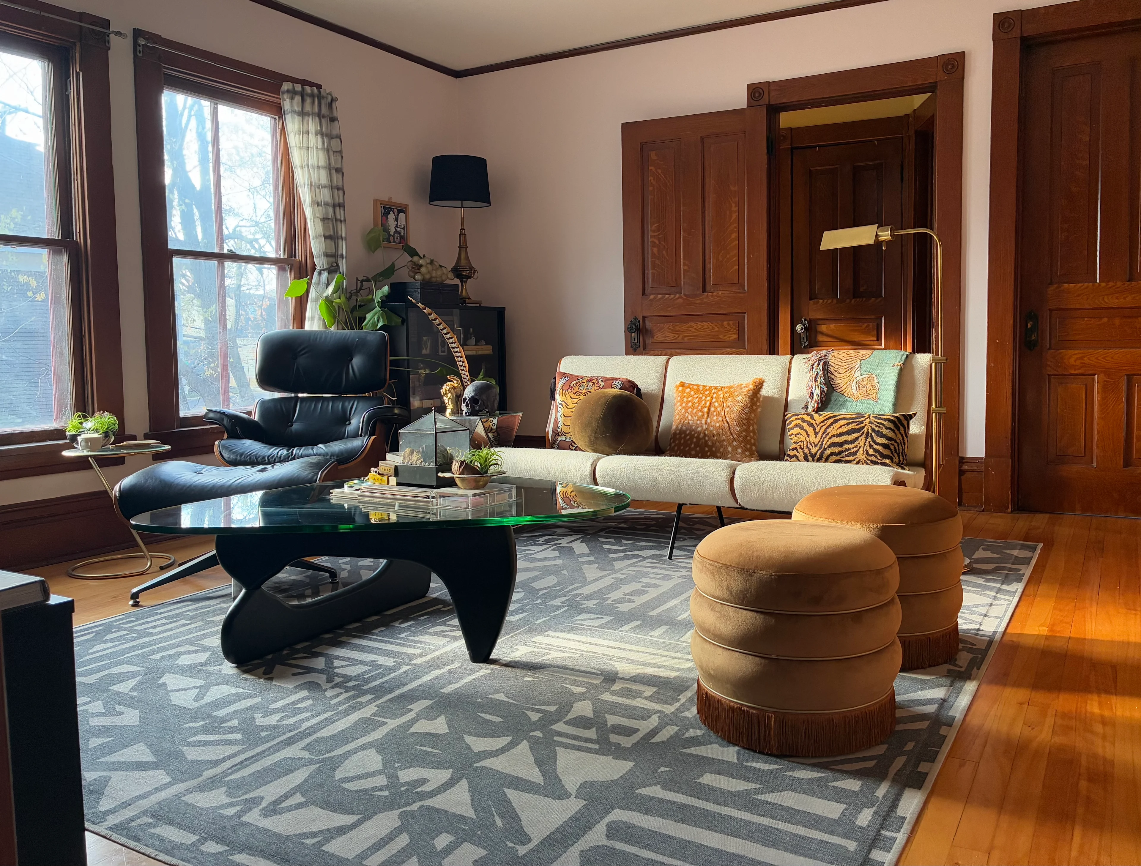
In my upstairs den, the warm wood shell of an Eames-style lounge chair sits next to the black base of the coffee table, with the golden wood doors and honey floors behind them. Black works almost like a neutral here. It gives all that warm wood a place to rest.
Give the wood some breathing room
If two pieces feel like they’re fighting, put something between them: a rug, upholstery, a painted wall, or a painted or lacquered piece of furniture. It gives each wood its own moment.
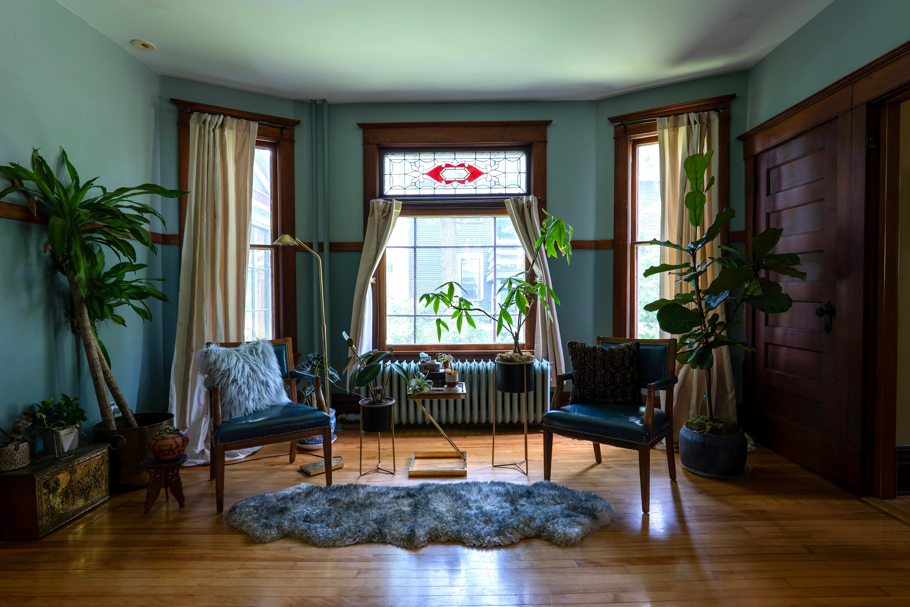
The teal walls in this room separate the reddish trim from the light floors, so they each get to shine without competing. In my living room, the cowhide rug does the same job, sitting between the dark coffee table and the light floor.
Mixing isn’t new


My favorite proof is this desk. Look closely at the corner: a lighter panel in the center, a thin dark line around it and a darker border with the grain running the other direction. That’s three wood tones in a few inches. Furniture makers have been mixing woods like this for centuries because it’s beautiful. We’re just doing it across a whole room.
Collected, not matched
Nothing in my house was bought as a set, and that’s my favorite thing about it. Every piece came from a different place and a different time, and the mix is what makes it feel like ours. Your home should feel that way too.
Not sure which tones are fighting in your space? That’s the kind of thing I look at during a consultation. Book a discovery call and let’s talk about your home.