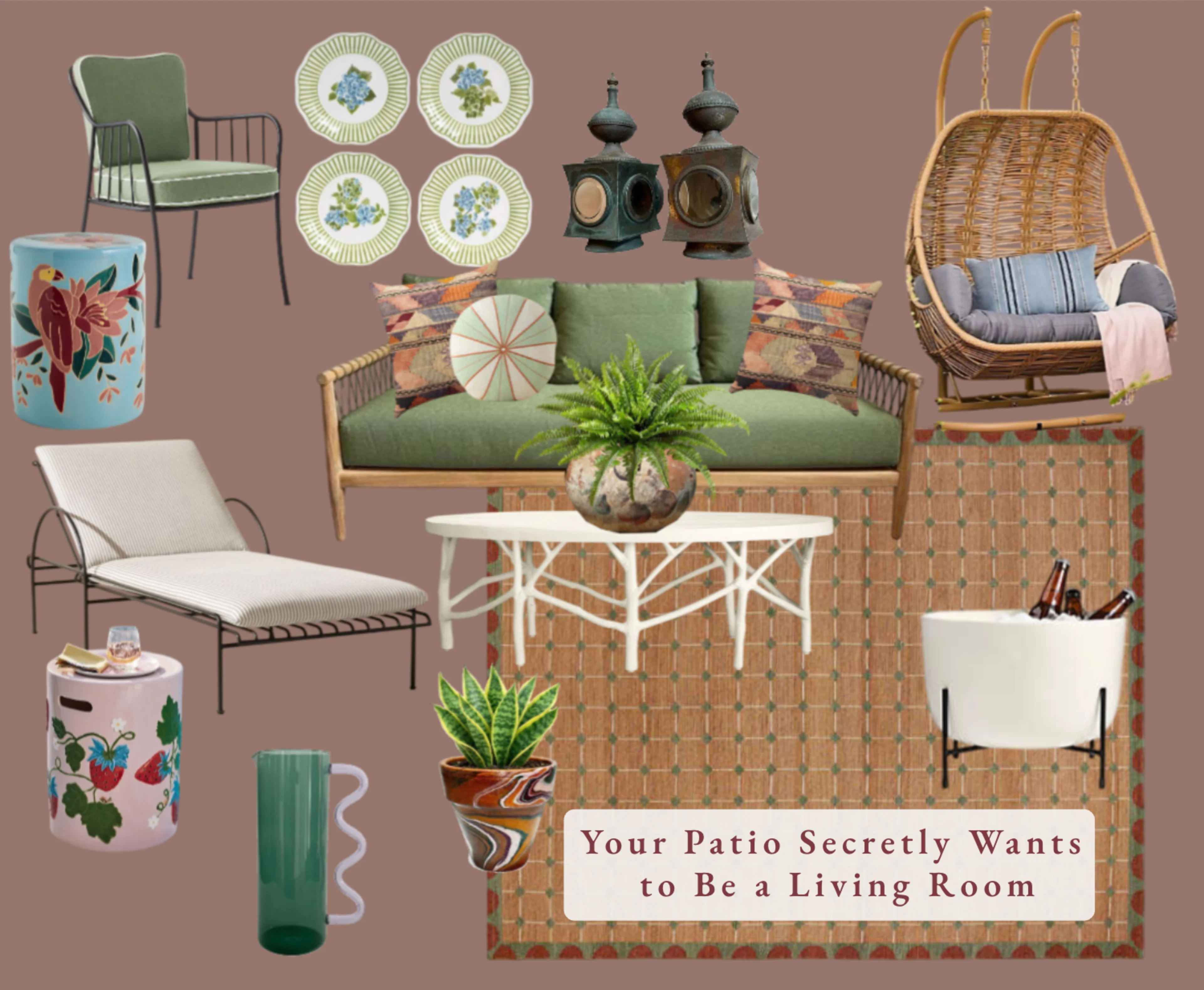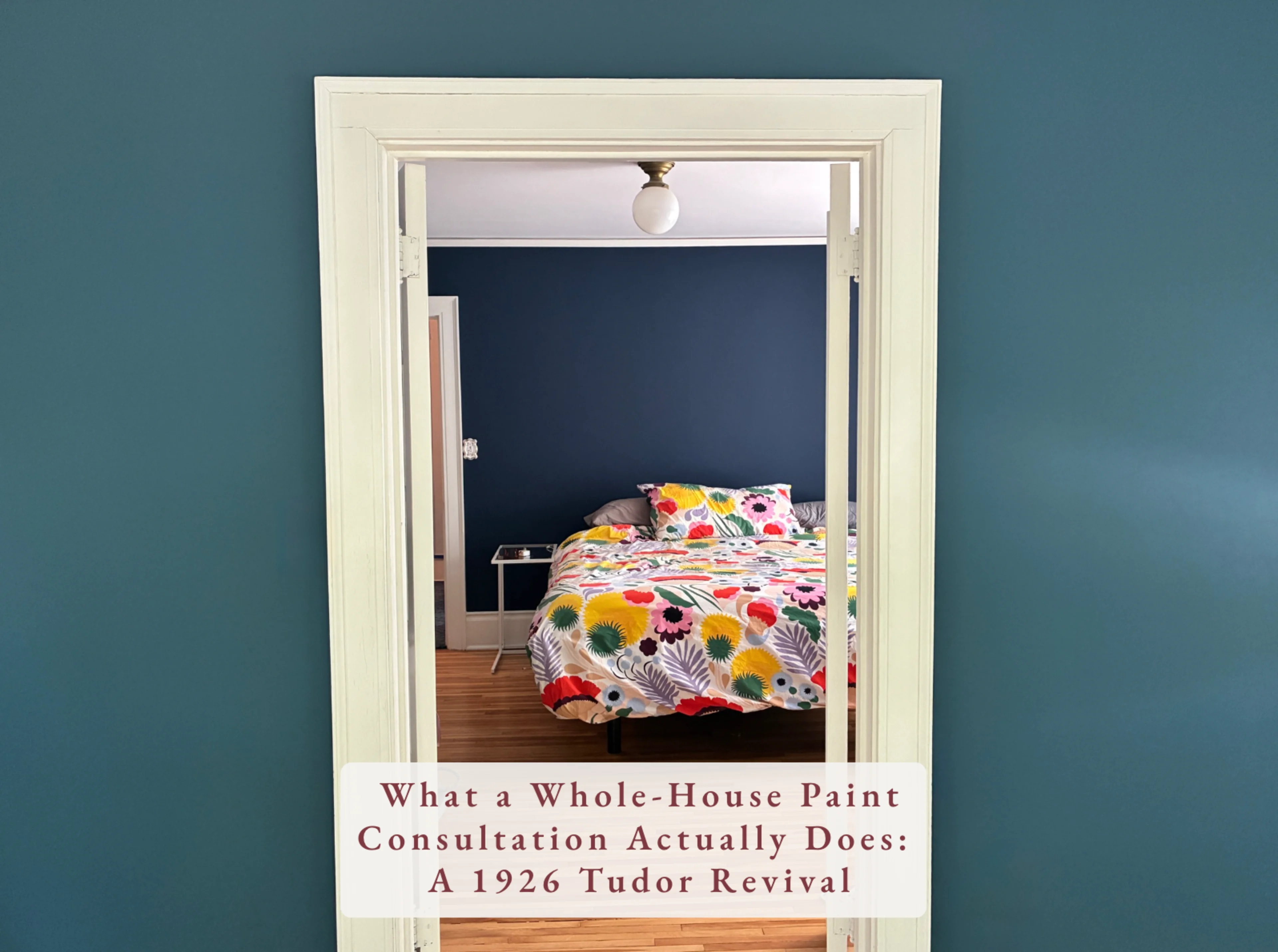
Picking paint color is one of the most paralyzing parts of designing a space. Clients stare at tiny chips under fluorescent store lighting and wonder why nothing ever looks right at home. Here's how I actually think about color — from the first room you walk into to the ceiling above your head. And yes, I'm using my own house as the example, because I have opinions, receipts, and a yellow ceiling story that still haunts me.
Start at the Front Door
I almost always begin with the entry, foyer, or hall — wherever you open the door and step in. That's the first impression and it sets the tone for everything that follows. The one exception? If I know we're wallpapering a space, I start there and build the color story outward from that pattern.
Let the Art or Furniture Lead
Sometimes a room has a strong anchor — a piece of art you know is going in a certain spot, a rug with a personality, a sofa that isn't going anywhere. When that's the case, let it lead. The palette is already in front of you. You just have to listen to it.
Cardinal Directions Matter More Than You Think
Which way does the room face? North-facing rooms read cooler and can make certain colors feel flat or cold. South-facing rooms get warm golden light that makes almost everything look beautiful. East and west light shifts dramatically throughout the day. I always think about where the light is coming from before I commit to anything.
Sample Like You Mean It
Tiny chips are almost useless. I use a Sherwin-Williams deck — every color, 4x4 inches, in a binder — to narrow things down, then I order large samples and move them wall to wall throughout the day. Morning light, afternoon light, evening light. Paint looks different in every single one and you need to see all of them before you decide.
Whites Are Not Neutral
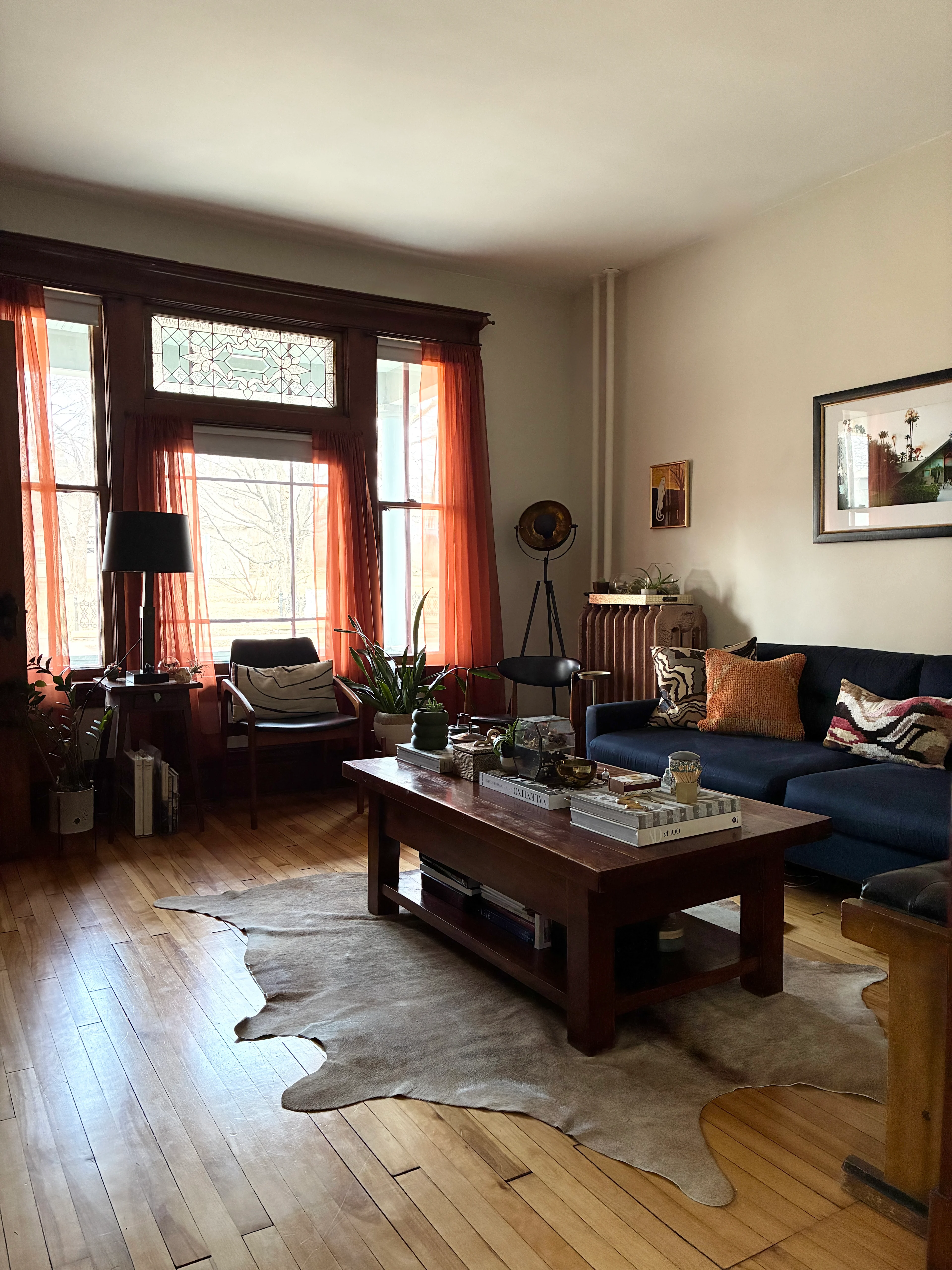
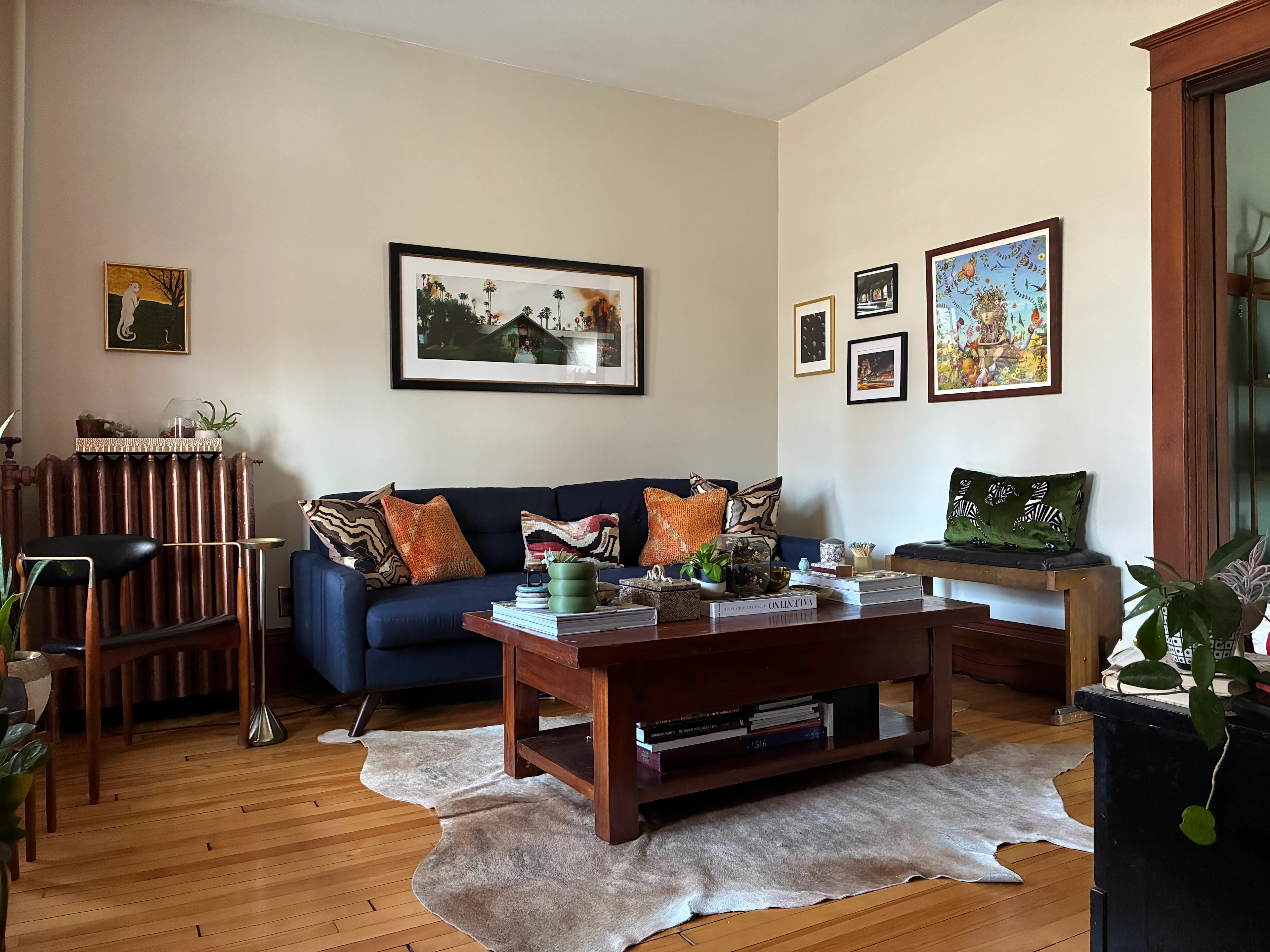
This is where clients go wrong constantly. Whites pull warm or cool, and they shift dramatically depending on your light. Our living room was a butter yellow when we moved in — not what I would have chosen. We hired the living room out to be painted, had some wall repair done in there, and I landed on Benjamin Moore Muskoka Trail, a warm off-white with just a hint of brown that finally felt grounded and calm. While we were at it I had the radiators professionally spray painted in Rust-Oleum aged copper metallic — because why not, honestly. Go a shade lighter or darker than you think you need. Lighting has a way of intensifying color in ways that always surprise people.
Think About Flow
A home is a sequence of spaces, not a series of isolated rooms. I think about how color transitions room to room, especially in the hallways and doorways connecting them. In our house, our son's bathroom sits close to our primary bedroom, so I chose Sherwin-Williams Sand Dune for the bathroom — warm and grounded — so it would pair naturally with the navy next door. (Want the full bathroom story? It involved five days, a lot of touch-ups, and one very dramatic day four — read it here.)

Don't Forget the Fifth Wall
The ceiling. It is a wall. It just happens to be above you. A ceiling color can completely dial up or dial back the drama in a room. My go-to for a crisp clean white is Benjamin Moore Chantilly Lace — also perfect for trim. Sherwin-Williams Pure White is another favorite. Want something more immersive? Go a couple shades lighter than your walls on the ceiling. And if you're feeling bold, wallpaper it. I will never talk you out of it.
Now. The yellow ceiling story.
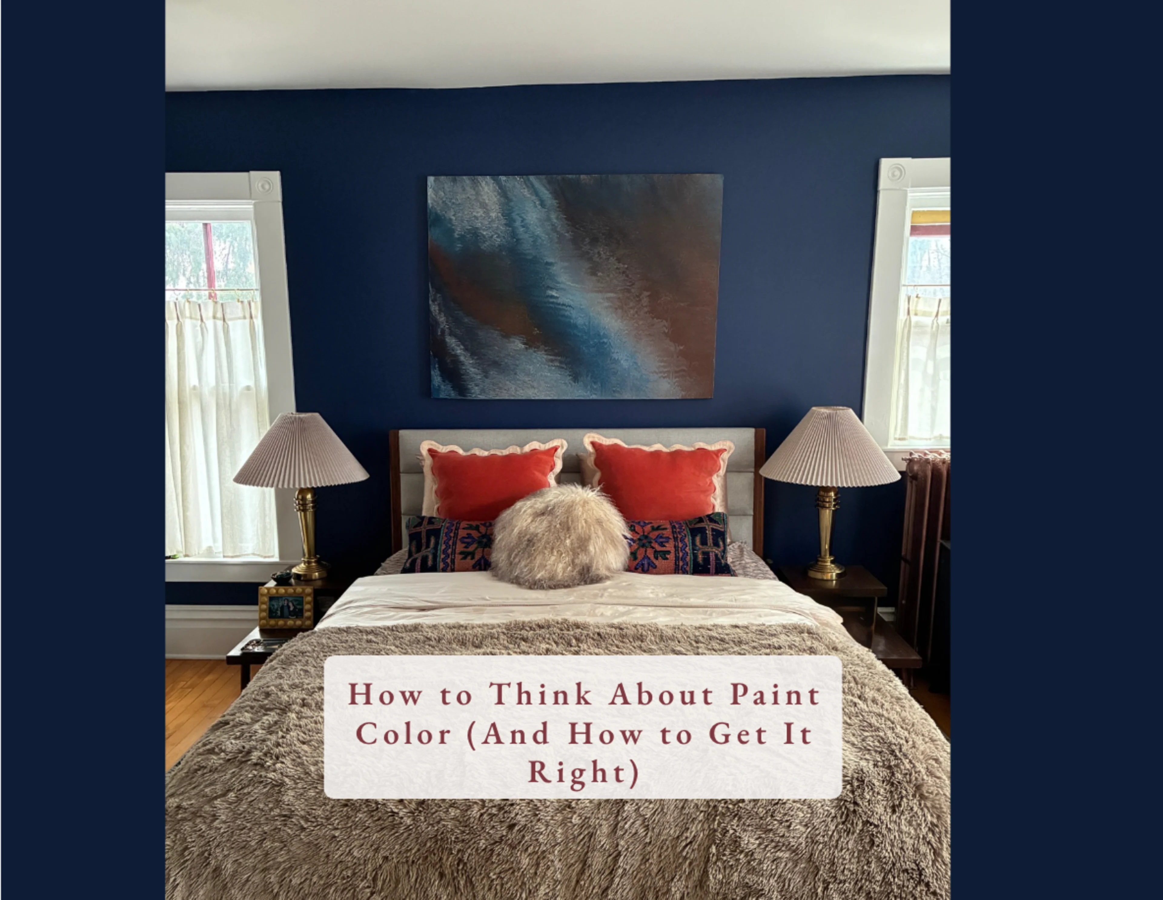
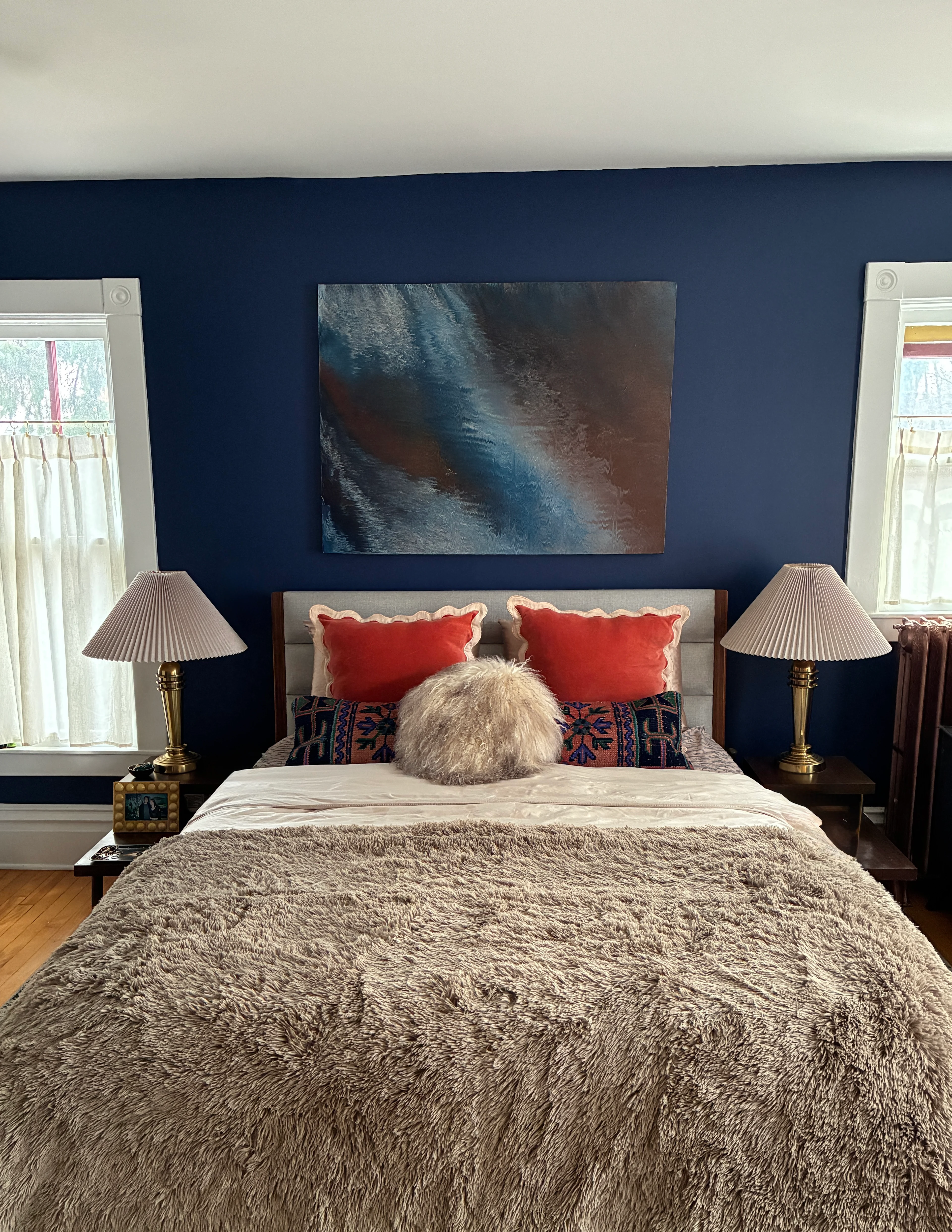
When we were painting our primary bedroom, we didn't realize the ceiling was yellow until the morning we were supposed to start. Yellow. The ceiling. I had to run to the hardware store for more paint — this was also my first time ever painting a ceiling, I had just recovered from my first bout of Covid, and on the very first roll I got a giant glob of paint directly in my mouth. Not my finest moment. We pushed through anyway — two coats on the ceiling, two coats on the trim, two coats on the walls — my husband had his heart set on navy and loved the saturation of Backdrop's Formentera. I wanted to go a little darker but said yes, and I'm genuinely glad I did. With help from family we finished in four days and I love that room now. The radiators in both rooms got the same Rust-Oleum aged copper treatment, professionally sprayed — because I was not about to be staring at drips for the rest of my life. Completely worth every bit of it.
On Moody Spaces
If a client tells me they want at least one moody room, it genuinely warms my heart. A deep dramatic space done well is one of the most satisfying things in design. Don't be afraid of it. Lean all the way in.
What's Next at My House

I'm already planning the next round of color — though it's all happening together or not at all, which means it's likely a next year project. We're focused on the exterior this summer, which includes removing a large tree and painting the outside of the house. The interior will follow.
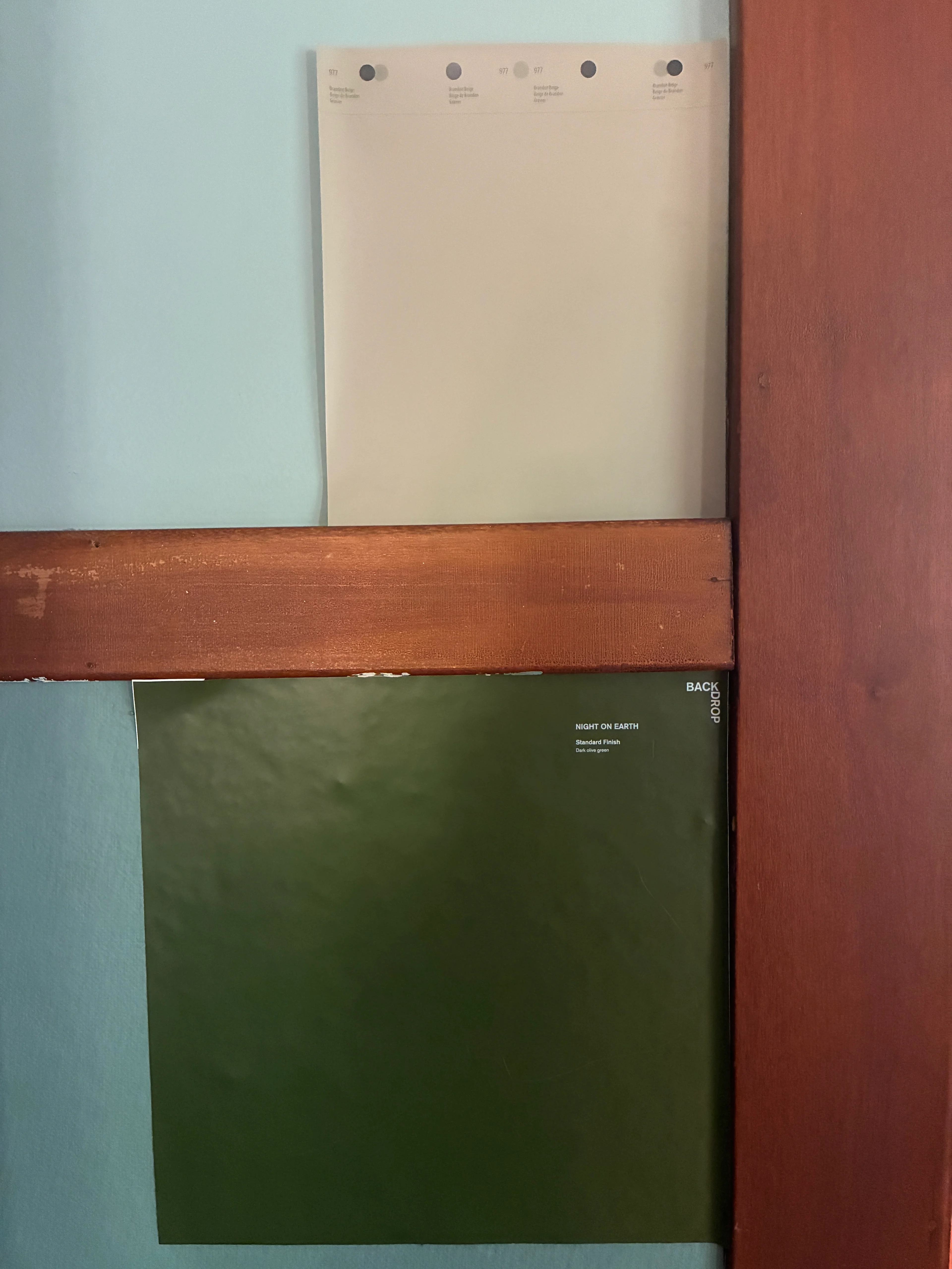
Here's what I'm planning: The sitting room gets Backdrop's Night on Earth below the picture rail with Sherwin-Williams Brandon Beige above it — replacing the current teal that has run its course. I'm also eyeing the Rust-Oleum treatment on those radiators too, either aged copper again or antique brass. The kitchen will be Sherwin-Williams Kestrel White, an off-white with a warm brown undertone. The sunroom gets a sage green. And the entry hall — Backdrop's The Palio, a deep chocolate brown I genuinely cannot wait for.
Will I be painting the kitchen myself? Absolutely not. Too many corners to cut, too large a space, zero interest. There are times you call in a professional. This is one of them. No shame whatsoever.