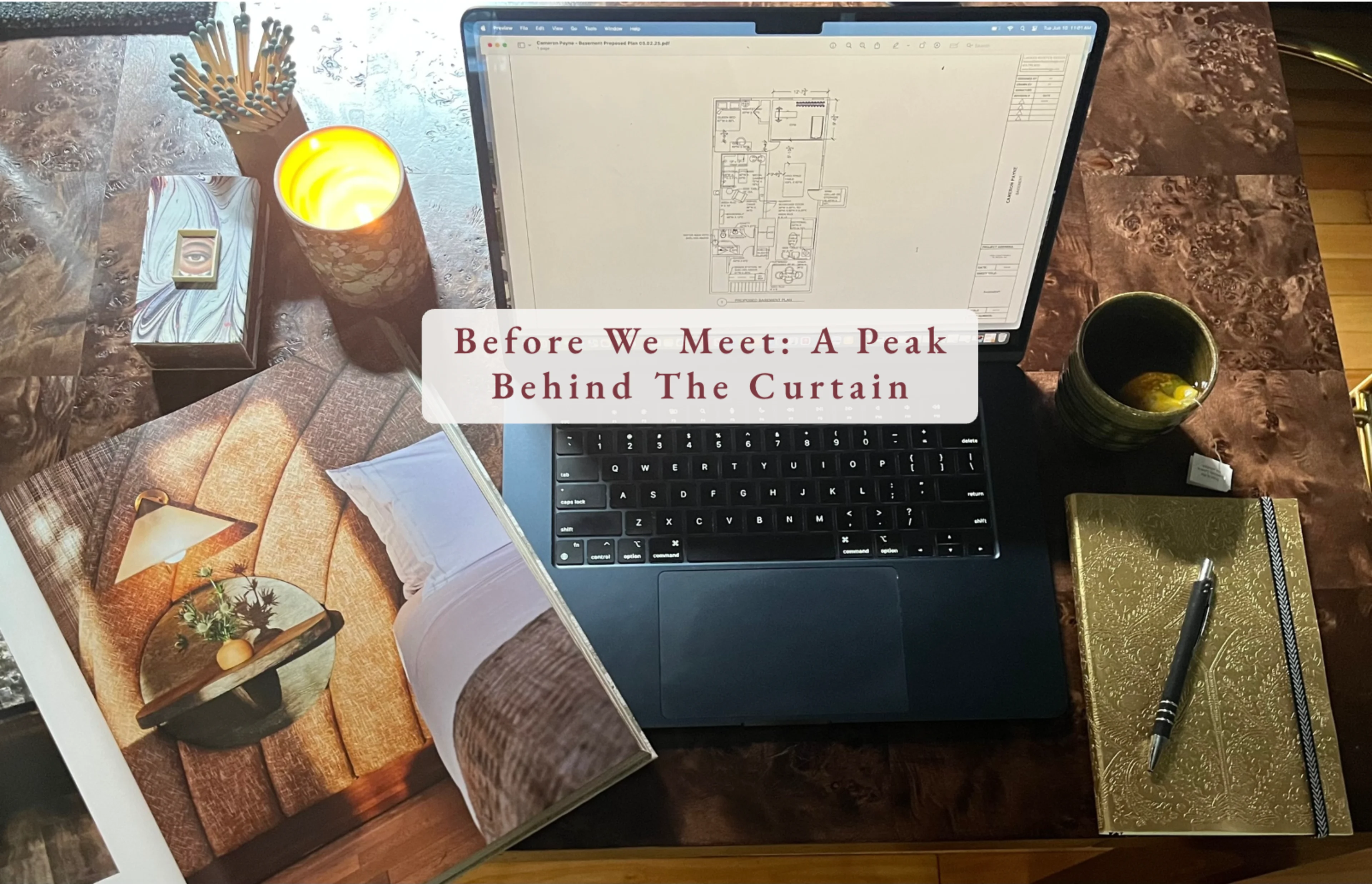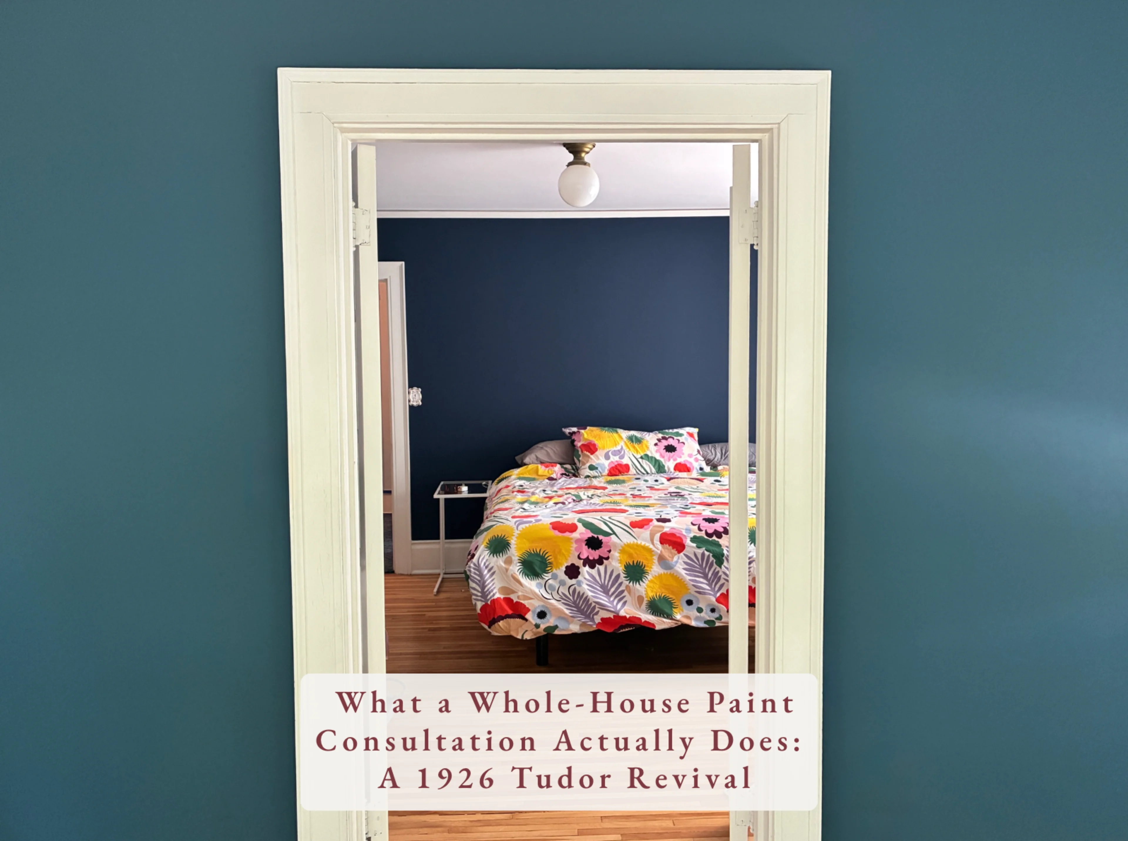
There's a certain kind of house that has been waiting a long time for someone to get it right.
This is one of them.
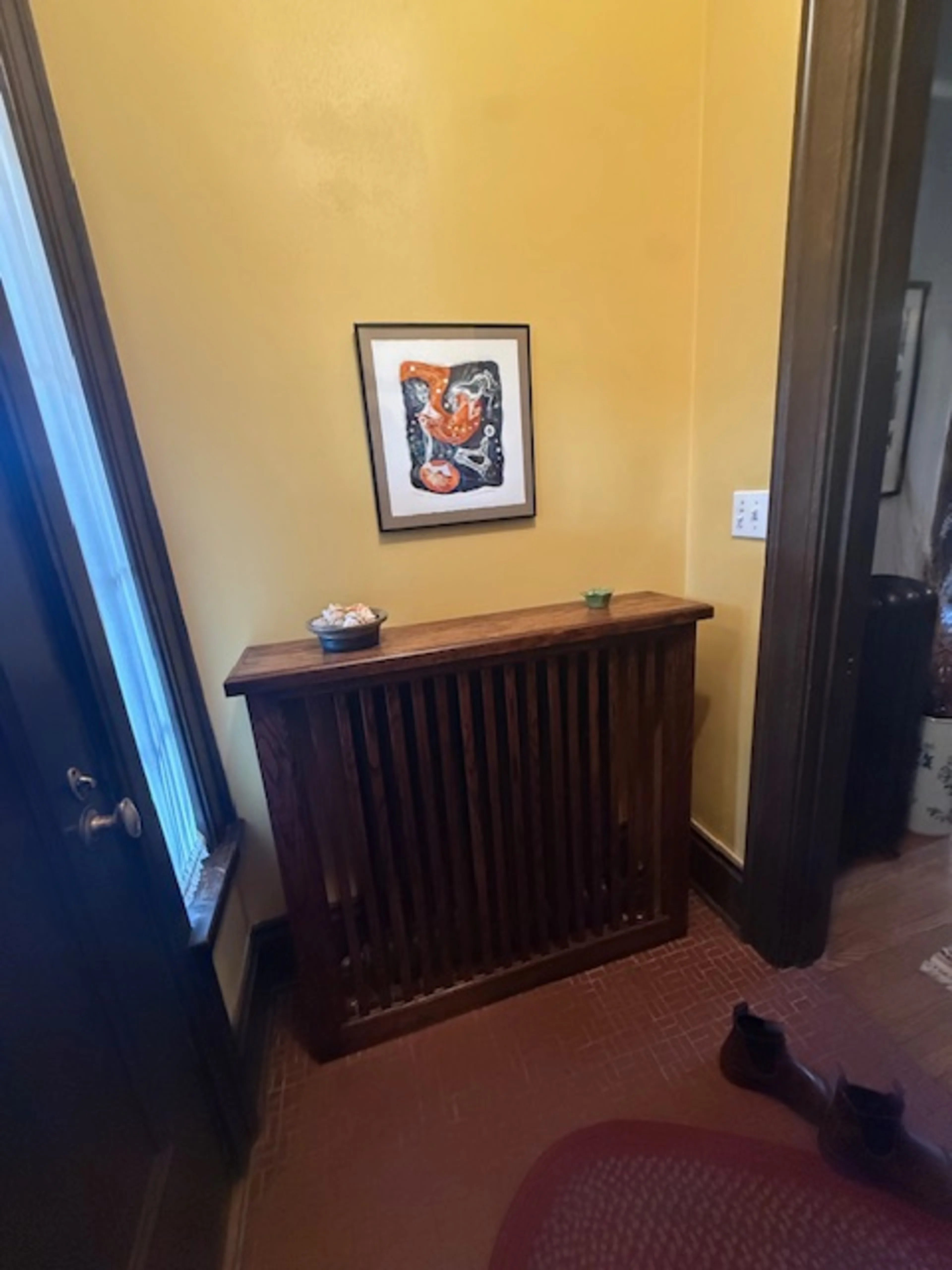
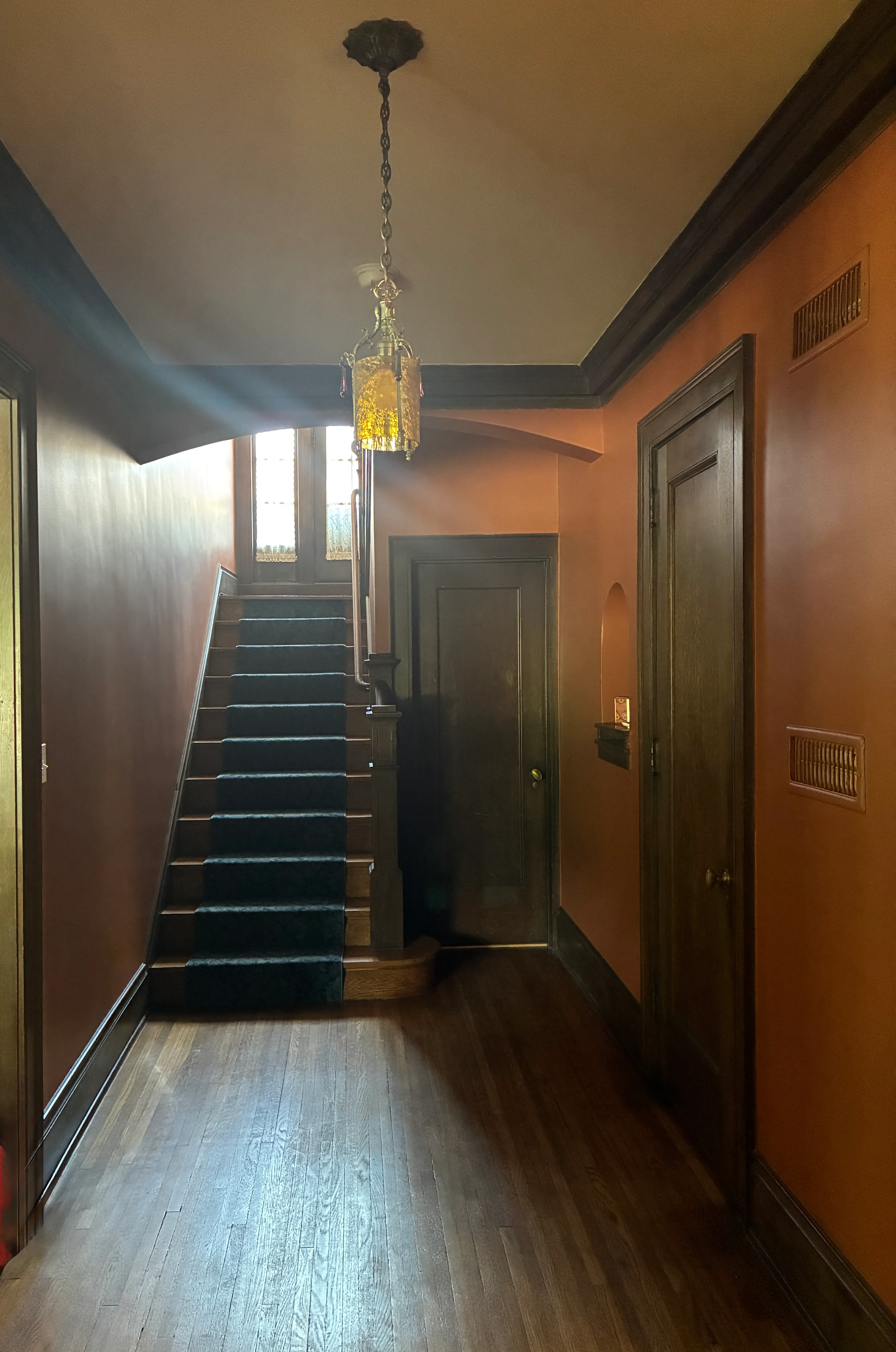
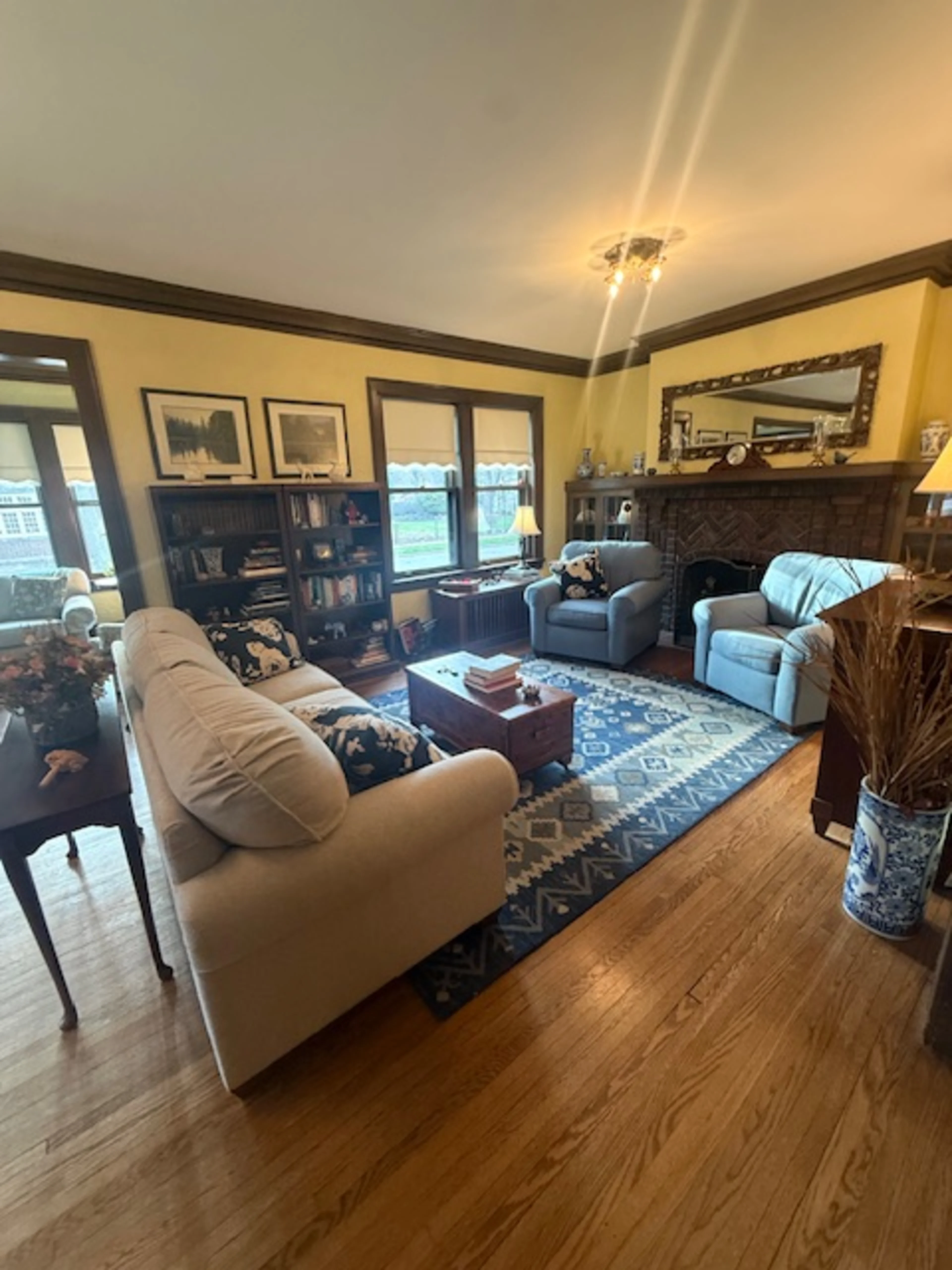
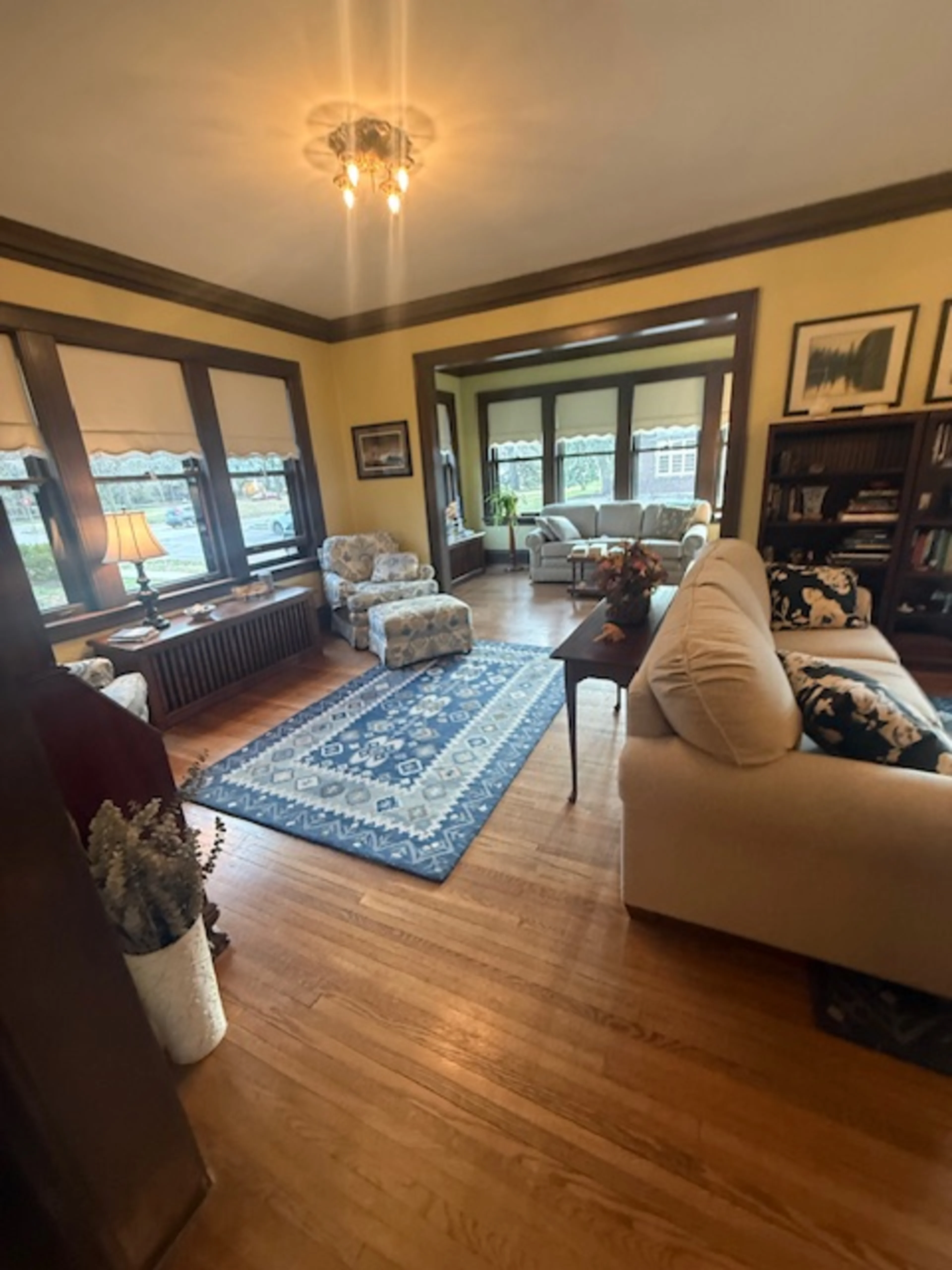
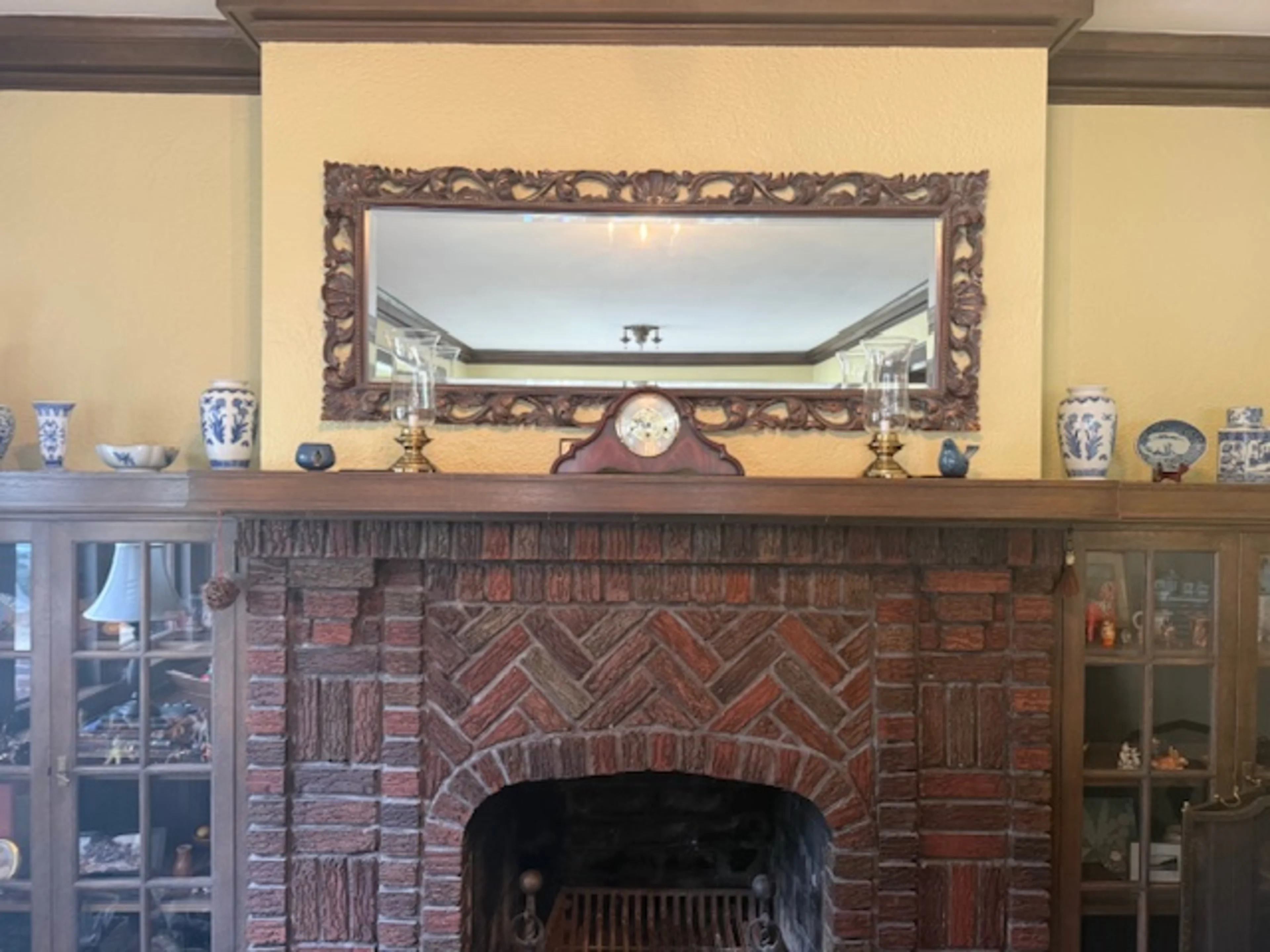
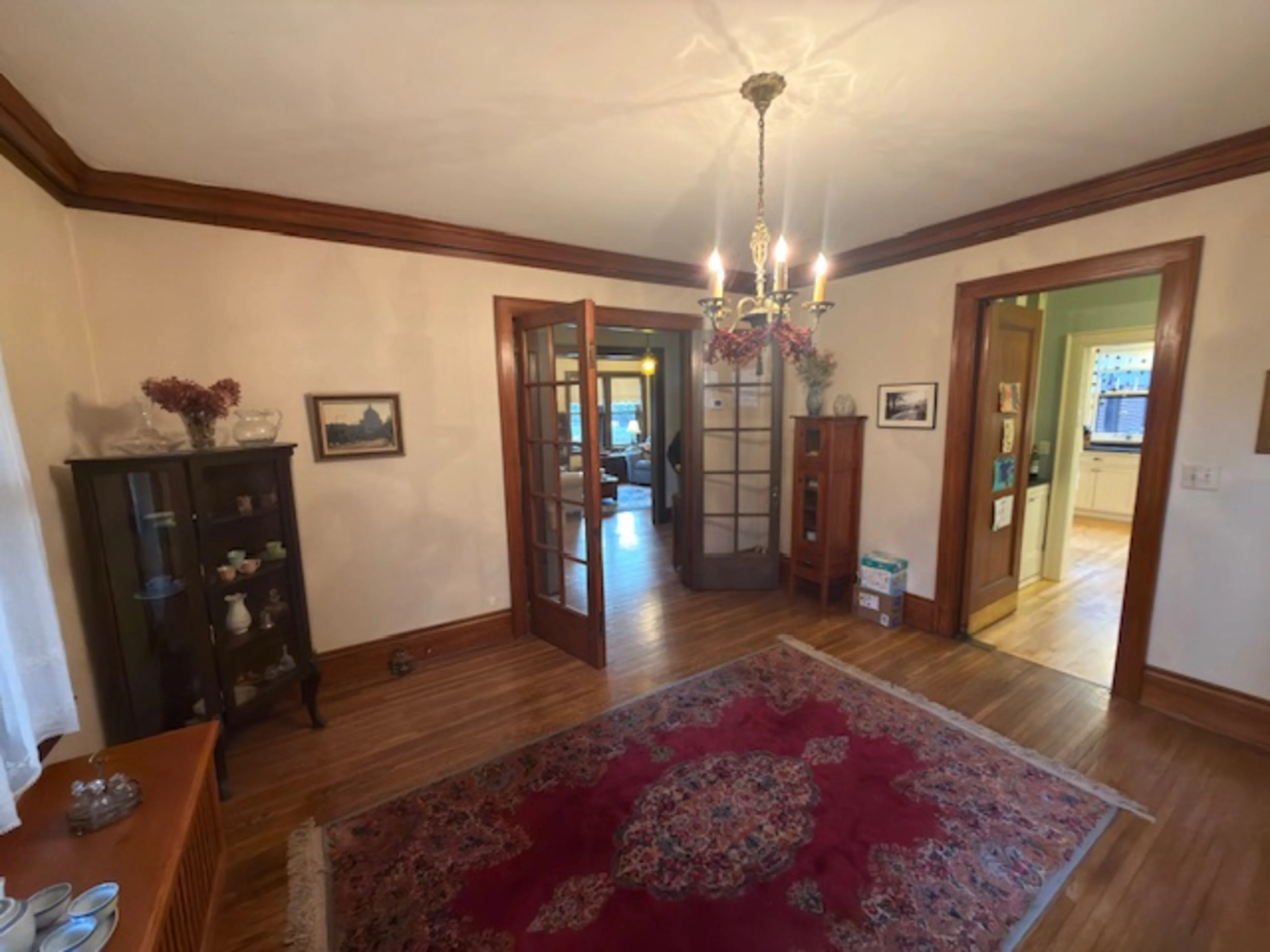
Built in 1926, this Tudor Revival has everything you'd want in a historic home — original woodwork throughout, a stunning arched brick fireplace flanked by built-in cabinetry, a herringbone brick entry floor that's still perfectly intact, an original hall bench with mirror and hooks, radiators, picture rails, a butler's pantry with glass-front cabinets and black countertops. The bones are exceptional. The kind of house that stops people mid-sentence when they walk in the door.
The previous paint colors were not doing any of it any favors. Butter yellow in the sunroom. Colors that felt disconnected from each other and from the house itself. Rooms that had been painted one at a time, one era at a time, without anyone standing back and asking: what does this house actually want?
That's the question a whole-house paint consultation answers.
Where I Always Start
Before I ever pulled out a fan deck, I researched the house.

A 1926 Tudor Revival is a specific thing with a specific history. The style was deeply influenced by the Arts and Crafts movement — earthy, warm, grounded. The original palette for homes like this leaned heavily on terracotta, warm browns, deep greens, warm creams. Colors that honored the woodwork rather than competing with it. Colors that felt like they belonged to the earth the house was built on.
That research doesn't give me the palette — it gives me a framework. A permission structure. A reason to go where the house is pointing and not second-guess it.
Then I Listen to the People Who Live There
They came with things they loved. A bold botanical duvet. Art they were committed to. They knew they wanted color and they were not afraid of a moody room.
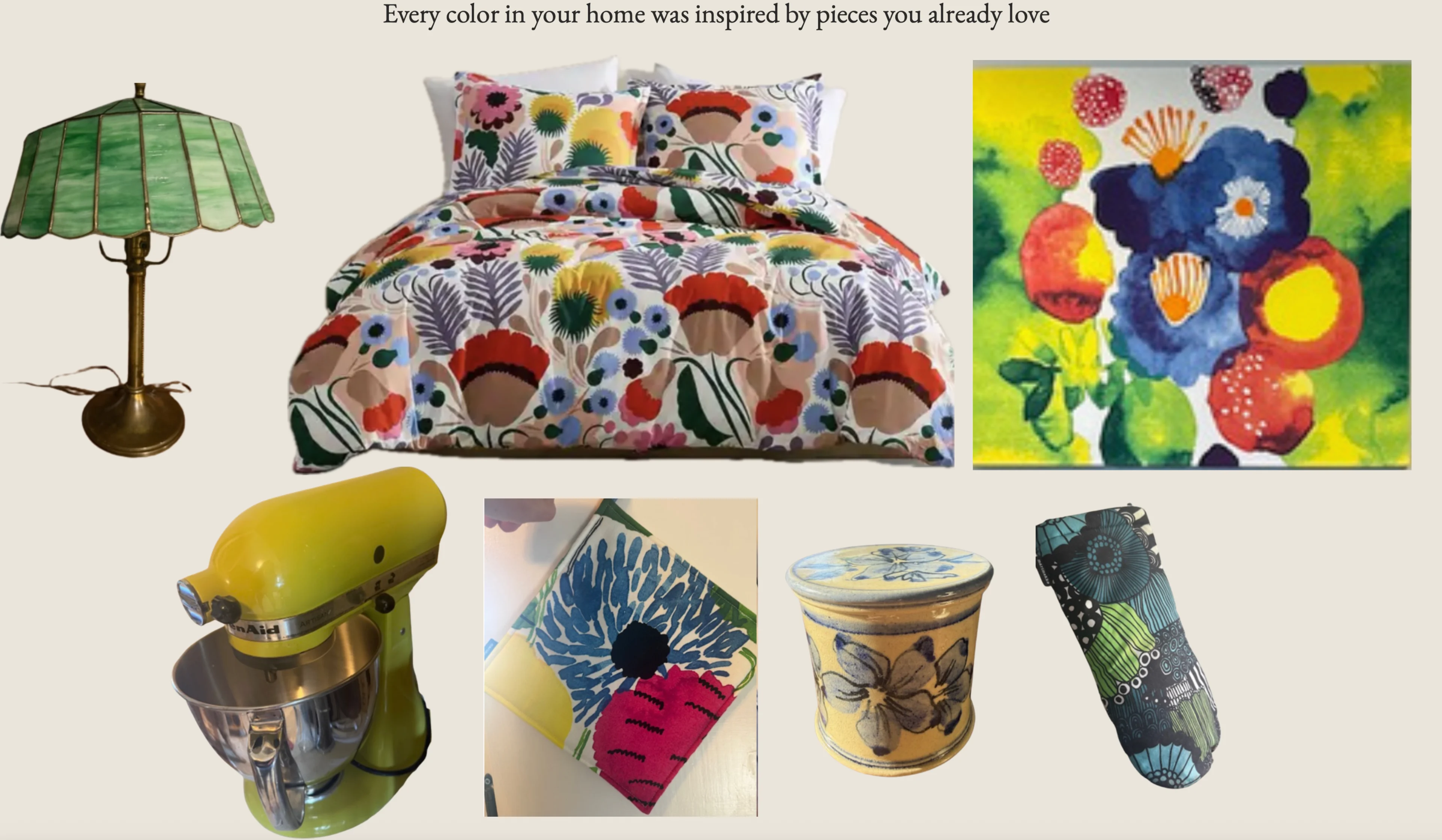
I love clients like this. It genuinely makes the work better.
Part of my job is to push you a little outside your comfort zone — because that's where the magic happens. And I'll be honest: when I'm a little nervous about a color too, that's actually a good sign. It means we're all pushing ourselves. It doesn't mean I think it's going to look bad. It means I know it's the right call and the question is whether everyone is ready to trust it.
With Rojo Marrón in the vestibule and breakfast nook — I knew. The question was whether they would think it was too much. Spoiler: they love it. The husband told me he never would have thought to paint those spaces that color. High compliment.
He also said something that stuck with me. They were in the middle of a move, making a million decisions, and having someone come in and say this is what you should do, here are painters who can start immediately and be done in a week — that was easy. Not stressful. That is literally my job. To guide you, make decisions that make sense for you and your family and the house you live in, and get it right the first time.
Because yes — it's paint, you can always repaint. But let's get it right the first time.
Nine Rooms, One House, One Cohesive Story
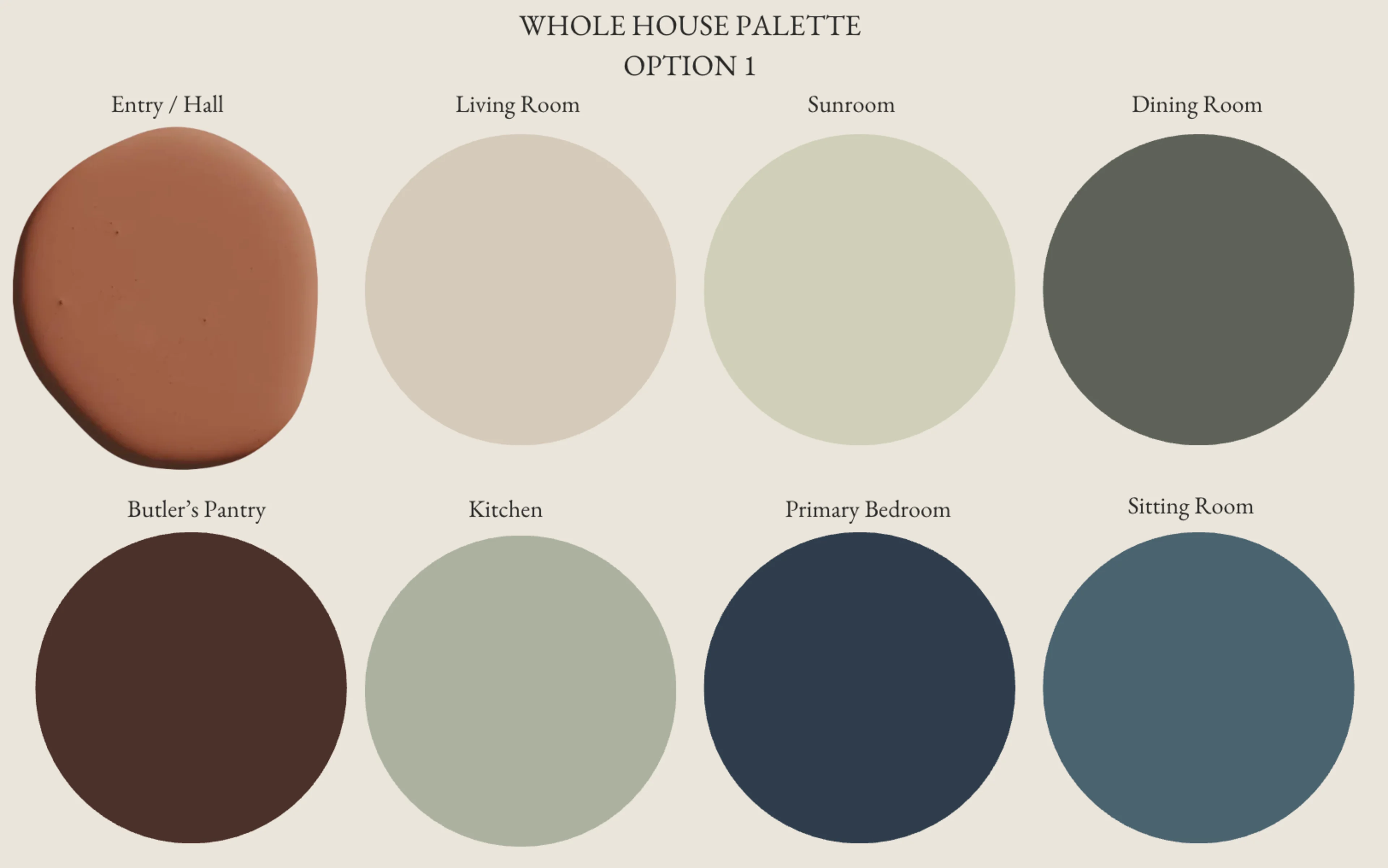
This project covered the main floor and upper level — nine rooms total. Every room connected. Every color chosen in relationship to what came before it and what came after.
The Vestibule gets your first color moment the second you walk in. We went with Rojo Marrón by Sherwin-Williams — a rich, warm brown that wraps around all that original dark woodwork like it was always meant to be there. It's bold. It's grounded. It's historically right for the era.
Before

After

The Main Hall flows from the vestibule in Ghost Ranch by Backdrop — warm and connected, keeping the energy of the entry without repeating it.
Before


After
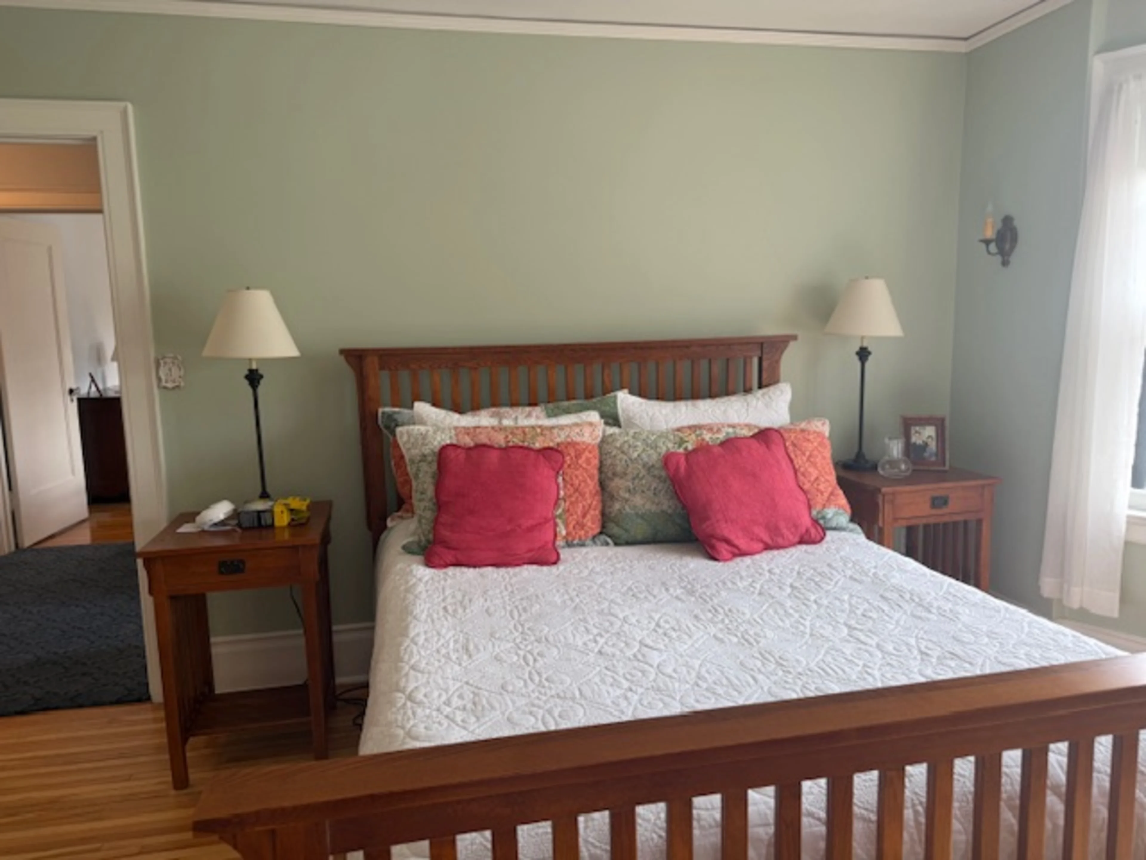
The Living Room came down from its previous color to Touch of Sand by Sherwin-Williams — a warm neutral with just a hint of brown and pink that makes the room glow. It finally lets the original brick fireplace and built-in cabinetry do the talking.
Before

After

The Sunroom was butter yellow. Now it's Acanthus by Sherwin-Williams — a historic color, a soft sage green that is perfectly appropriate for a 1926 home and completely transforms the space. This one was also intentional in a way that goes beyond the walls. The windows look out onto nothing but green trees and landscaping. Plants are going in there. In the summer you're surrounded by green inside and out. And in a Minnesota winter, when everything outside is gray and frozen, that sunroom becomes its own little oasis. That's not just a paint color — that's an experience.
After


The Dining Room is where we went deep. The art in here is Marimekko's Juhannustaika — and Pewter Green by Sherwin-Williams was chosen deliberately as a muddier pull from the colors already in that print. Not an exact match. A step back, a little darker, a little more grounded — so the art itself pops off the wall rather than blending into it. That's the difference between picking a color you like and picking the right color for the room.
Before
After

The Kitchen got Cascade Green by Sherwin-Williams — another historic color — chosen specifically to play off the original tile detail in that space. The transformation in there is significant.
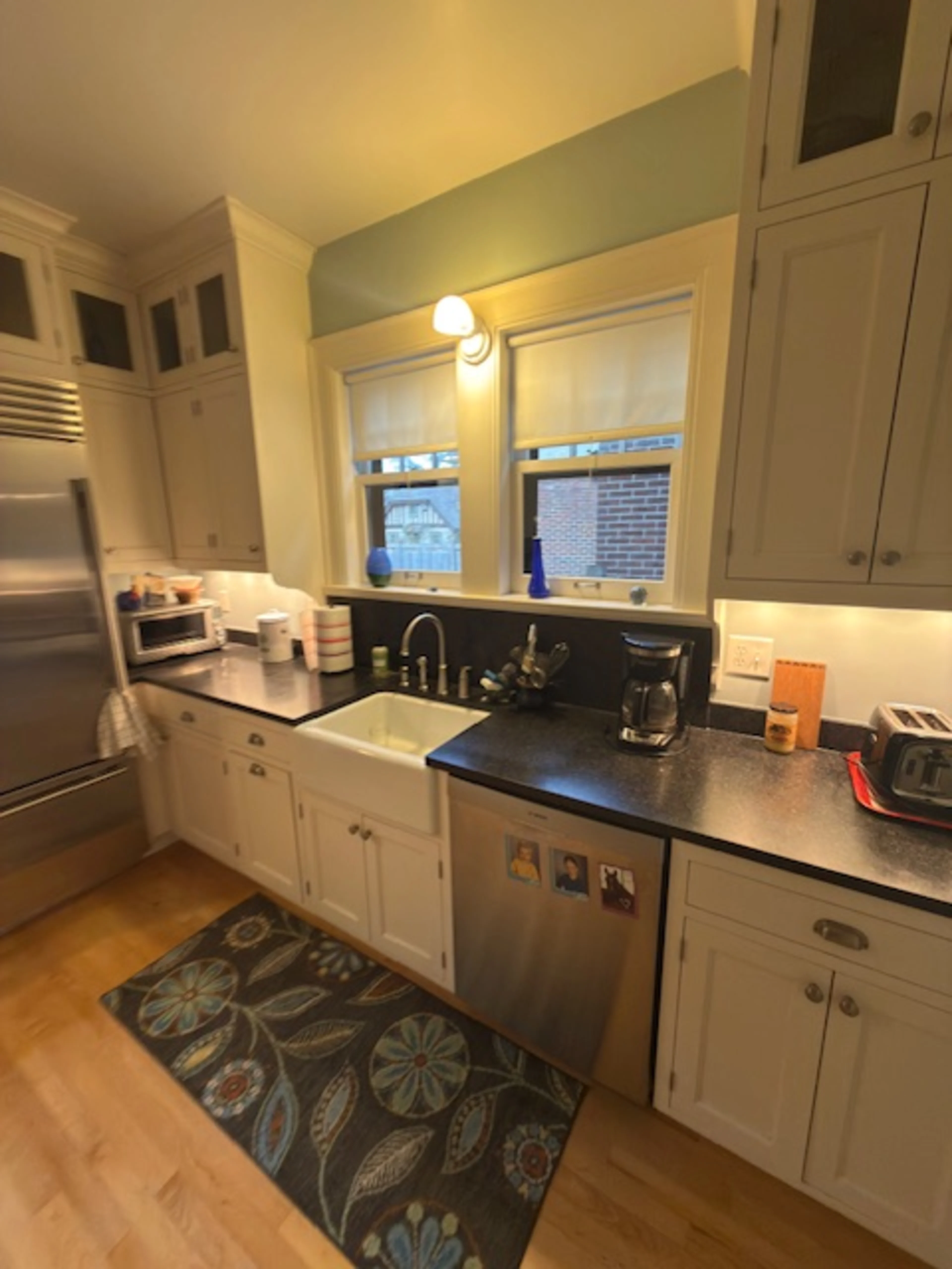
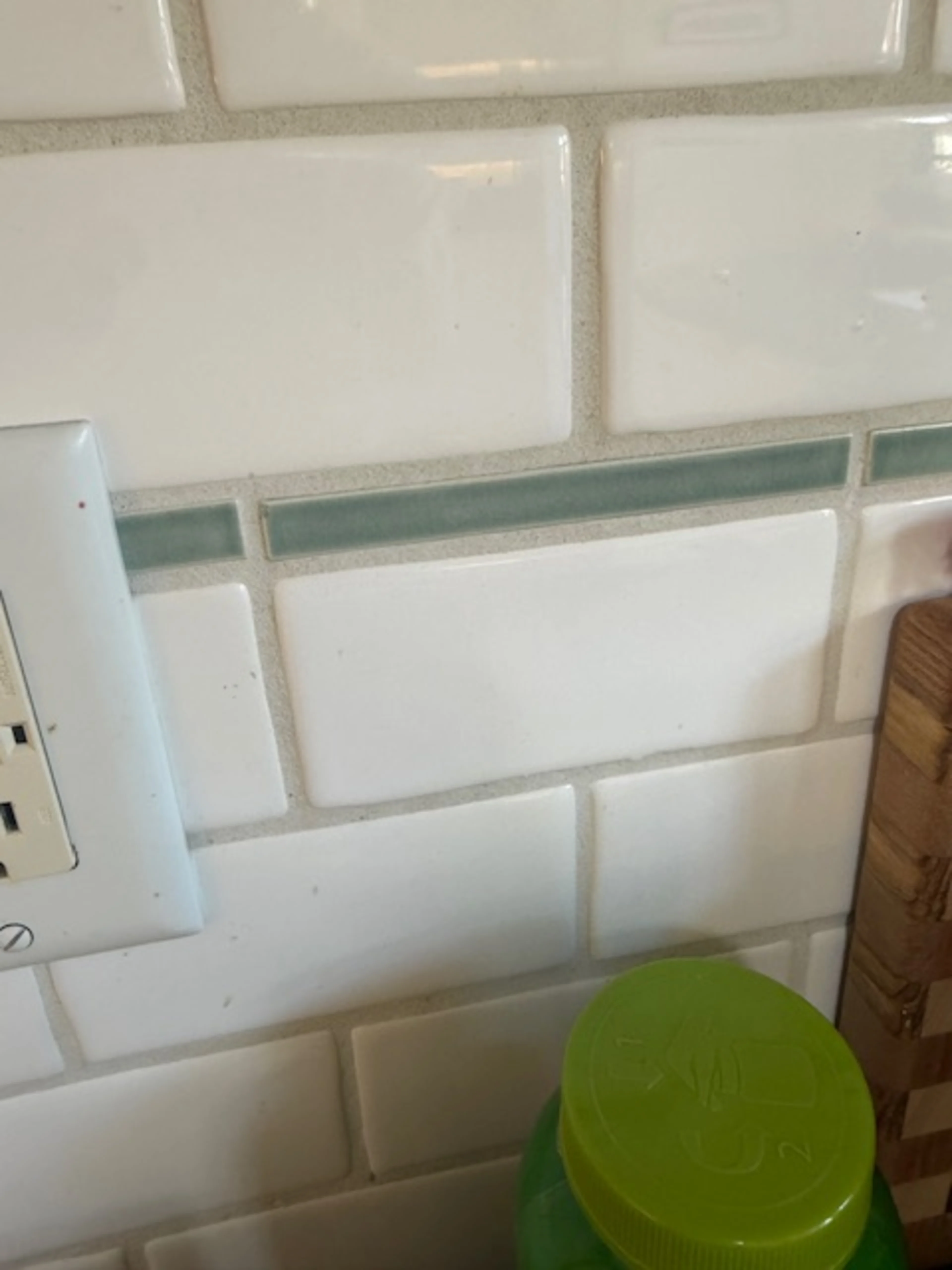
After


The Breakfast Nook and Butler's Pantry got the same Rojo Marrón as the vestibule — rich, warm, dramatic, and completely unexpected. The glass-front cabinets and black countertops against that color are exactly right.
Before
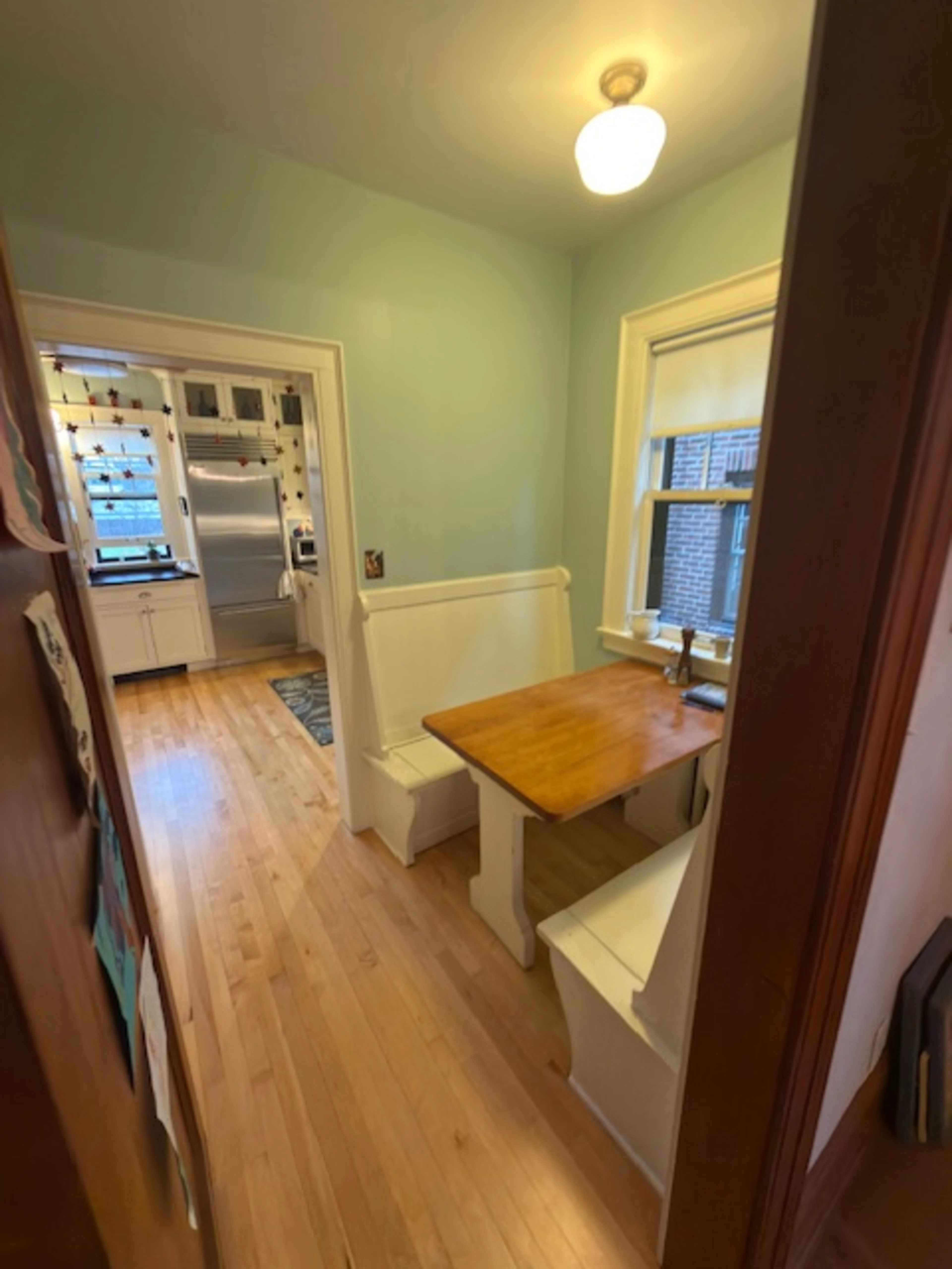
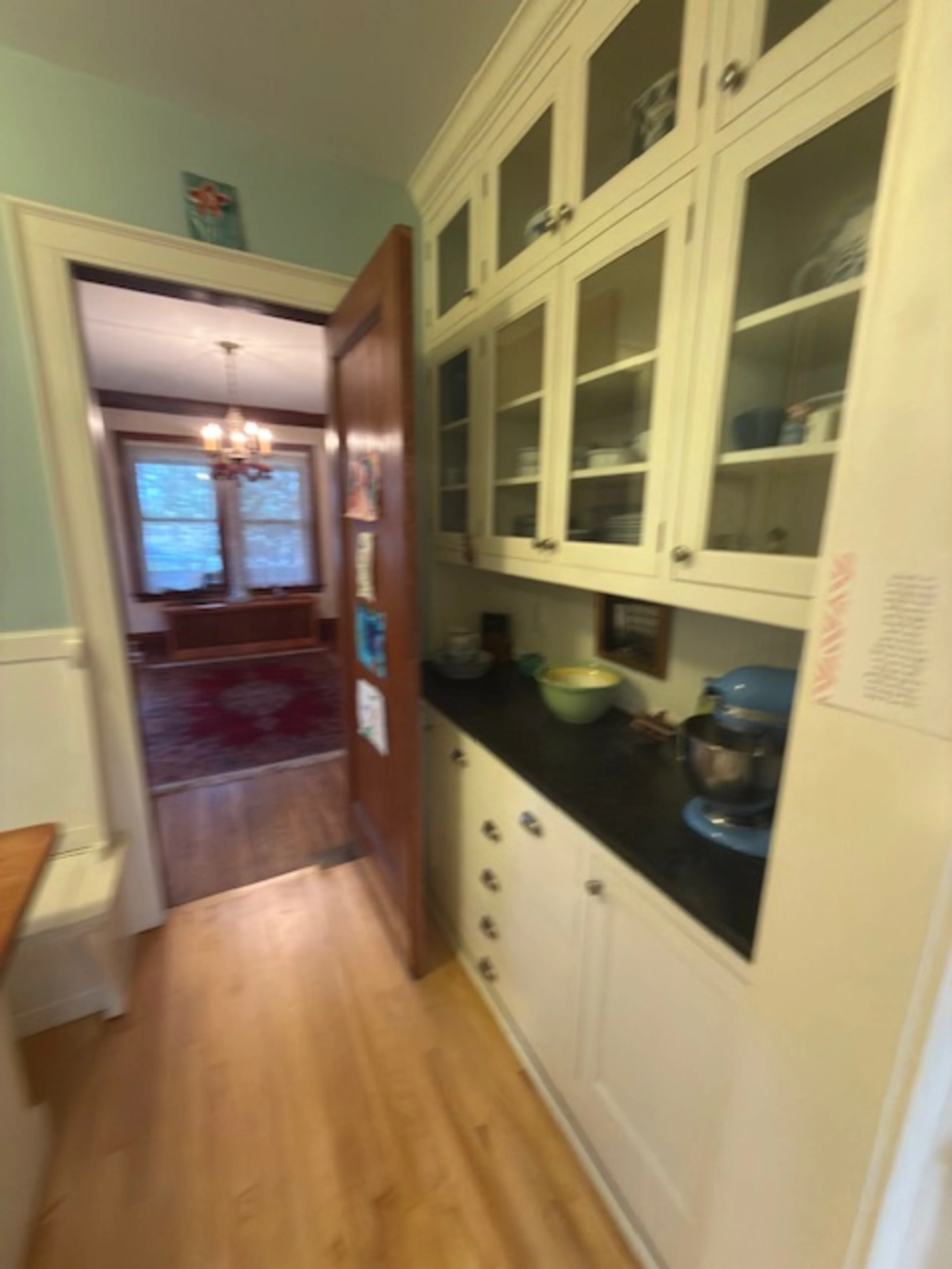
After

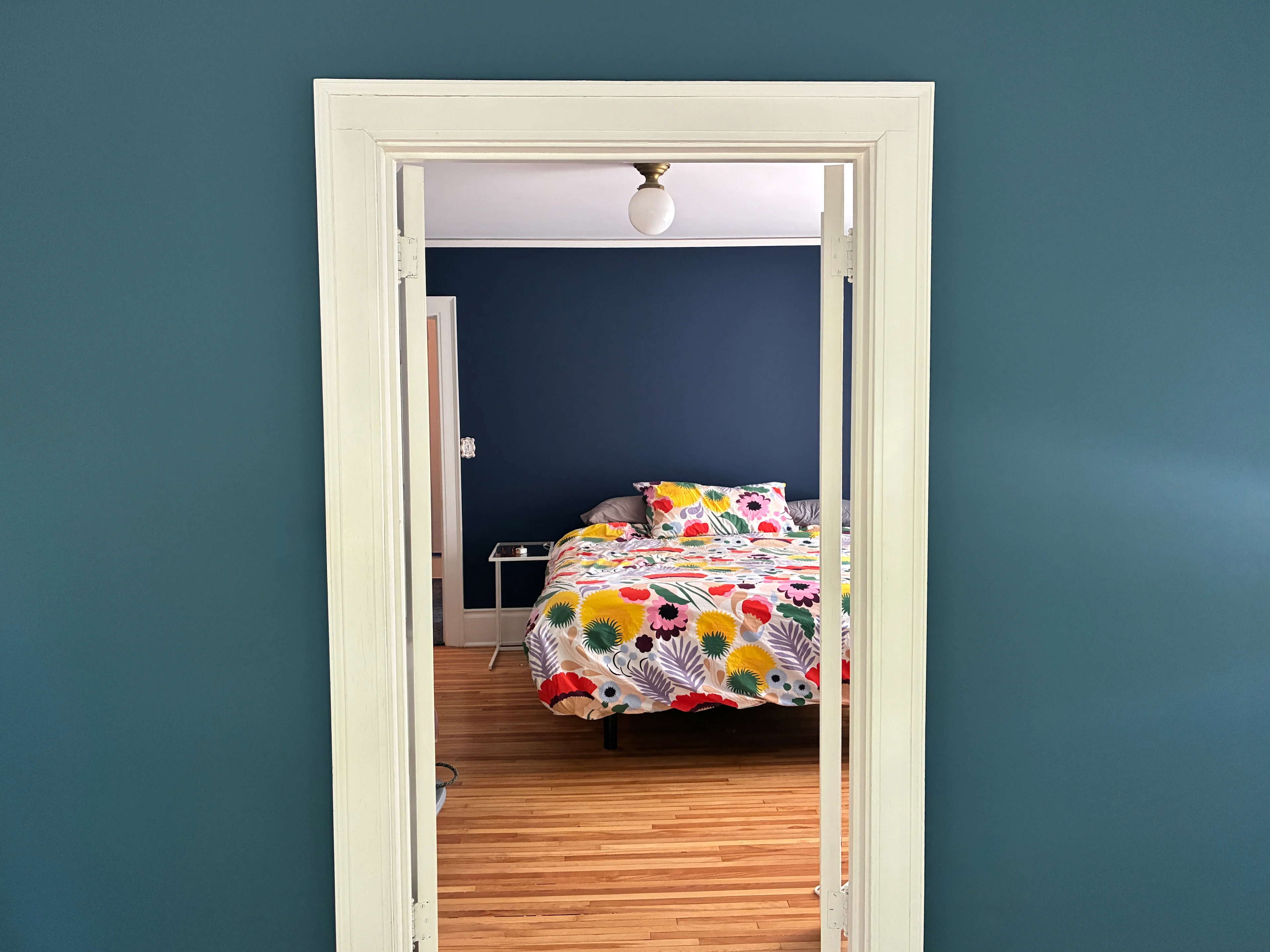
The Primary Bedroom is navy — deep, saturated, bold — with the Marimekko duvet popping against it. We were aligned on this direction from the very beginning and it did not disappoint.
Before
After


The Primary Sitting Room transitions beautifully from the bedroom — a few shades lighter than the navy, keeping the rooms connected while giving the sitting room its own identity. Boy did it turn out lovely.
Before

After

The Upstairs Hall ties it all together with Practical Beige — chosen specifically to work with the carpet, the stair runner, and the upstairs bathroom tile. Every decision in relationship to everything around it.
Before

After

What Paint Actually Does
People hire me for a lot of things. But a whole-house paint consultation might be the highest-value thing I do — not because I know a lot of colors, but because I know how to listen to a house, listen to the people who live in it, and build a palette that makes everything feel like it was always supposed to be exactly this way.
The colors that weren't working in this house weren't wrong because they were the wrong colors in some abstract sense. They were wrong because nobody had ever asked what this particular house wanted — or pushed the people living in it toward something that might feel like a lot on a paint chip but is exactly right on the wall.
That's the job. And this house? Finally exactly what it was always meant to be.
Interested in a whole-house paint consultation? I'd love to talk. Set up your complimentary discovery call here.
A huge thank you to the team at Abode Finishes (@abodefinishes) for bringing every single one of these colors to life. The execution was flawless and the homeowners absolutely loved working with them — and honestly so did I. If you're in the Minneapolis area and need a painter who actually gets it, they're your people.