Every home has a first sentence—the moment you cross the threshold and the room tells you who it is. Hallways carry that introduction. They don’t need to be loud, but they do need a point of view: confident scale, considered materials, flattering light, and art chosen with intent.
Scale is a love language
Underscaled pieces make a corridor feel tentative. I like a console with presence, lamps that anchor the sightline, and a runner that reads as purposeful rather than “almost long enough.” Leave negative space so the architecture can breathe.
Materials write the melody
The palette sets your register. I’m drawn to tension: warm metals with cool stone, graphic weaves with refined silhouettes, velvet against plaster. That interplay is where a pass-through becomes a place.
Art direction over decoration
Art shouldn’t be filler. Whether it’s a single statement, a salon mix, or intimate family imagery, the hallway is prime real estate for storytelling. Choose pieces that hold the eye at a glance and reward a closer look.
Light, always flattering
Hallway lighting should behave like good skincare. Lamps at eye level soften faces and surfaces; a pendant adds movement and draws the gaze through. Warm bulbs and dimmers let the space shift from day to evening.
Edit like you mean it
Confidence reads as clarity. Choose a few excellent pieces, repeat materials intentionally, and let scale and silhouette carry the space. A hallway doesn’t need everything; it needs the right things.
Example I: Bold Brushstrokes

Confident pattern, sculptural forms, and modern romance with brass.
This concept leads with a gestural wall—painterly geometry in wine, clay, and plum—paired with a lithe, arched coffee table that echoes the architecture beyond. A burnished brass console adds quiet shine, while twin lamps bring symmetry and warmth. The oversized greenery reads as living sculpture; the pendant glows rather than glares. Cinematic and edited—it tells guests, “We like beauty with backbone.”
Bold Brushstrokes — a confident mix of gesture, brass, and sculptural light for a hallway that refuses to whisper.
Example II: Graphic Ground
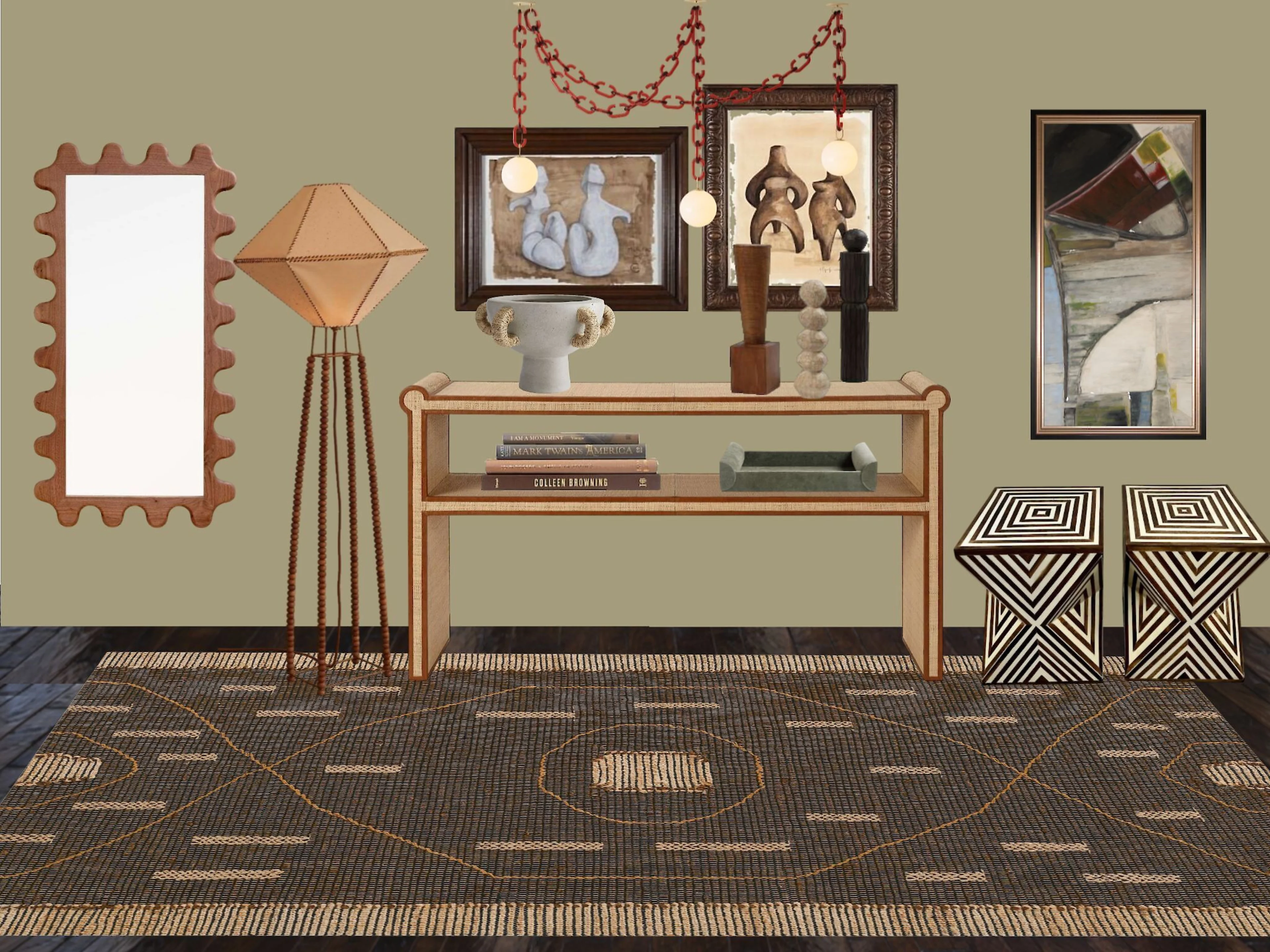
Textural restraint with graphic punch.
Here, rhythm comes from materials: a tailored console with wrapped edges, a crafted floor lamp, and a tribal-leaning rug that grounds the vignette. Artwork is layered and conversational—figurative, abstract, and object-driven—curated rather than matched. The palette is mineral and warm: camel, espresso, bone, charcoal. Quieter than the first board, yet every piece has personality. Lived-in, worldly, and resolutely modern.
Graphic Ground — texture-forward neutrals, sculptural lighting, and art with a point of view.
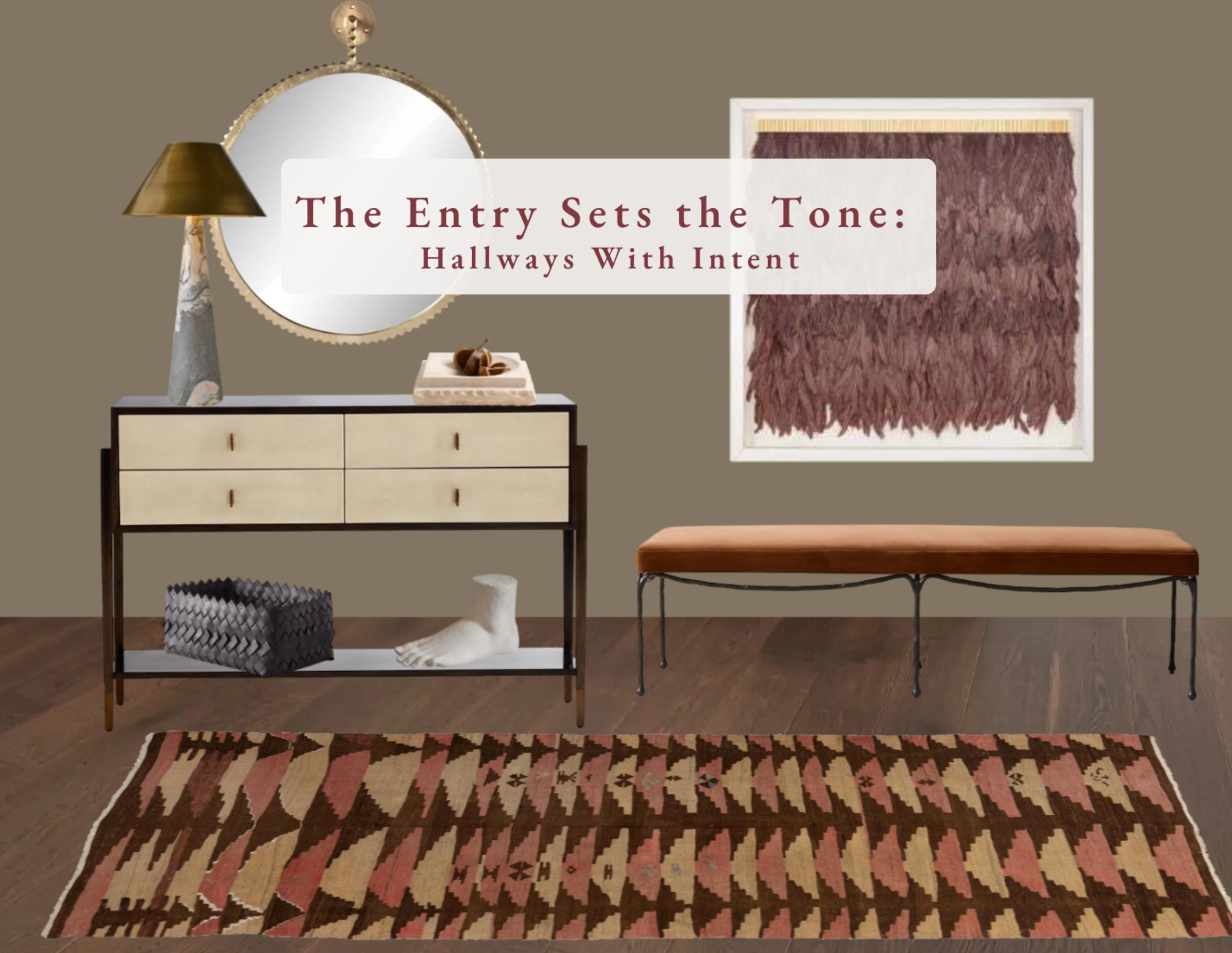
Example III: Tailored Warmth

Quiet glamour with real texture.
This hallway leans into restraint: a leather-front console on dark wood, a scalloped brass mirror that reads like jewelry, and a rust velvet bench with slender iron legs. The vintage kilim pulls rose, camel, and umber through the space, while the feathered wall piece adds softness and movement. Edited, tactile, and welcoming—the kind of entry that whispers confidence.
Tailored Warmth — leather, brass, velvet, and a vintage kilim for a quietly glamorous welcome.
Your entry is the thesis for the home. Lead with intention—through scale, materiality, light, and art—and the rest of the rooms fall into a beautiful conversation.
Let’s set the tone.
Thoughtful scale, materiality, and art—tailored to you. Inquire here →