Patterns are one of the most powerful design tools. They add depth, movement, and personality to a room in a way solids alone can’t. But mixing them is where many people hesitate — how do you know what “goes” together? The truth is, patterns almost always can coexist if you balance three things: scale, tone, and grounding elements.
Below, I’m breaking down three simple ways to layer patterns with confidence, using examples from pared-down mood boards (not fully designed spaces, but focused studies in pattern).
1. Stripes Work Like a Neutral
Stripes are the denim of design — they pair effortlessly with almost anything. Because they read as structured and repetitive, they act as a stabilizer when combined with more organic or intricate patterns.
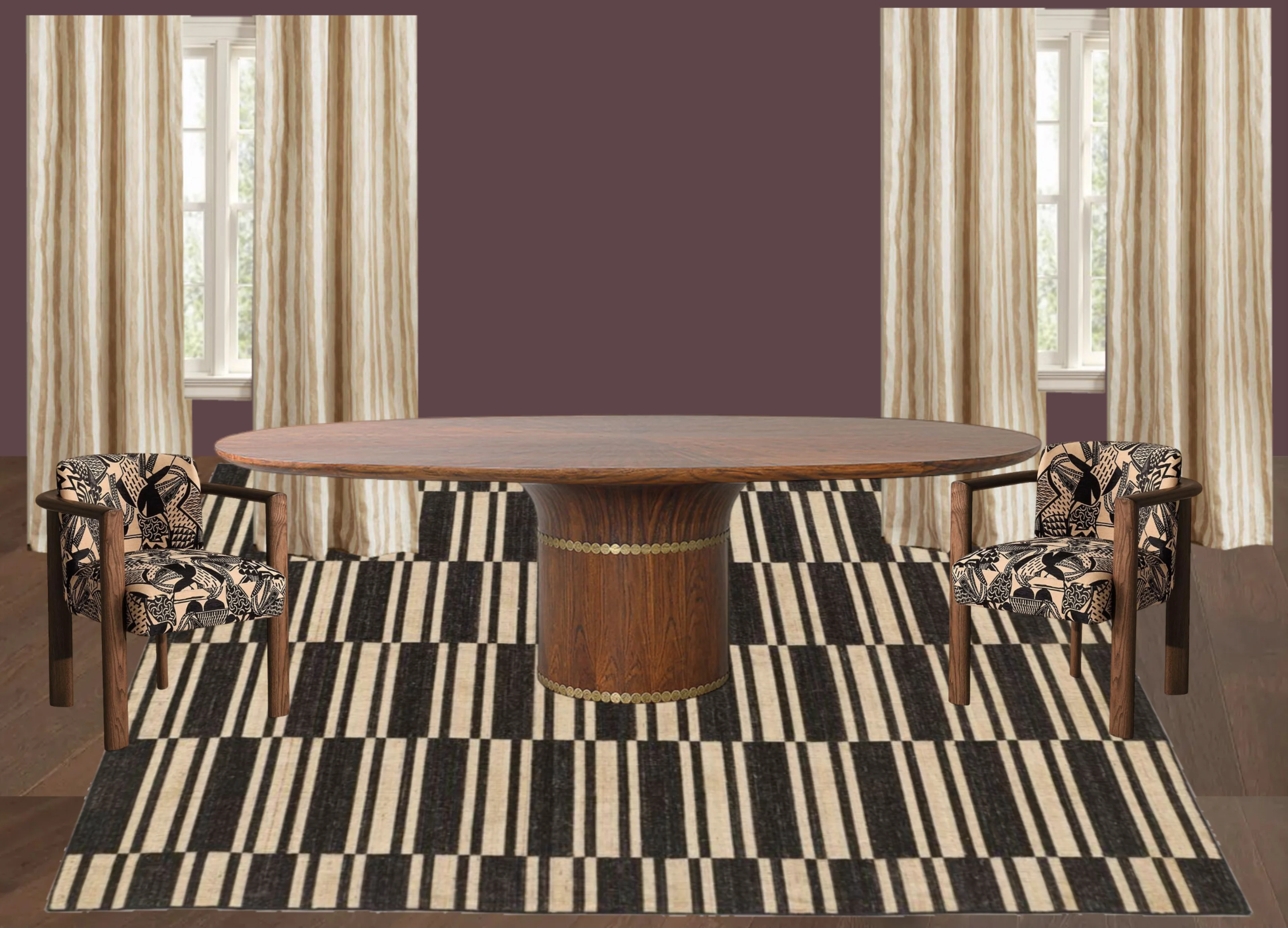
Example: In the dining room board, striped drapery creates vertical rhythm that balances the bold geometric rug and graphic upholstery. In another, a purple striped settee anchors the room, grounding layered prints while still feeling fresh. In both cases, stripes behave more like a backdrop than a distraction.
Pro tip: Don’t be afraid to repeat stripes in different ways — on furniture, drapery, or even walls. They’ll still read as a neutral thread.
2. Stay Within a Tonal Family
The quickest way to make multiple patterns feel cohesive is to keep them in the same tonal palette. They don’t need to match perfectly, but they should share an undertone — warm, cool, earthy, jewel-toned, etc. When the colors relate, the patterns will naturally work together.
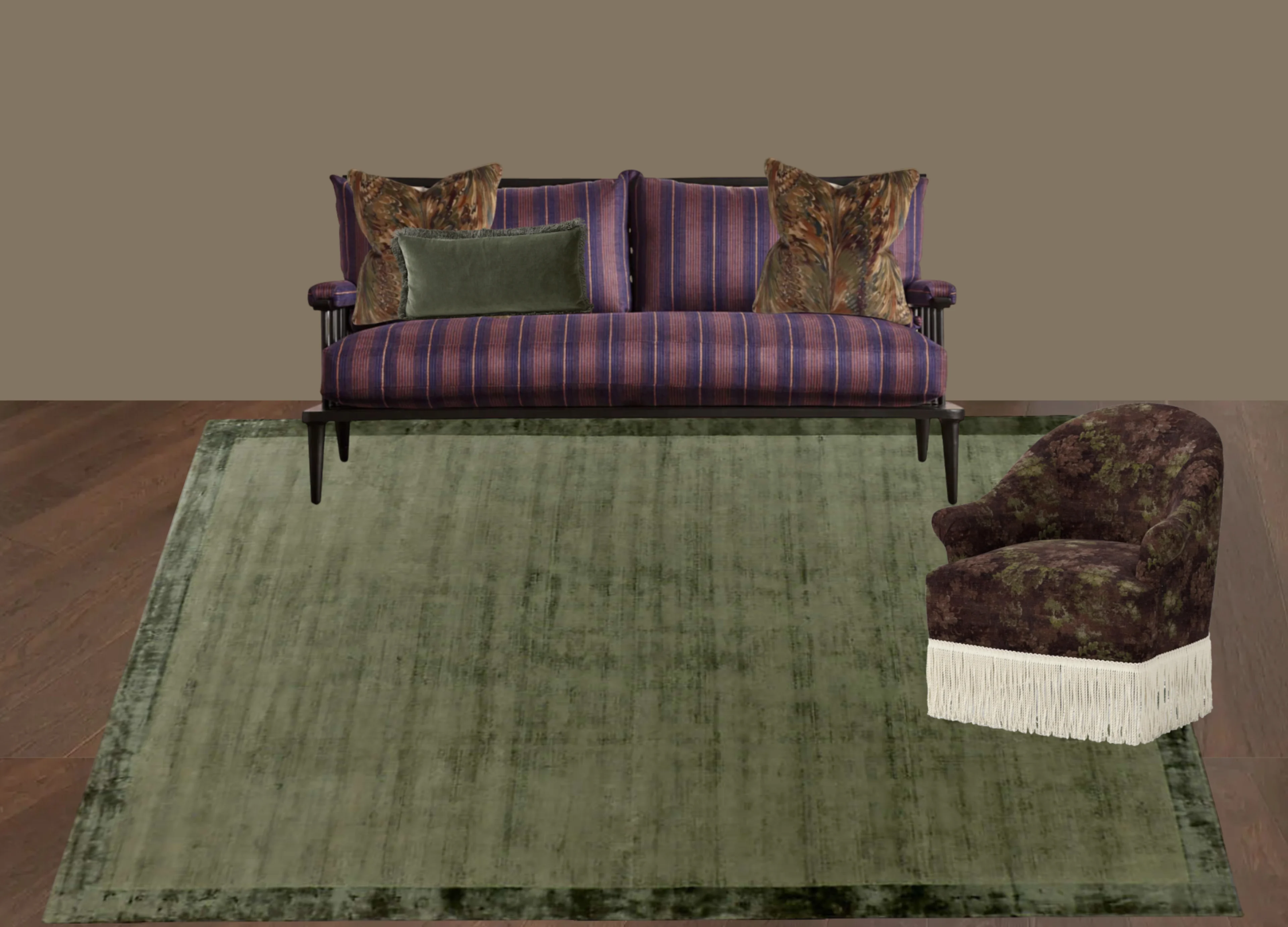
Example: Across all three boards, tone is the unifier. Plum and olive, neutrals with black and wood, or browns with warm metallics — the shared undertones keep the pattern play intentional rather than chaotic.
Pro tip: Start with one grounding color you love, then layer patterns that pull from or complement that tone.
3. Play With Scale
This is the number-one rule of mixing patterns: vary the scale. If every print is large and bold, the room can feel overwhelming. If everything is tiny and delicate, it can feel busy. Mixing oversized motifs with smaller repeats (and solids in between) creates rhythm and flow.
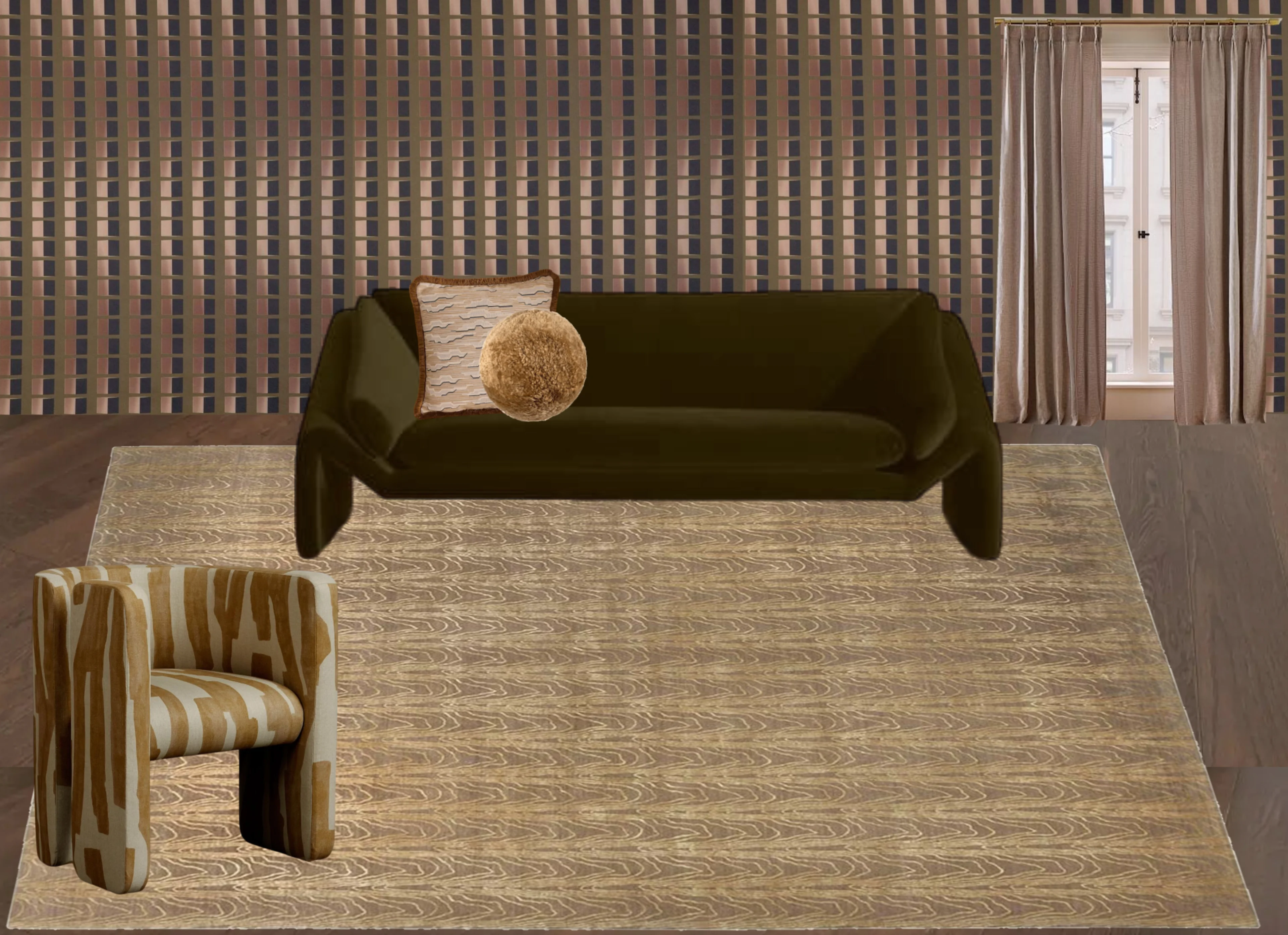
Example: In the final board, the painterly chair upholstery is bold and gestural, while the rug echoes the movement at a smaller scale. The wallpaper, with its near-stripe geometric rhythm, almost acts as another neutral — its tones relate seamlessly to the other elements. Solid upholstery and tonal drapery give the eye a place to rest, letting the conversation between large, medium, and small patterns really shine.
Pro tip: Think of scale as a conversation. A bold pattern starts the dialogue, smaller patterns echo or contrast it, and solids give everyone room to breathe.
Mixing patterns doesn’t have to be intimidating. Start with stripes or another “neutral” pattern, keep your tones consistent, and vary the scale so your eye moves easily through the room. When done thoughtfully, patterns bring energy, warmth, and character in a way nothing else can.
So the next time you’re drawn to a bold rug, an intricate wallpaper, or a painterly fabric — trust your instincts and let them play together. The results might surprise you.