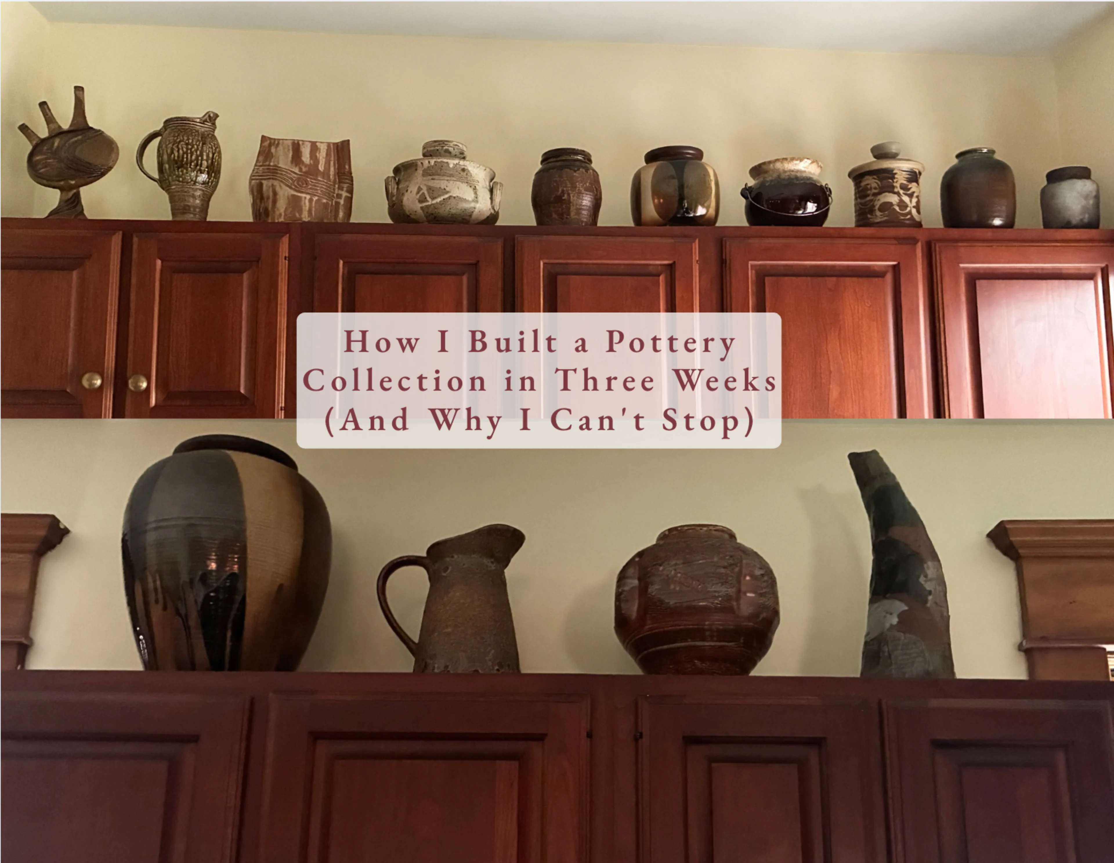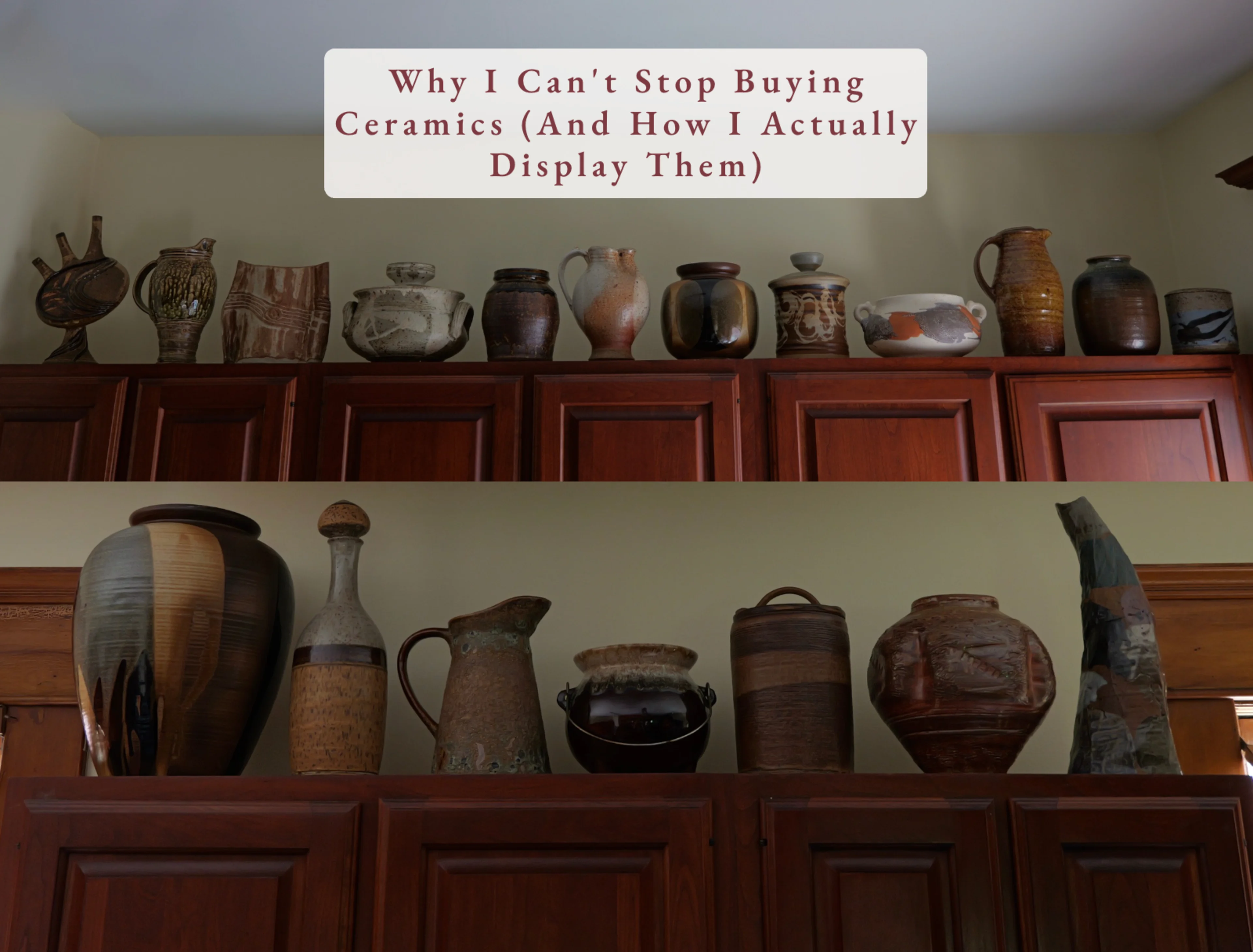
I rearranged the pottery shelf above my kitchen cabinets a few weeks back, and it reminded me that I've never actually written about how I display this collection — only how I built it.
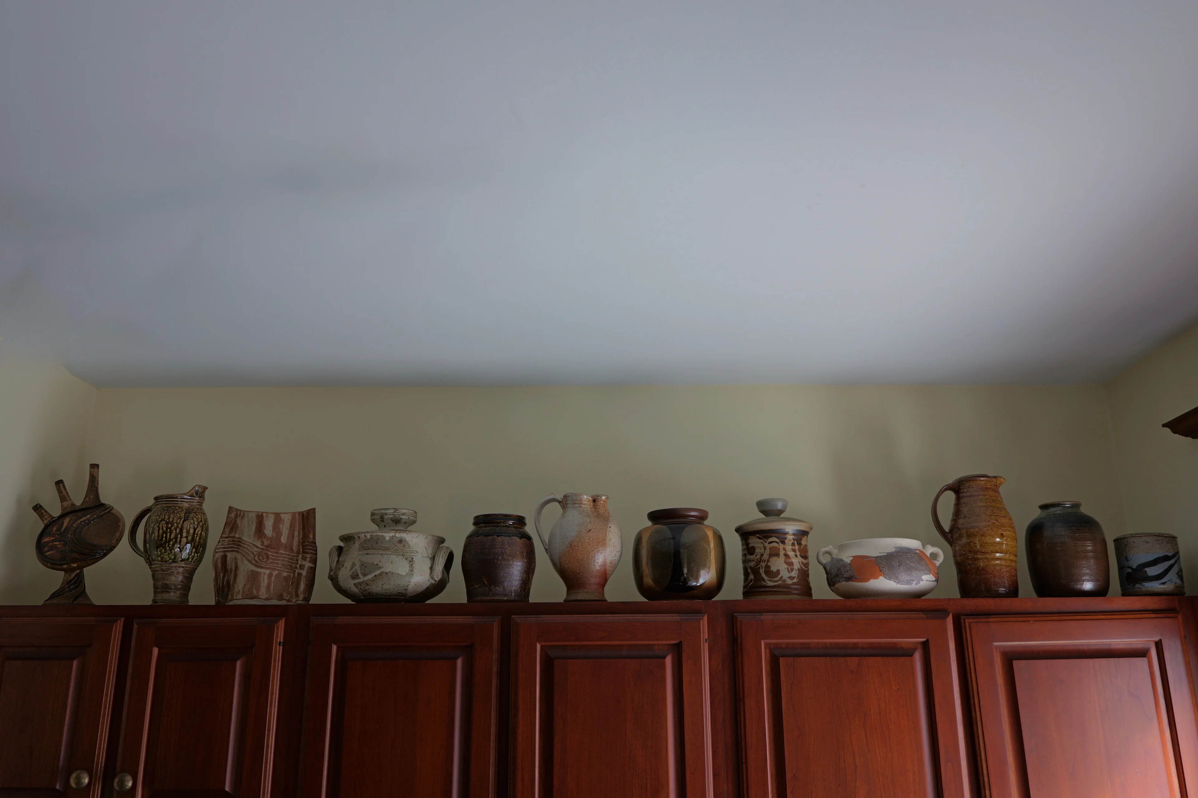
If you've been following along, you know the story: a basement discovery, a few very persuasive vintage shops, and suddenly an entire run of kitchen cabinets dedicated to ceramics. What I haven't talked about is the actual method behind getting a shelf like this to look intentional instead of chaotic — because with a collection this size, that's not automatic. It takes real editing.
I only follow three rules, but underneath those rules is a much longer list of things I'm actually looking at every time I pick up a piece.
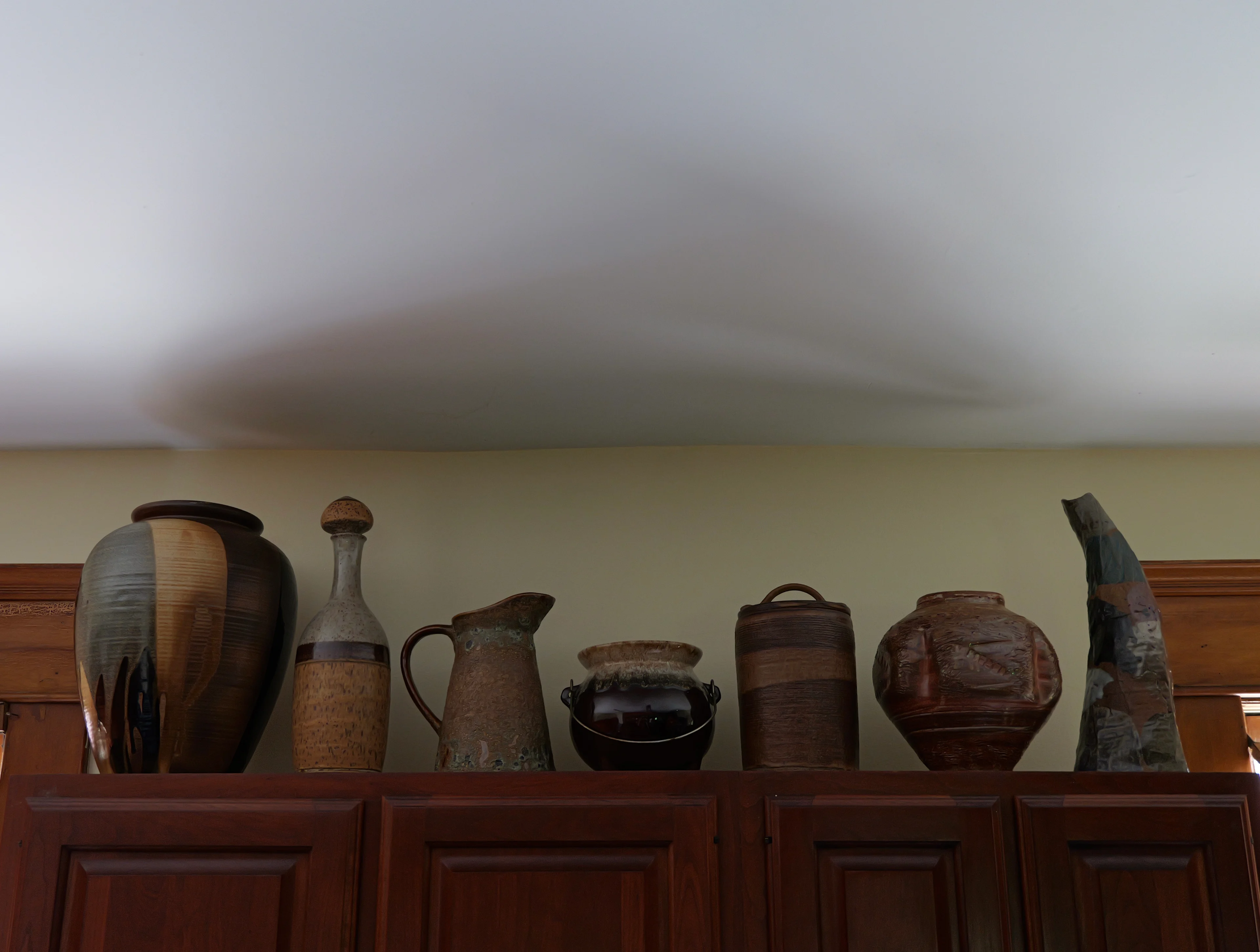
Rule one: it needs a great shape or a great glaze.
Ideally both, but I won't compromise on at least one. That said — I'm rarely evaluating just one thing. I'm looking at color, texture, shape, and pattern all at once, and a piece only has to nail one or two to pull me in. A muddy, matte glaze with incredible texture will win me over just as fast as a glossy, saturated color with a totally plain shape. It's never one formula.


Rule two: vary the height.
This is the one people skip, and it's the one that matters most. Line up a row of same-size pots and it reads like inventory at a shop. Stagger the heights — tall pitcher, short bowl, medium jar, taller vase — and it reads like a collection that grew over time. Because mine did.

Rule three: find the common thread.
It doesn't have to be color. Mine definitely isn't color-matched. But something has to tie the grouping together — a shared warmth in the glazes, a similar era, a consistent roughness in the texture. Without that thread, even genuinely great individual pieces just start to look like clutter.

The details that get me every freakin' time: lids and handles.
I have a real weakness for a funky lid or stopper — you'll notice a lot of pieces on this shelf have one. There's something about a jar with a strange little knob, or a bottle with a chunky ceramic stopper, that elevates the whole piece instantly. And handles are just as important to me — the shape of it, whether it's a clean loop or a pinch or something a little more sculptural, tells you so much about whether a piece was made with real intention or just mass produced to check a box. Between the two, I could talk myself into buying almost anything.
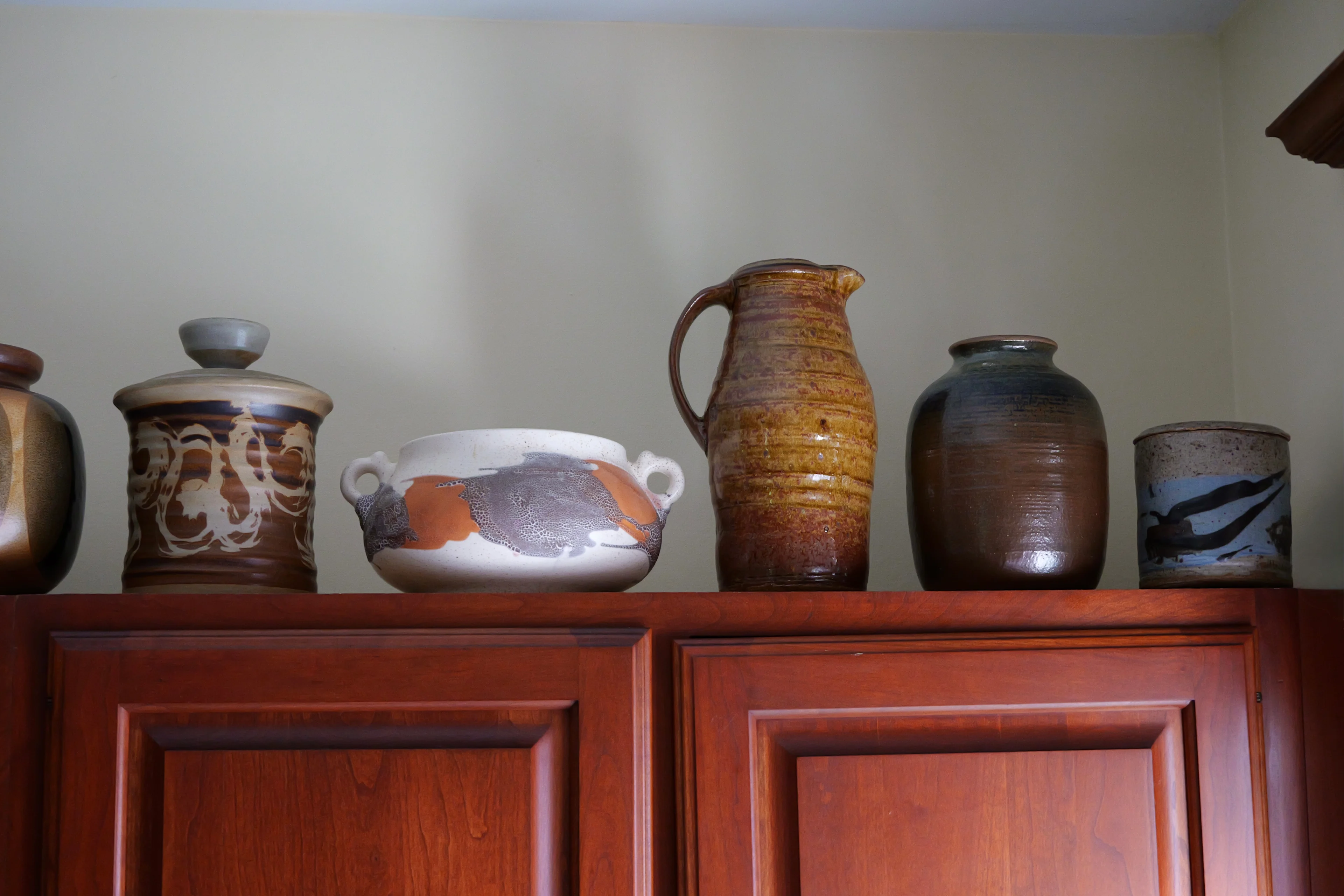
And then there's pattern.
I don't go looking for it specifically, but I notice it immediately when it's there. That lower white piece on the shelf has almost an animal-print quality to the glaze — not literal, but the eye reads it that way, and it's one of my favorite pieces because of it. Pattern in ceramics is rarely printed on; it's usually something that happened in the glaze or the firing, which makes it feel more like a happy accident than a design choice. I love that.

Not every piece makes it to the kitchen shelf, either. The green onyx piece with the little ring stopper by my sink didn't have an obvious home when I bought it — I just loved it too much to leave it behind. It now lives rent-free on my counter, permanently. My husband asked, reasonably, if it was going to move somewhere else eventually. The answer is no. It goes there. I will die on that hill.
If there's one thing I'd tell anyone building a collection like this: the shelf will tell you what it needs next. Mine still does — and so will your countertop, if you let it.
Building your own collection or need help styling what you already have? Let's talk.