Valentine’s décor doesn’t have to be loud, overly themed, or destined to live in a storage bin 11 months of the year. I’m much more drawn to a quieter approach — one that layers texture, material, and color in a way that feels romantic and livable.
This year’s Valentine’s styling leans into warmth and softness: blush-toned glass, aged brass, tactile linens, and just enough color to make a space feel special without feeling seasonal or temporary.
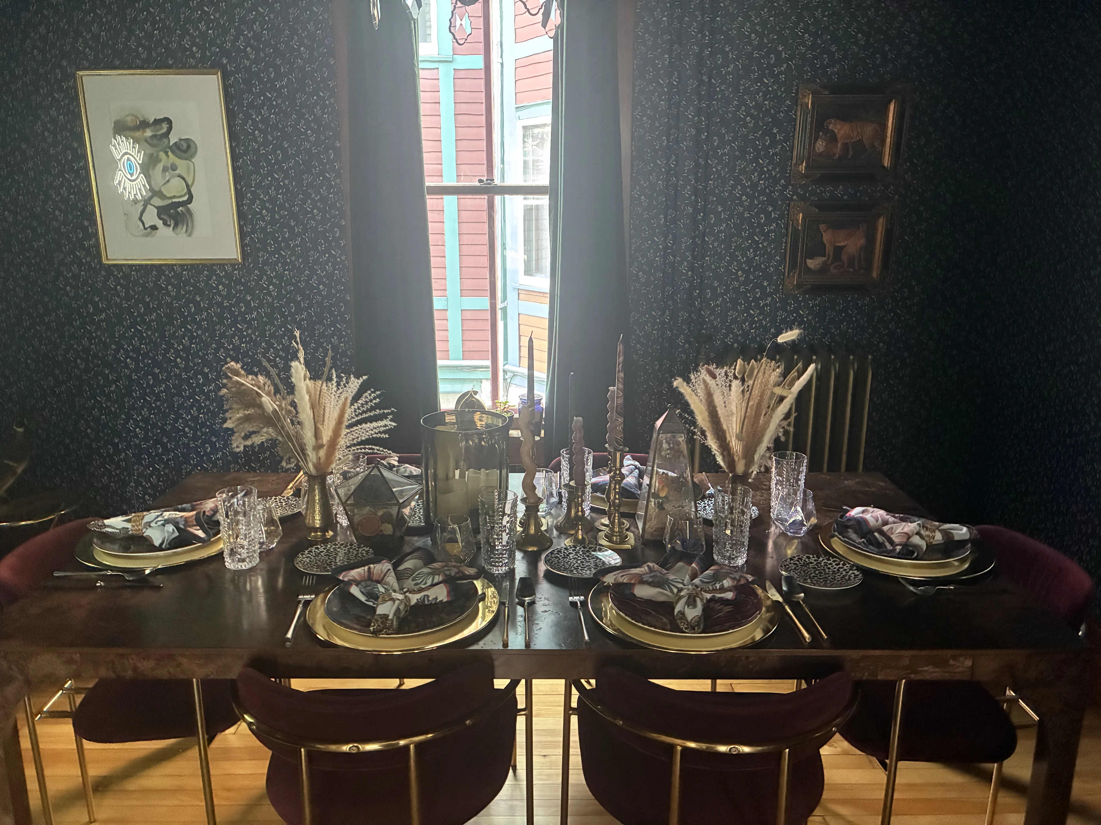
The images below show how this comes together in my own dining room — a space where deep color, pattern, and warmth already set the tone. I love using moments like this as an excuse to lean a little further into softness and detail, without changing the room’s DNA or making it feel like a “holiday setup.”


Below, I’m sharing the pieces that inspired this look and how I like to use them together.

Start with a Soft Foundation
A table runner is one of my favorite ways to introduce color without overwhelming a space. I love a vintage-inspired or subtly patterned runner layered over a wood table — it immediately adds warmth and softness while still letting the natural material show through.
In my dining room, the runner becomes the bridge between the darker, moodier elements of the space and the lighter, romantic layers on top.
👉 Link: Table runner
Layer Warm Metals
Warm metals, especially aged or brushed brass, add instant depth. They reflect light beautifully and pair especially well with pinks, reds, and soft neutrals.
I like using brass in everyday pieces — plates, flatware, or small accents — so it feels intentional rather than precious. In a darker room, those warm metallic moments keep things from feeling heavy.
👉 Links: Brass chargers
Bring in Blush + Tinted Glass
Glassware is an easy way to introduce color without commitment. Blush, rose, or lightly tinted glass feels romantic but still sophisticated — and it works just as well after Valentine’s Day.
On a table with darker tones and wood finishes, this kind of glass adds contrast and lightness without feeling overly sweet.
👉 Links: Blush glass plates / coupe glasses
Add Contrast with Candles
Candles are where I’ll lean a little bolder. Red or deep pink tapers add contrast and height, grounding softer tones and giving the table a focal point.
I prefer simple shapes and clean holders here — especially when the surrounding textures are doing most of the work.
👉 Links: Taper candles / candle, vase
Finish with Texture + Personality
This is where the space really comes alive. Linen napkins with contrast stitching, sculptural ceramics, or a playful vessel add character and prevent the look from feeling too polished.
I love mixing these kinds of pieces into my everyday dining setup so the table feels styled, but still welcoming — never fussy or off-limits.
👉 Links: Linen napkins / flower sculpture / place card holders / heart decor
Romantic, But Meant for Everyday Living
The goal isn’t to decorate for Valentine’s Day — it’s to create a home that feels warm, layered, and personal. When you focus on materials and texture first, the romance naturally follows.
These are the kinds of pieces I love investing in because they transition seamlessly from holiday moments to everyday life. If you’re craving a softer, more refined approach to seasonal styling, this is a great place to start.