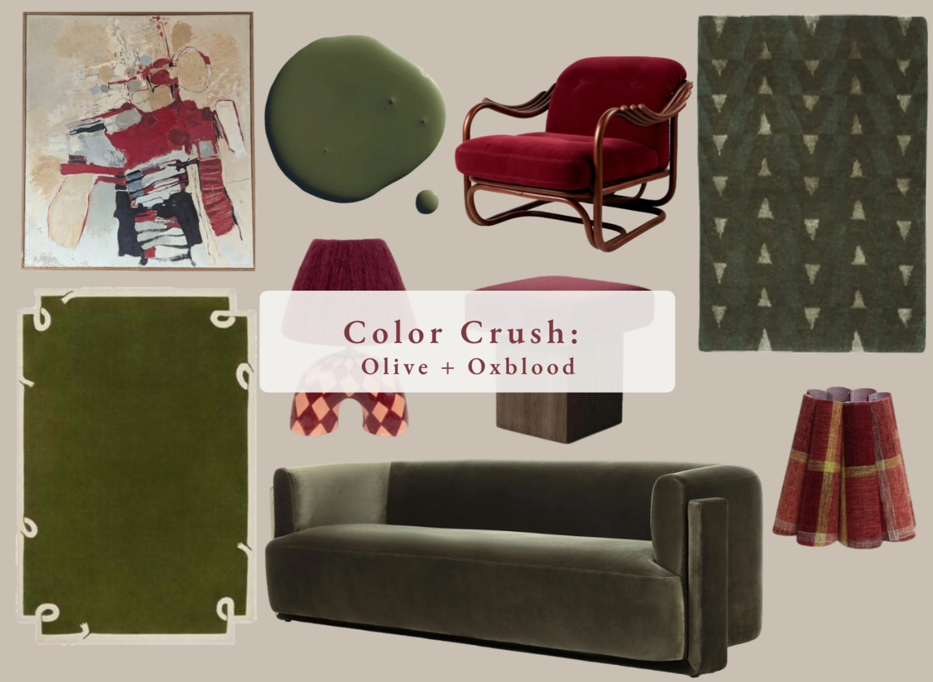
Two richly saturated hues I’m loving right now
Why these two? Olive and oxblood are both timeless, grounded colors with beautiful depth. Olive reads calm and earthy; oxblood feels luxe and dramatic. Together they create a collected, high/low balance—think warm wood, aged brass, tactile textiles, and a few playful moments.
Olive Green: Calm, collected, forever
Olive is one of my go-to “quiet color” neutrals. It behaves like a sophisticated backdrop yet still carries personality.
What it pairs with
Materials: walnut, white oak, travertine, green or Emperador marble, iron, unlacquered brass
Textiles: linen, mohair, bouclé, tailored wool checks
Patterns: marbled paper, small-scale geometrics, block prints
Where it shines
Upholstery that you want to feel elevated but livable (sofas, lounge chairs, dining seats)
Rugs that ground a room without shouting
Zellige or handmade tile for subtle movement
Lampshades and accessories for layered tone-on-tone moments
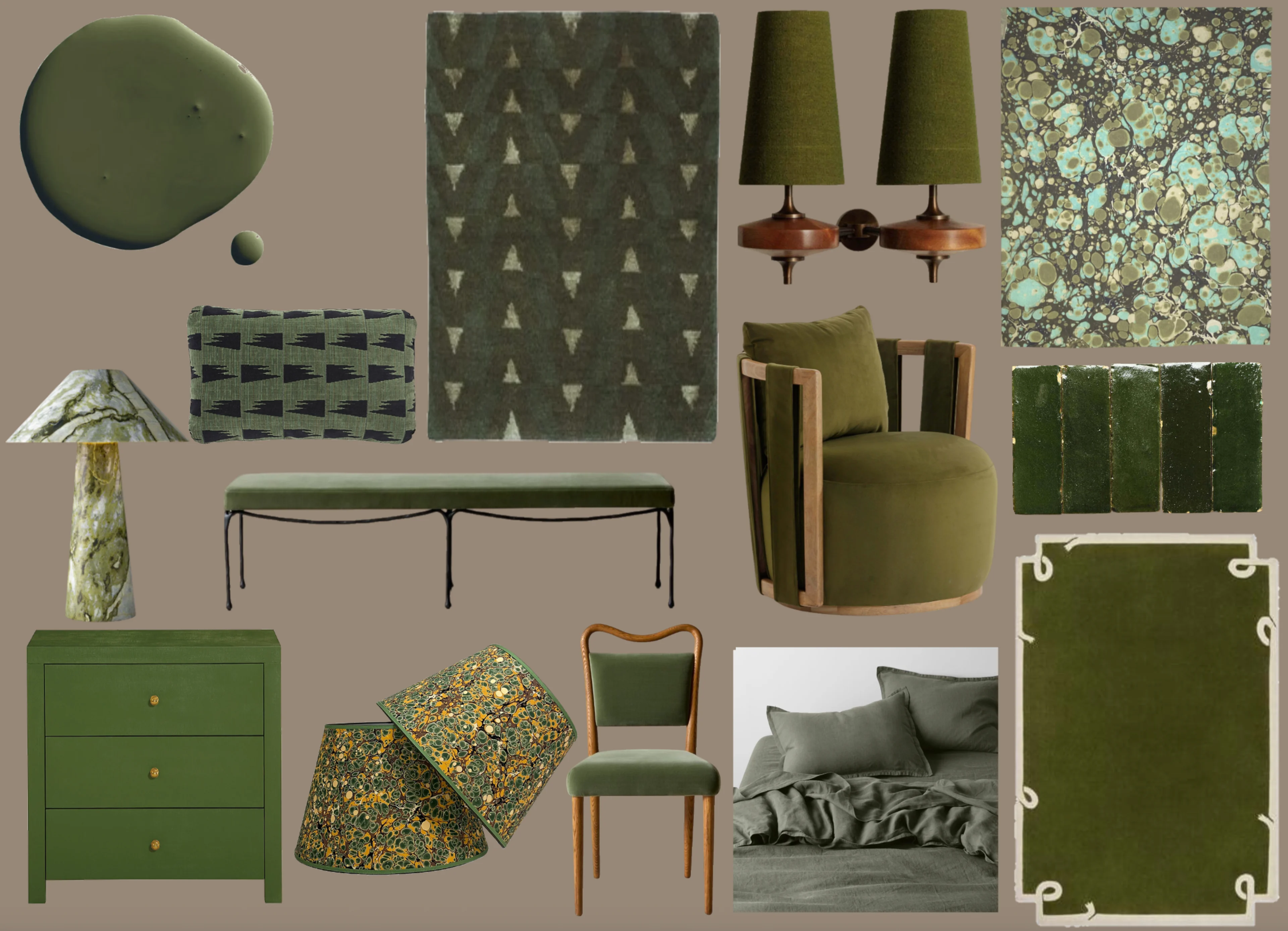
Design note from the board: Tonal olive sings when you mix textures—velvet, linen, zellige, marbled paper—then ground with dark iron and warm wood. Keep silhouettes tailored and let small hits of brass be the highlight so the palette feels rich, not heavy.
Oxblood: Moody, warm, and a little glam
Oxblood lands in that sweet spot between red, brown, and wine—perfect when you want drama with warmth.
What it pairs with
Materials: rosewood, dark walnut, patinated brass, veined marbles, leather
Textiles: velvet (always), wool, fringe or pleated shades for texture
Accents: blush, mushroom, tobacco, cognac, and hits of black
Where it shines
A statement lounge chair or sculptural bench
Rugs that anchor open plans
Lamps and small furniture that add depth without overtaking the palette
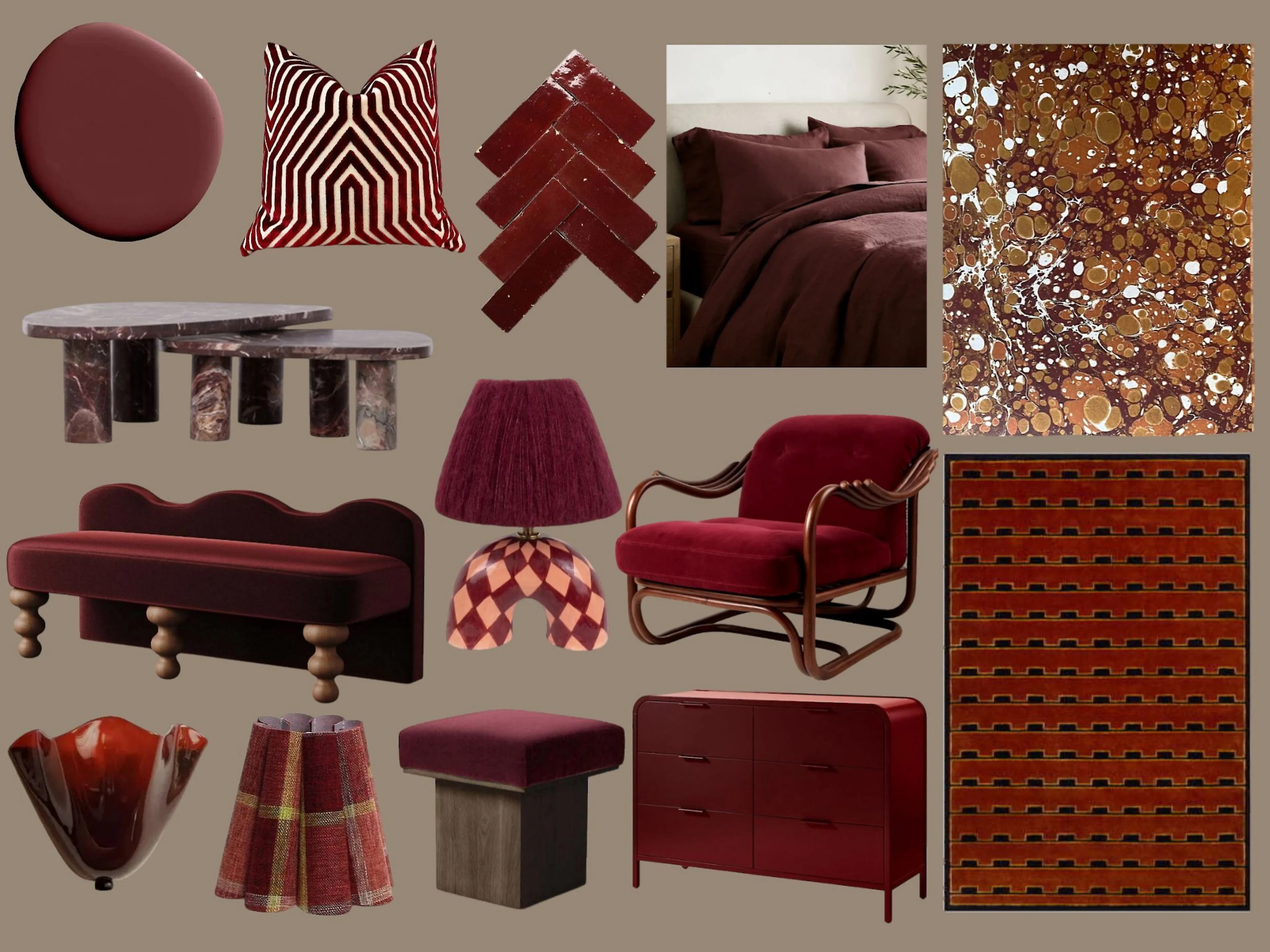
Design note from the board: A curvy oxblood lounge chair with a checkered lamp and marbled wallpaper reads chic, playful, and grown-up all at once.
Olive + Oxblood together
This combo is classic and unexpected—especially when you keep the supporting pieces quiet.
How to balance it
Use a 60/30/10 ratio: let one hue lead (60%), support with the other (30%), and finish with a metal/neutral accent (10%).
Choose a bridge piece—artwork, a patterned rug, or marbled paper—that includes both tones.
Layer camel, parchment, bone, burl, and warm woods, so the palette feels collected, not themed.
Keep brass warm and gently patinated; let black appear only in small lines (frames, piping).
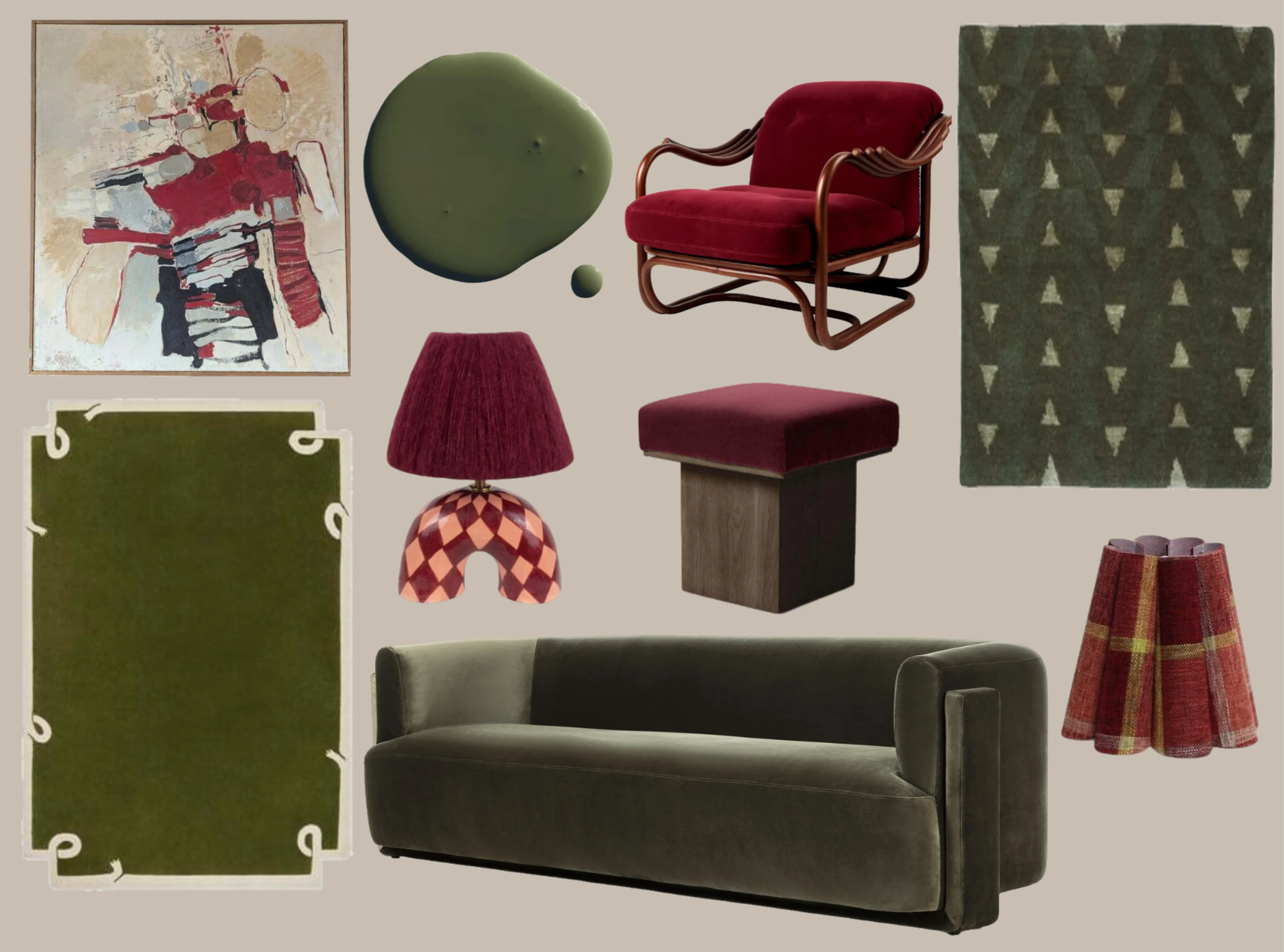
Design note from the mixed board: Olive sofa + oxblood stool + geometric olive rug + a single oxblood lamp = restrained, cozy sophistication.
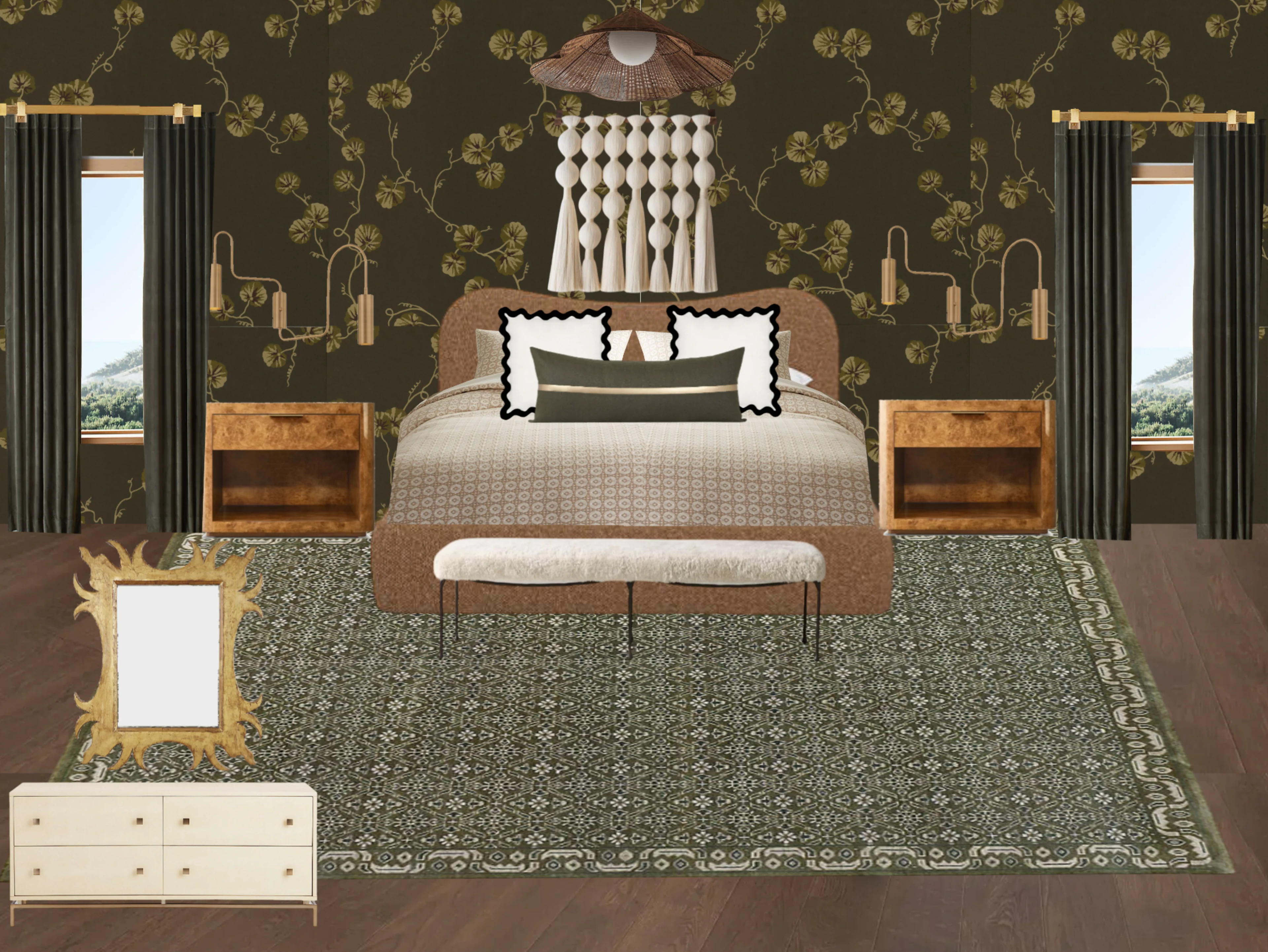
A Restful Olive Bedroom (from my board)
Olive is especially beautiful in bedrooms. In this scheme, olive drapery, wallpaper, and a patterned rug meet a textural headboard, burl nightstands, and taupe bedding. Brass swing-arm lighting adds warmth; a carved mirror brings romance. It’s tonal, tactile, and easy to live with.
Quick spec tips
Paint sheen: matte/eggshell for walls (olive), satin/semigloss only on trim.
Velvet choices: pick a short, dense pile for family spaces; save the plushest velvets for lower-traffic rooms.
Sample first: look at colors in both daylight and lamplight—olive especially shifts with light.
Love the palette? Book a discovery call or join my newsletter for monthly Design Edits and fresh mood boards.