There's a version of this project where we just picked pretty finishes and called it a day. That's not what happened here — and honestly, that's my favorite kind of project to write about.
My clients found me on Instagram, inspired by a past project (hi, if you're one of the people who found this post the same way — welcome). One of them is a serious home baker. The other is the engineer of the two, and he's building every single piece of cabinetry himself. Their 1912 house on the east side of St. Paul has beautiful original bones — and a kitchen that had been fighting those bones for a long time.
Starting With Goals
Before we talk finishes or layouts, I always start every project — even a single-room paint consultation — the same way: by talking through goals out loud. Not just "what do you want it to look like," but what the space actually needs to do for the people living in it, and making sure what I think the goals are actually lines up with what they're picturing. It sounds simple, but skipping this step is how projects end up beautiful and wrong.
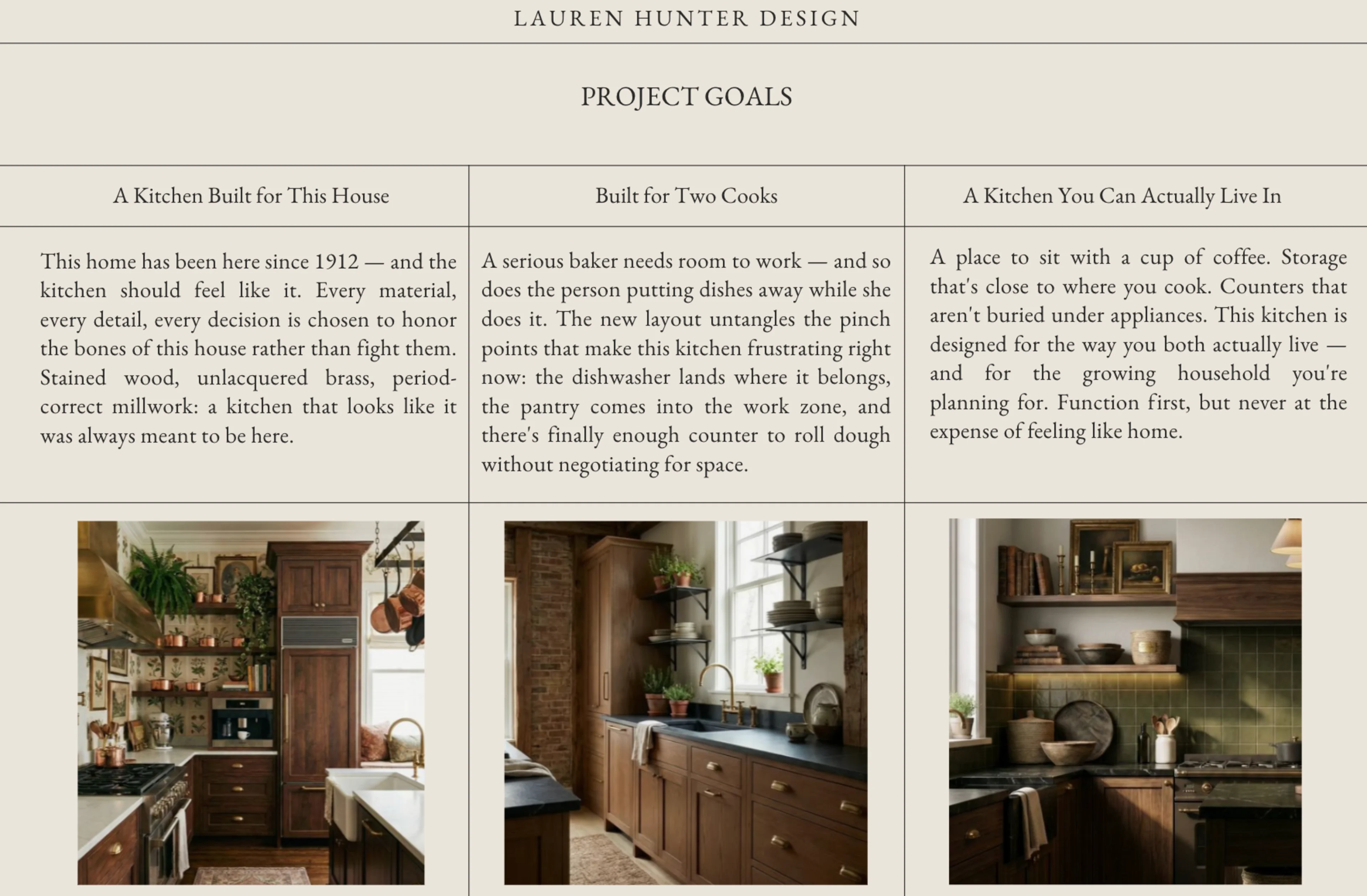
For this kitchen, three goals kept coming up:
A kitchen built for this house. This home has been here since 1912, and the kitchen needed to feel like it always had been — not like a showroom kitchen dropped into an old shell. Every material and detail got chosen to honor the house rather than fight it.
Built for two cooks. A serious baker needs real room to work, and so does whoever's putting dishes away while she does it. The old layout had pinch points everywhere — this one needed to untangle them.
A kitchen you can actually live in. Storage close to where you cook. Counters that aren't buried under appliances. A place to sit down with your coffee. Function first, but never at the expense of feeling like home.
Every decision below traces back to one of these three things.
The Before
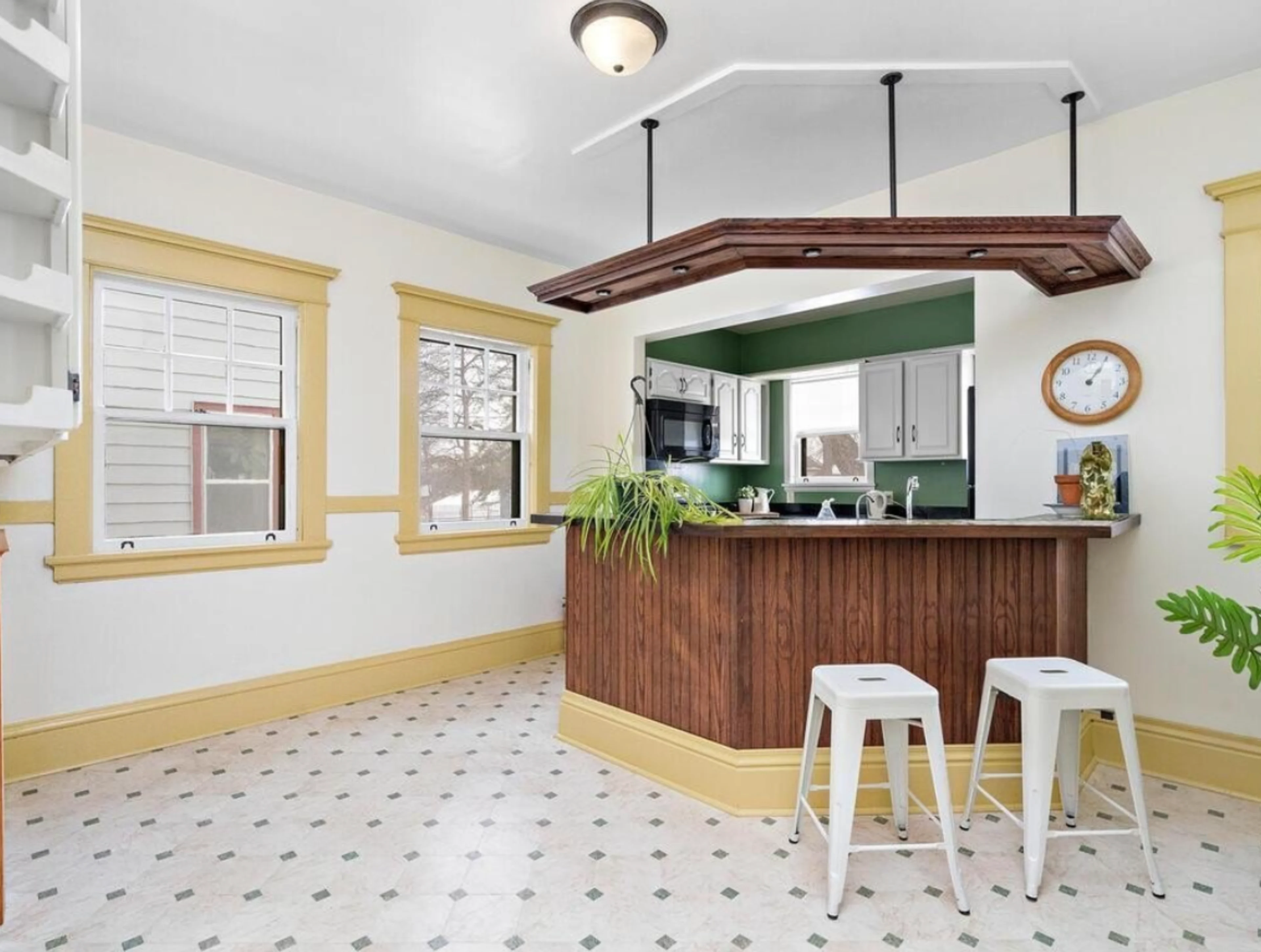
This is where we started. White cabinets, stainless appliances, a quirky wood-paneled peninsula bar with an odd angled counter (the sink was tucked into that angle — we have questions about who designed that one), and a diamond-pattern vinyl floor that had seen better decades. It's not that it was ugly, exactly — it just wasn't speaking the same language as the rest of this 1912 house.


The Layout: Solving the Real Problems First
Before a single finish got chosen, we had to solve how this kitchen actually works.
The island that wasn't. Everyone wants an island until you measure the room. We tried every configuration, and the math never worked — clearances came in too tight everywhere that mattered, especially in the sink and dishwasher zone. So instead of forcing something that would feel cramped every single day, we let it go.

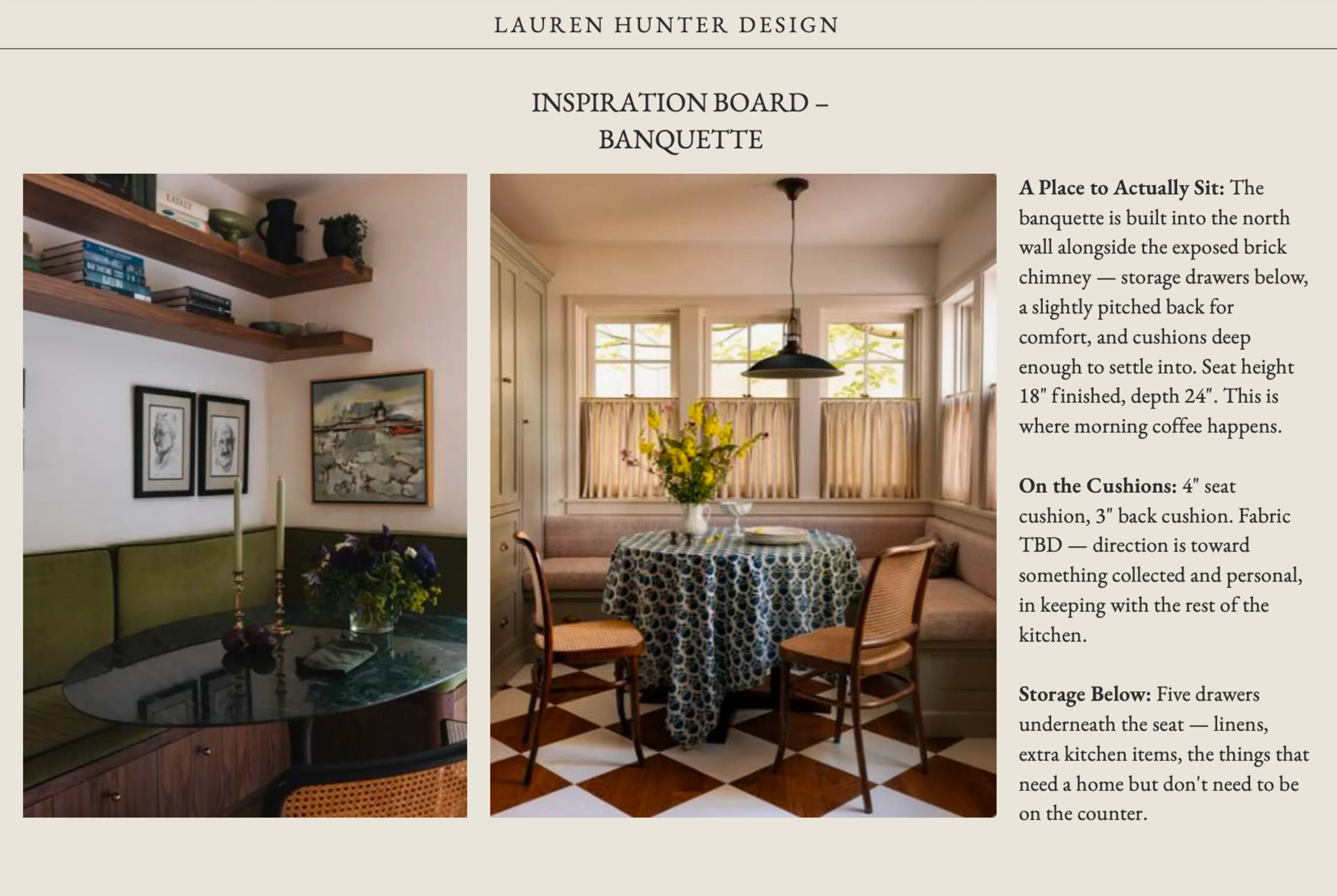
Banquette over peninsula. Without an island, we still needed a plan for seating and workflow. We debated a peninsula against a built-in banquette, and the banquette won — it opens the room up, gives them a real dedicated spot for morning coffee, and tucks in against the exposed brick chimney for a corner that already feels like the best seat in the house.
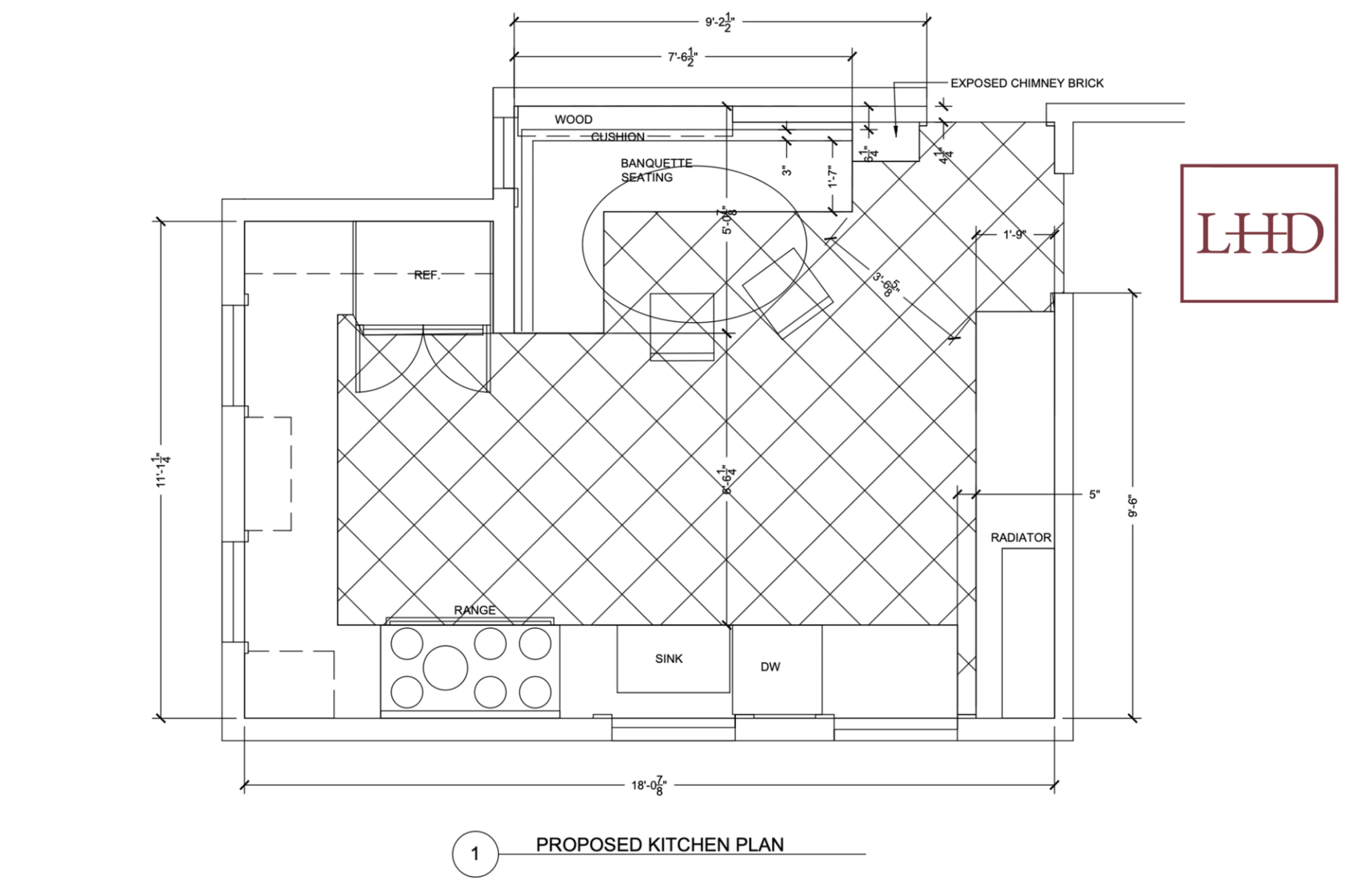
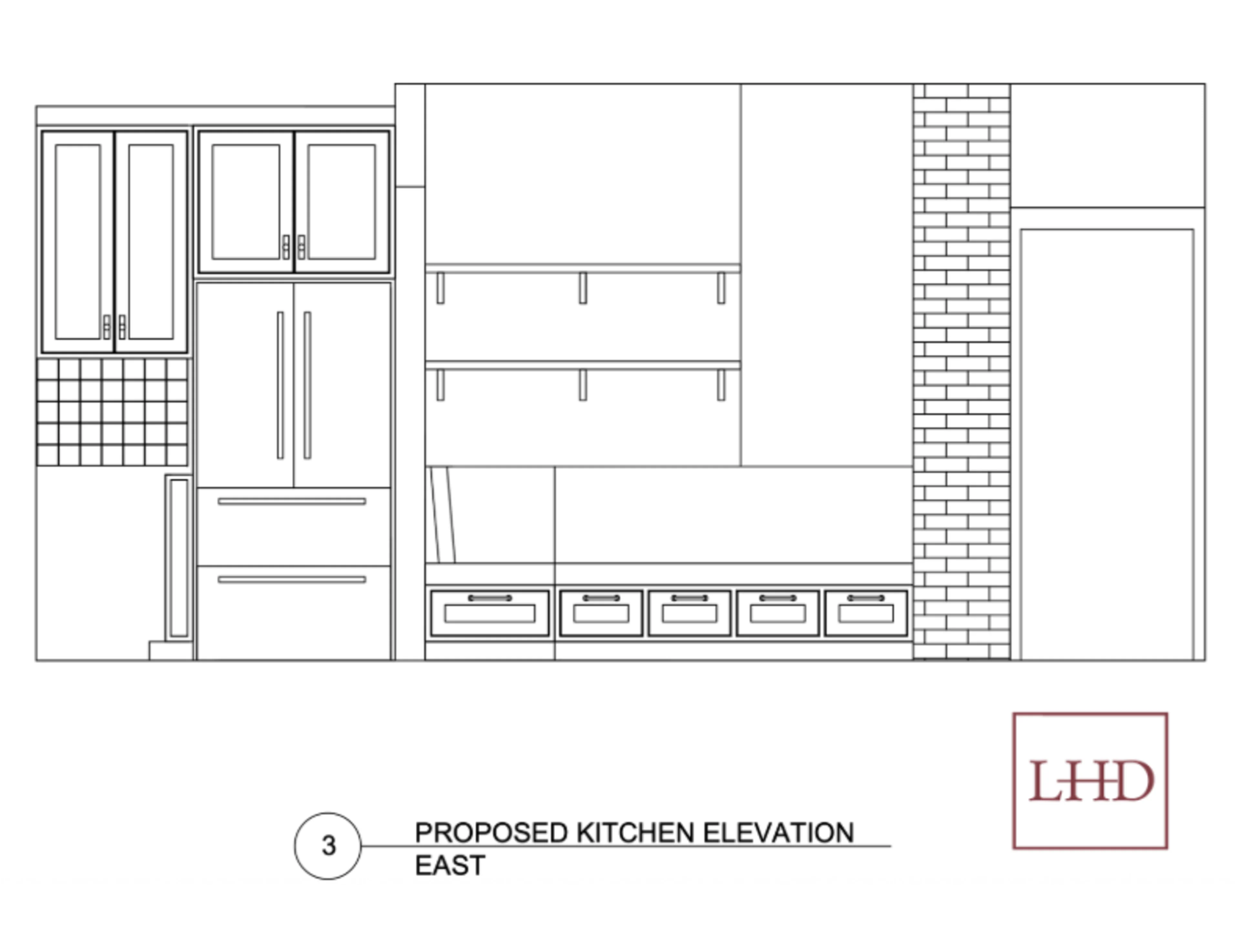
The sink moved to the window. It used to be tucked into that odd angled peninsula counter — now it sits right in front of the window, giving the whole work zone a focal point and a view instead of a strange corner.
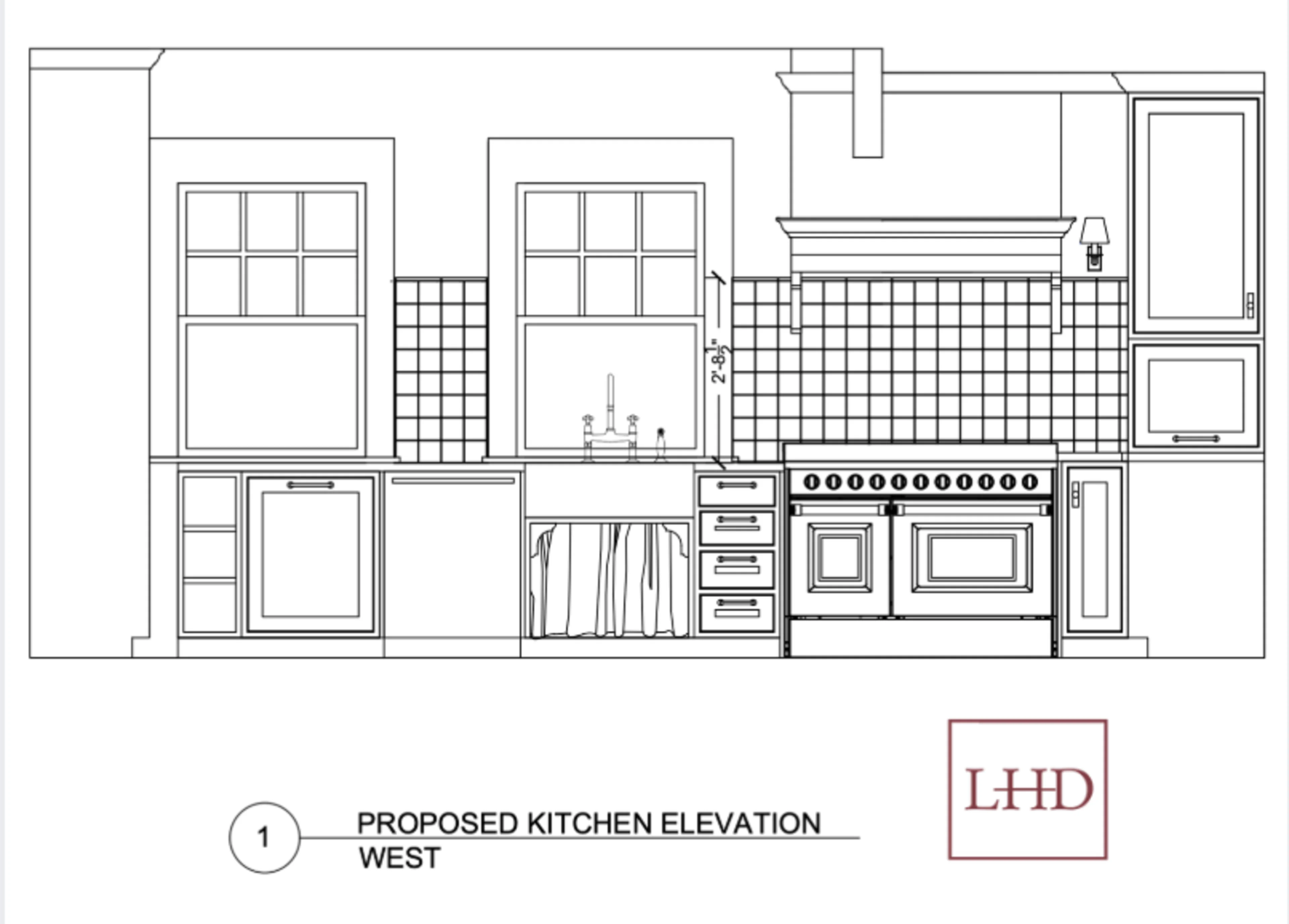
The range and the fridge stayed exactly where they were. Not every decision needs to be dramatic. Some things just work.
The result: significantly more storage and workable counter space than this kitchen has ever had.
Cabinets to the Ceiling, and Higher Than You'd Expect
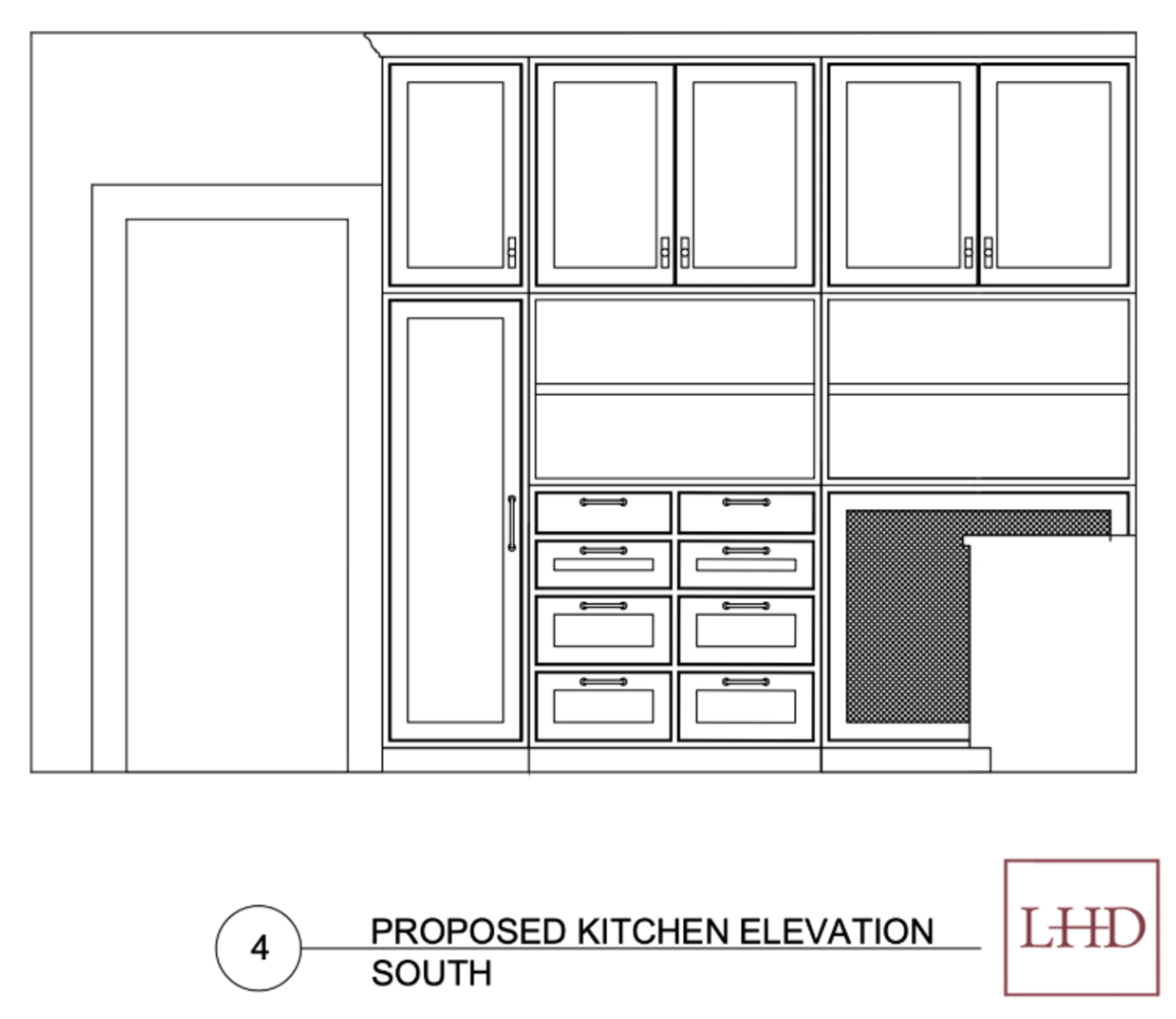
My client wanted cabinetry that ran all the way to the ceiling — no wasted space, no dust-collecting gap up top. She also wanted the uppers set higher than the standard 18" above the counter, more of a European proportion. I jumped at that idea immediately. It changes the whole feel of the room — taller, more architectural, less "standard kitchen."
Open Shelving Over Upper Cabinets (Mostly)
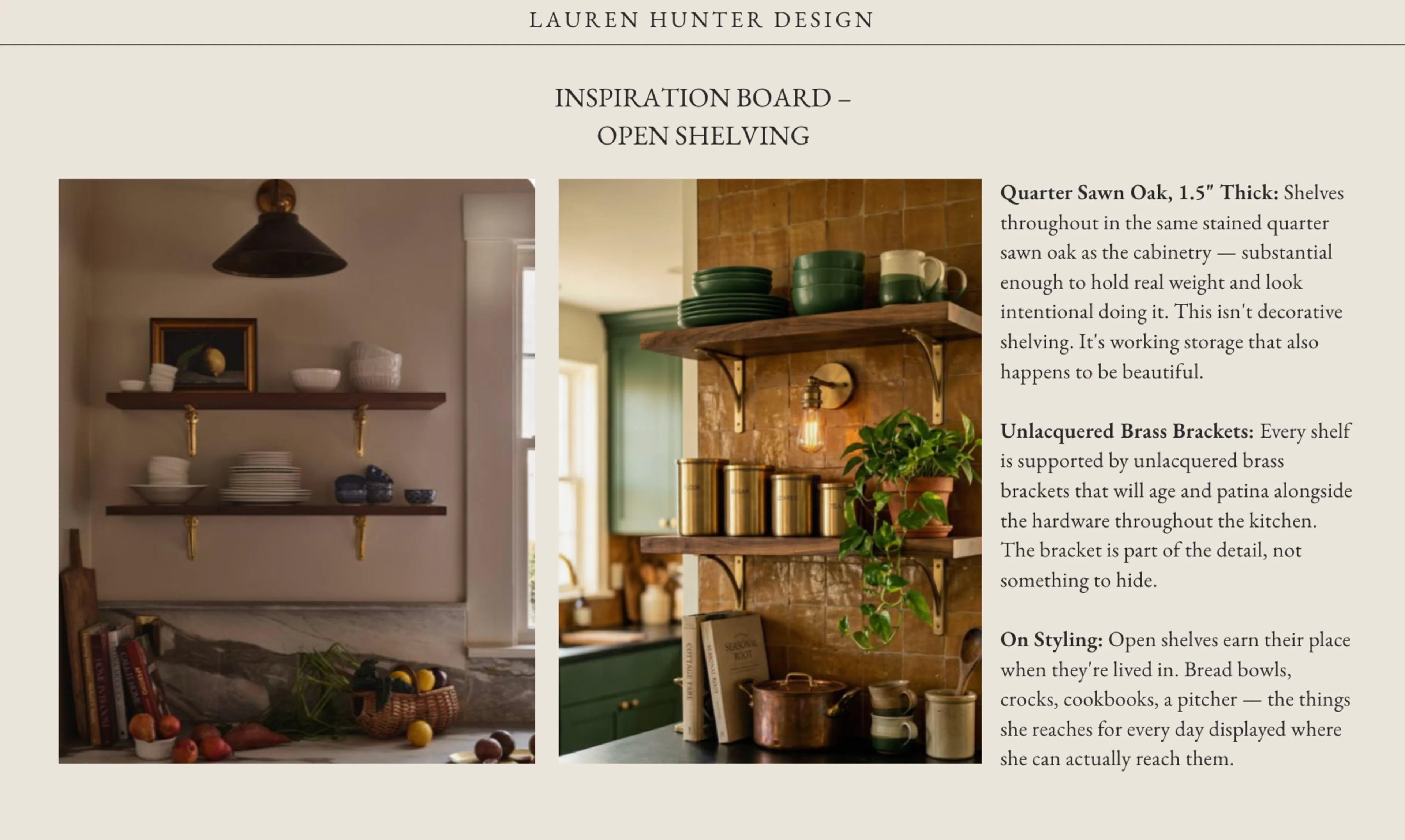
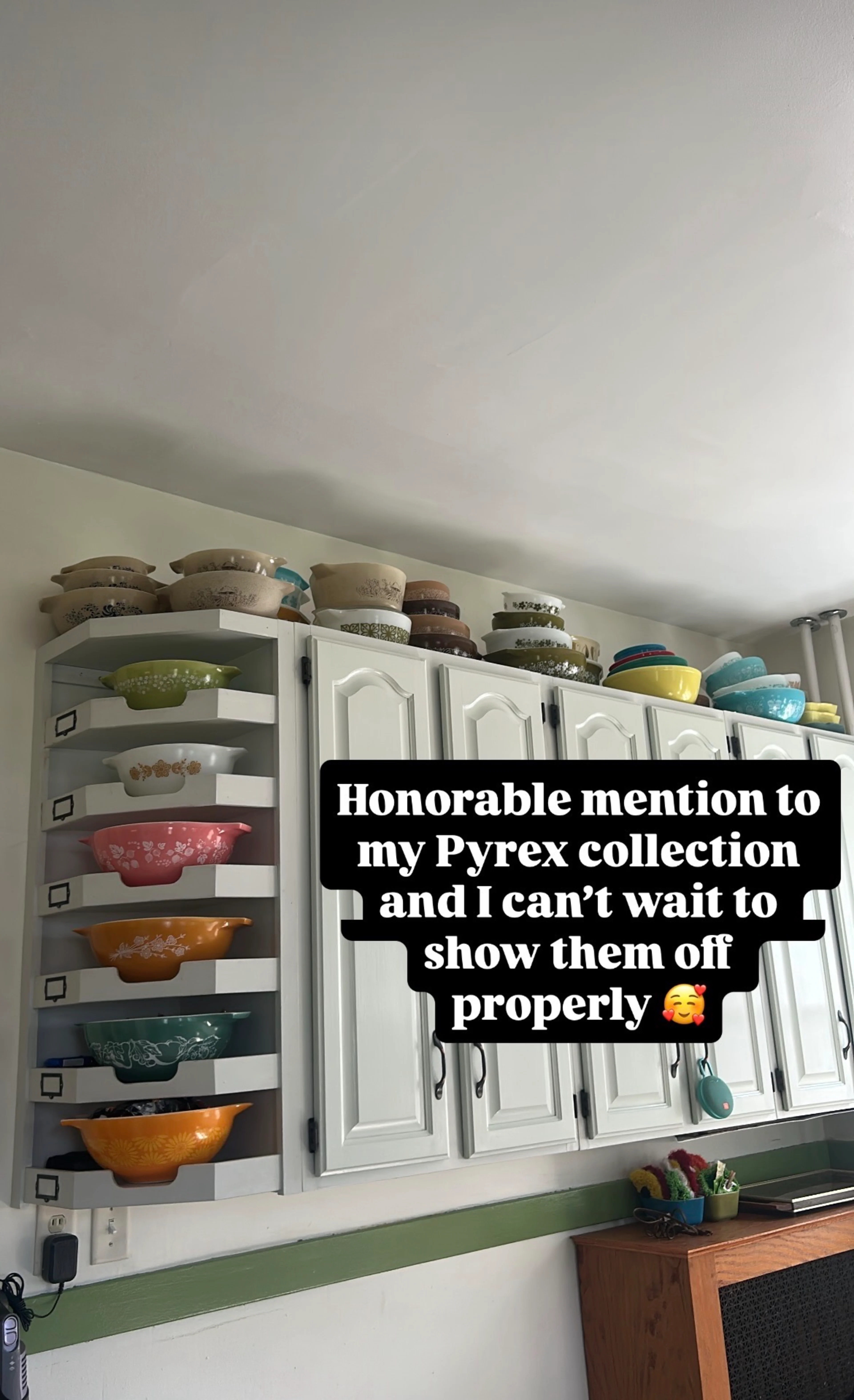
Here's the thing about open shelving: it looks incredible and it requires you to actually keep it up. We had the conversation. I told her — straight up — more open shelving means more dusting, more editing, more "does this look intentional or did I just run out of room." She didn't blink. She's got a vintage Pyrex collection that would make any thrift-store hunter weep with jealousy — and A LOT of it — and she wanted a place to actually show it off instead of burying it in a cabinet. So this kitchen leans heavily on open shelves instead of a wall of closed doors, and it's going to be so much more her because of it.
Staying True to Arts & Crafts
This is the part of the project I geeked out on the most. A 1912 house deserves a kitchen that looks like it's always belonged there, not one that got dropped in from a showroom catalog. Every detail was chosen with that in mind:
Inset cabinetry
with a beaded face frame — more precise to build, and it reads as custom rather than just expensive
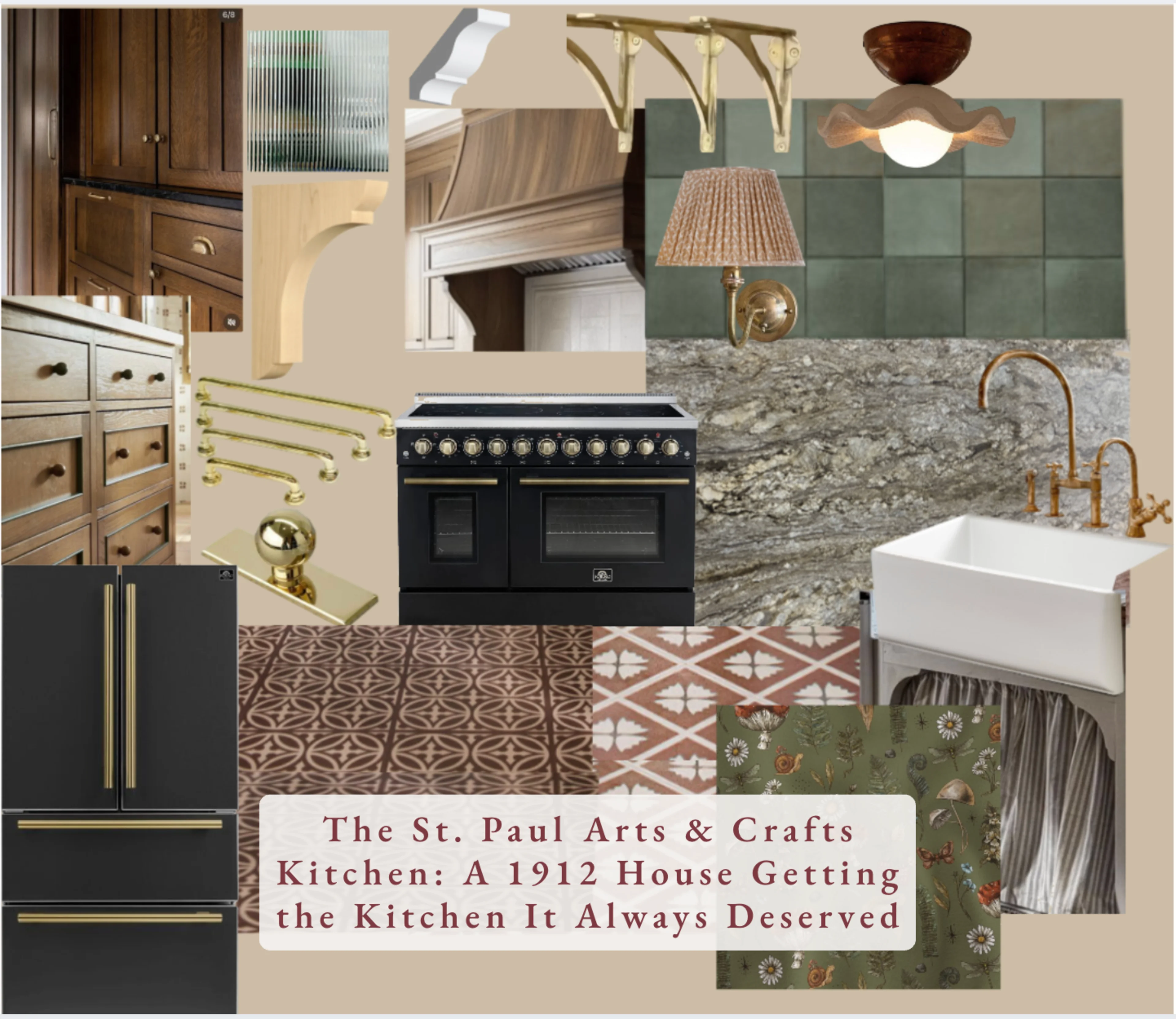
Unlacquered brass hardware throughout, because it patinas and ages right along with the house instead of staying artificially shiny forever
Corbels at the hood (and smaller matching ones at the sink) — a detail straight out of the Arts & Crafts playbook
Crown molding profile chosen specifically because it's indicative of the era
A historical paint color rather than anything trendy
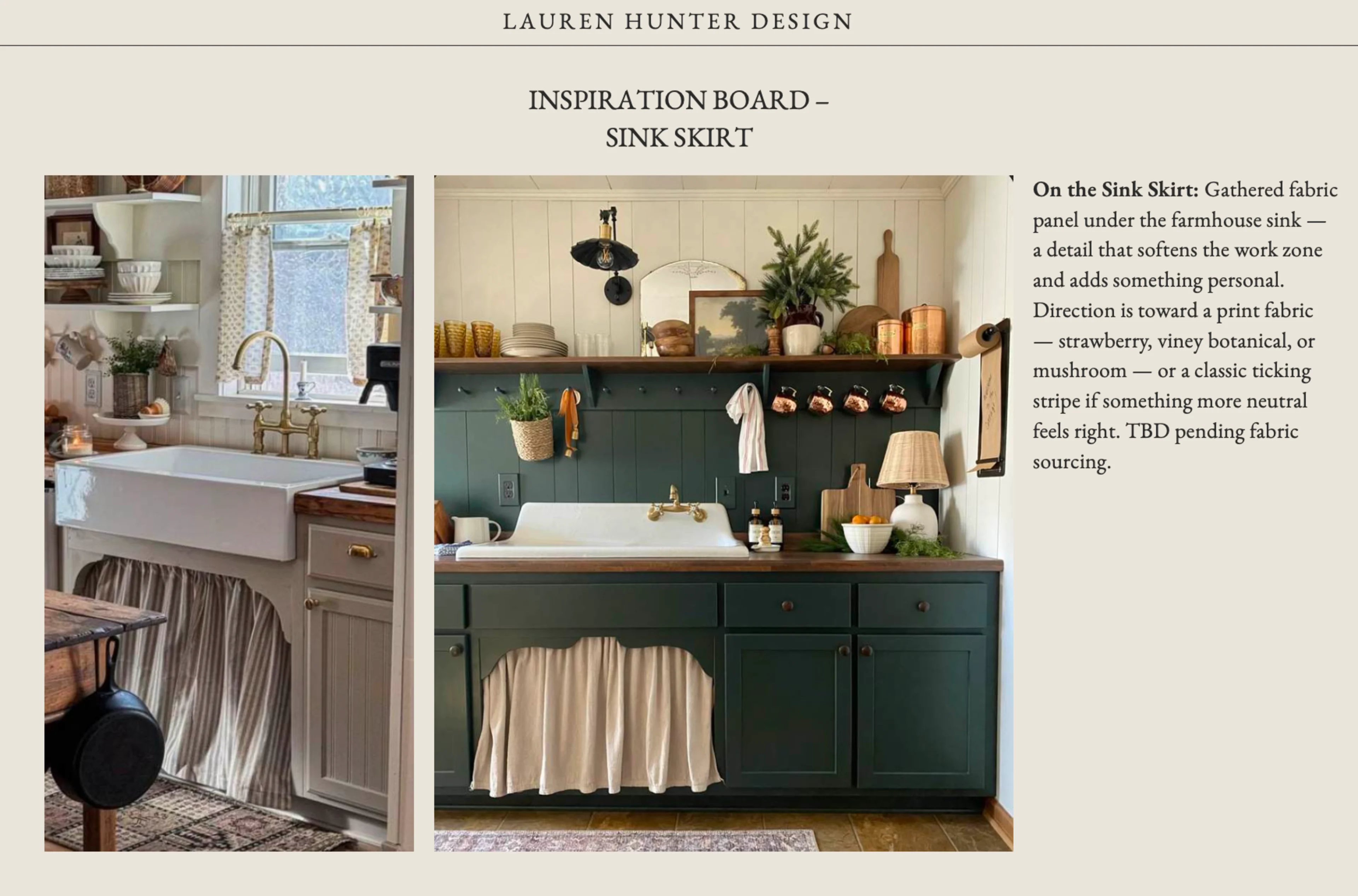
We're hoping they land on painted cabinetry for the pantry/hutch wall — a soft contrast to all that stained quarter sawn oak — plus a sink skirt for a little softness at the workzone, and an unlacquered brass sconce with a pleated fabric shade over the sink. Because why not.
The Countertop Journey (Butcher Block → Soapstone → Granite)
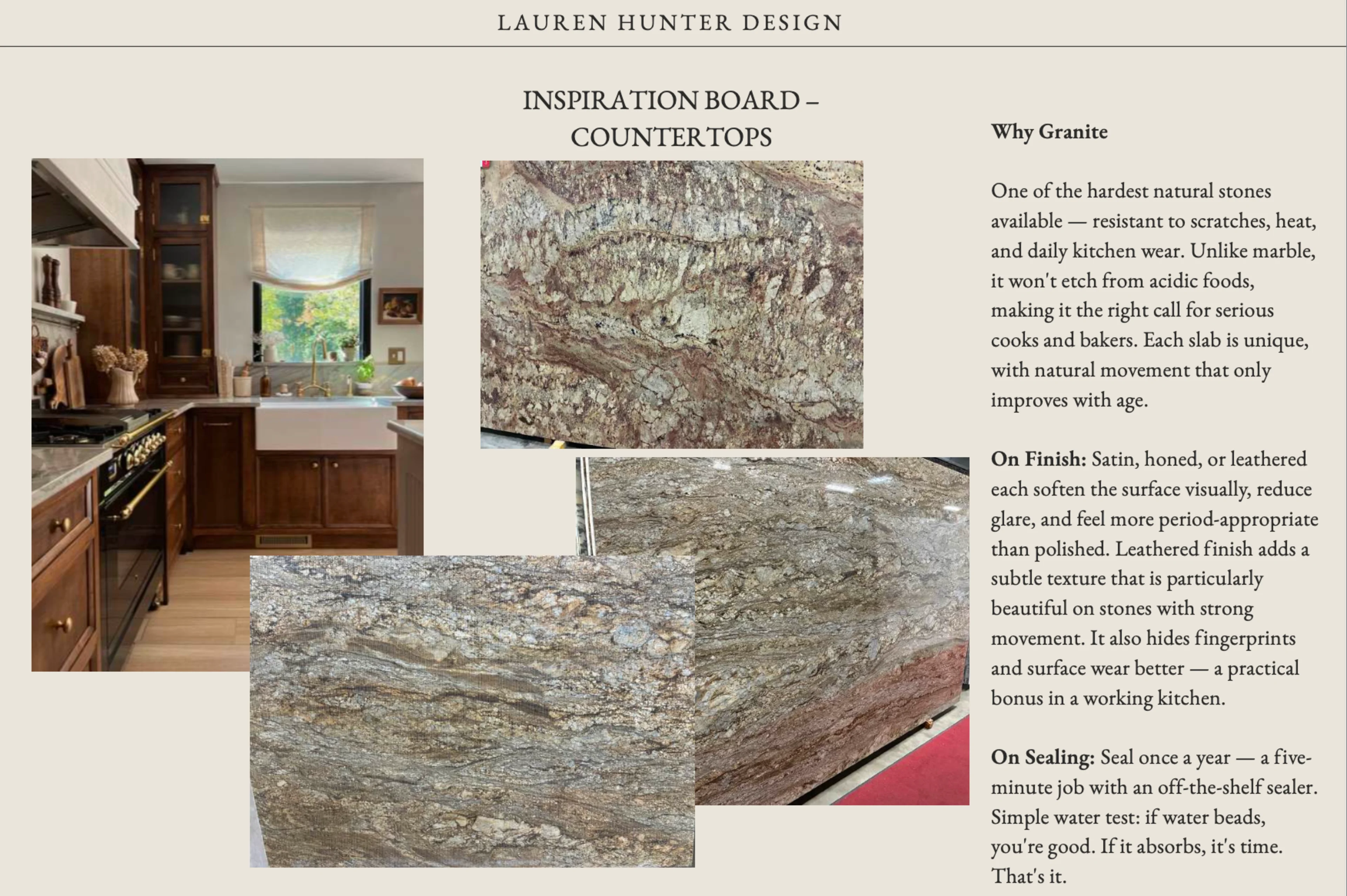
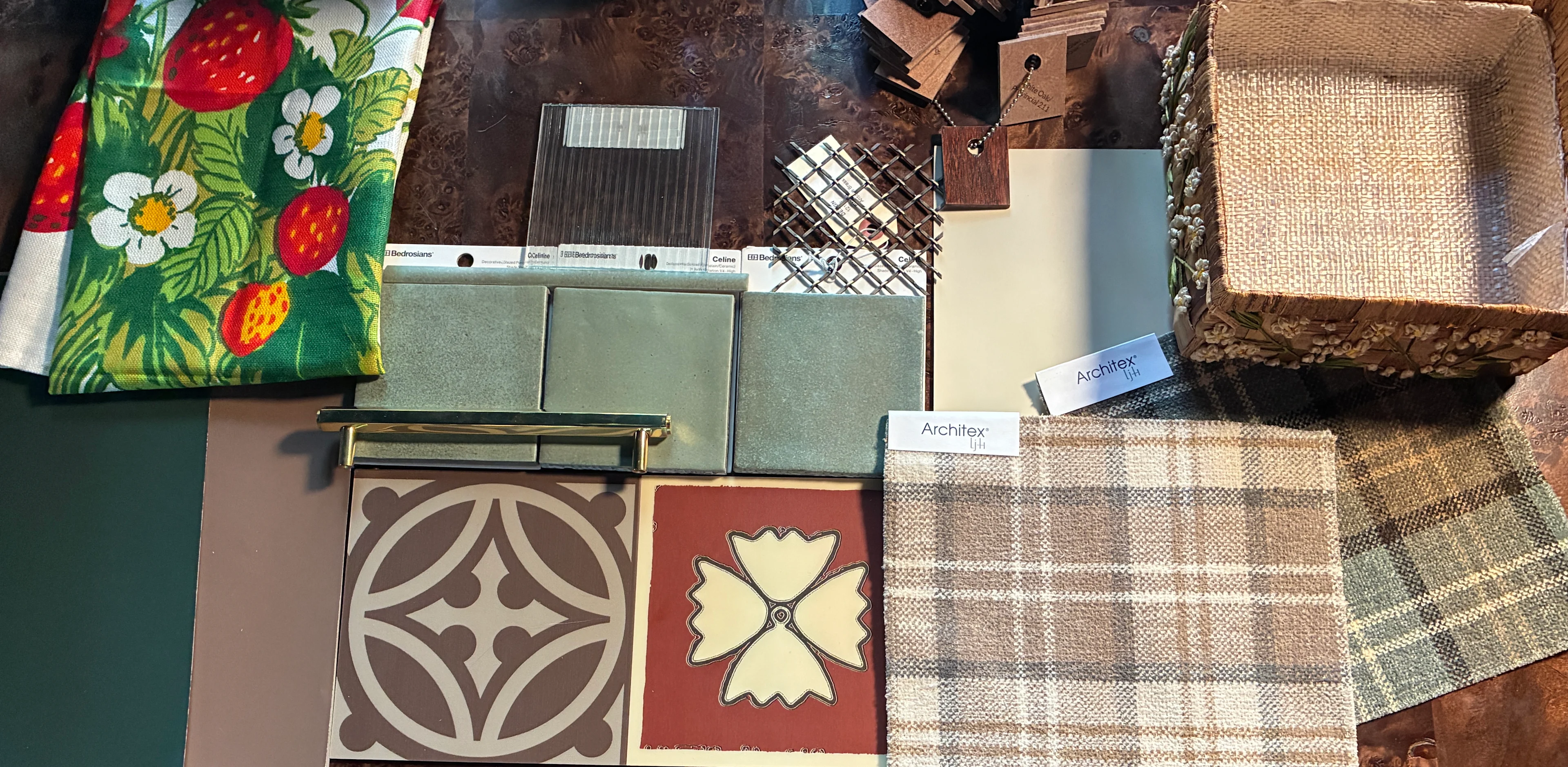
This one took some real back-and-forth. My first instinct was butcher block — warm, classic, great for a baker. But against the stained oak cabinetry, it didn't feel right; too much wood-on-wood. Next up was soapstone, but we ultimately landed on granite with a lot of natural movement and warm taupe tones that tie every material in the room together. Sometimes the "right" answer only reveals itself once you've ruled out the other options.
Appliances: Splurging Where It Counts
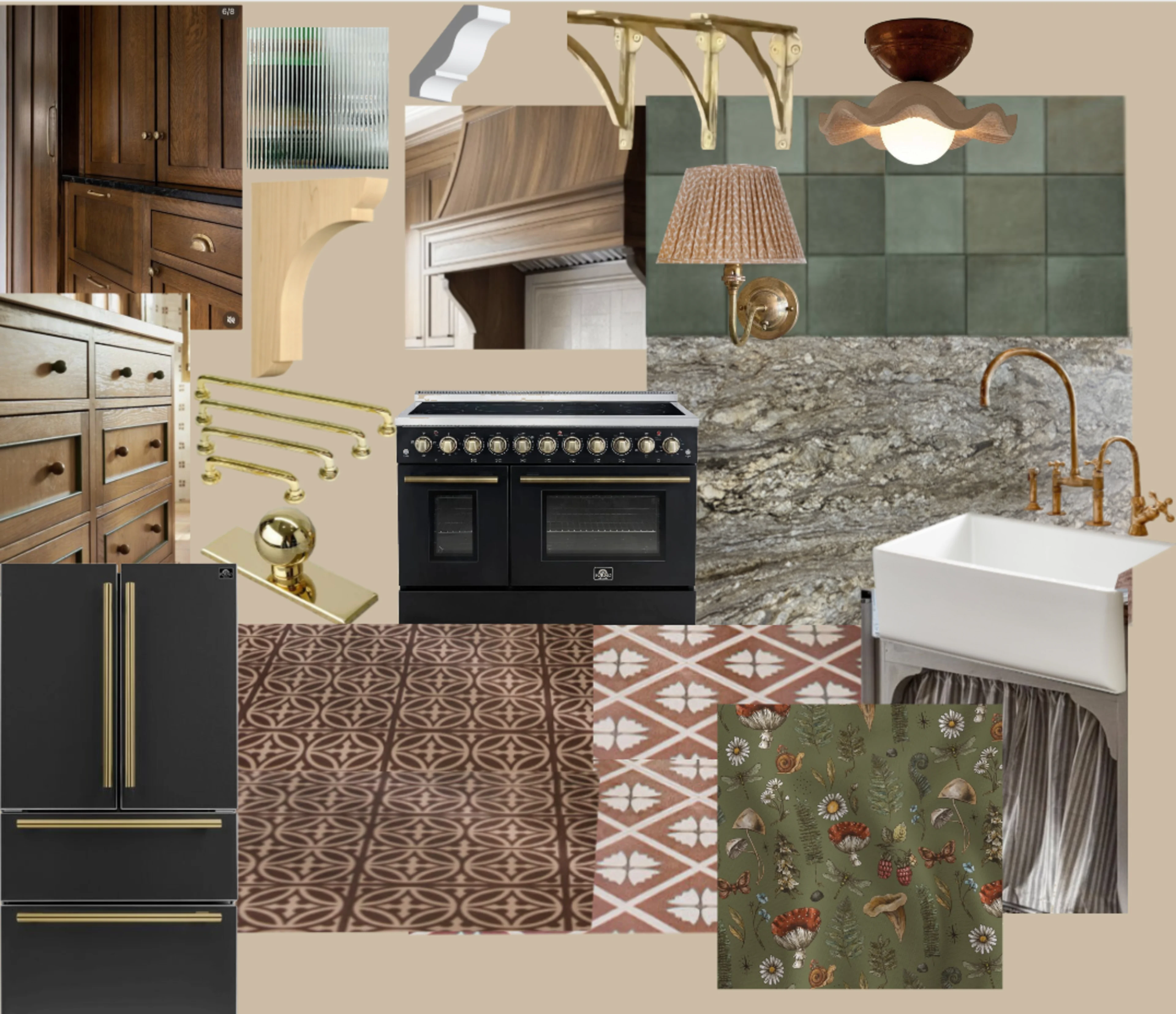
This is the part I'm genuinely proud of: matte black with antique brass hardware — timeless, warm, exactly the vibe we wanted — and we found it without blowing the budget. Yay us. As for the range, we're hoping to go bigger with a double oven for all her baking dreams, but it's still up in the air — there's a half wall that may or may not allow for it, depending on what demo uncovers. Cross your fingers with us.
Backsplash and Floor
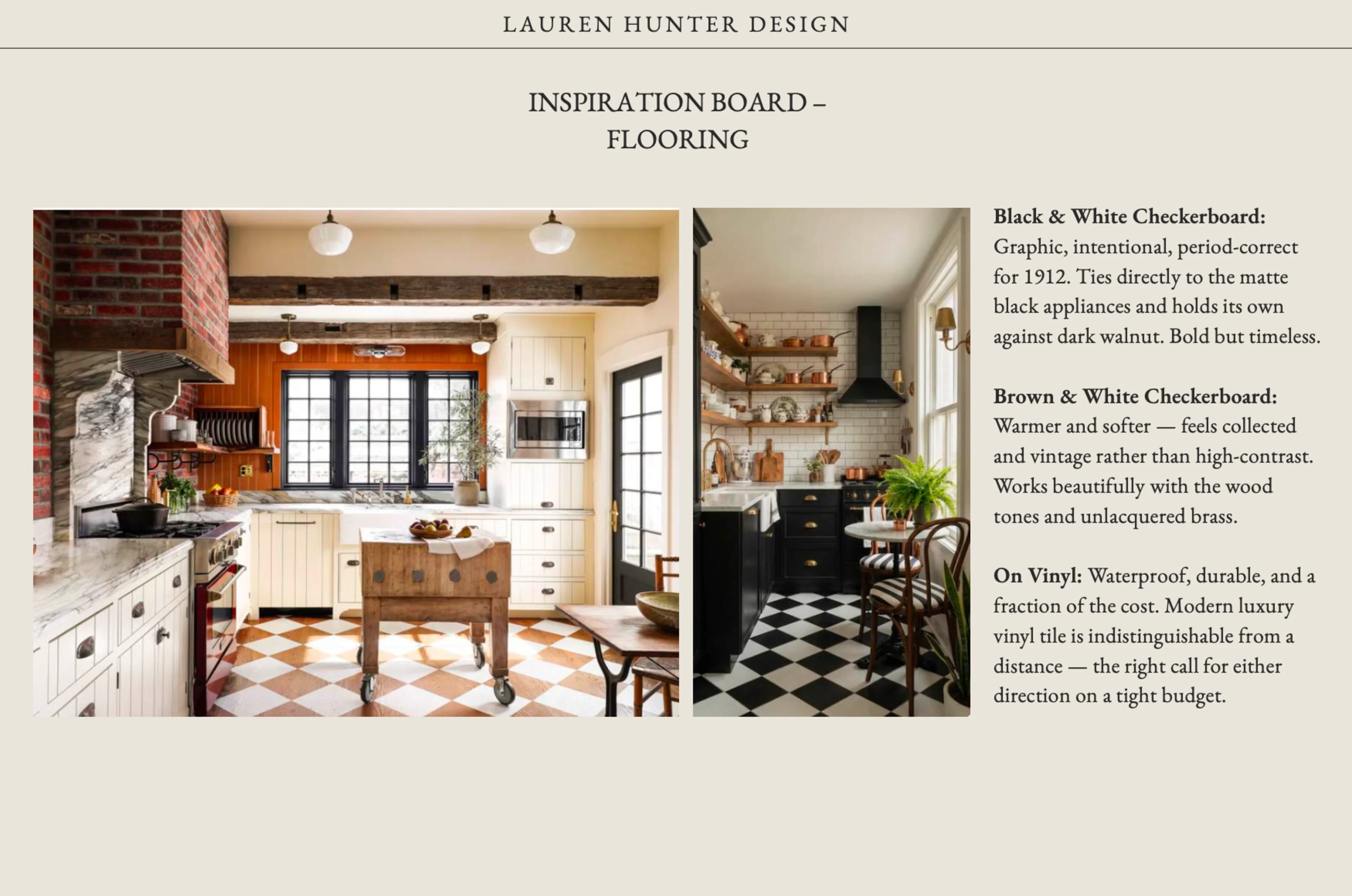
The backsplash is a stacked square tile in a warm green with real variation in it — we skipped handmade tile to save some budget, but the color and texture still bring that same handcrafted warmth. We're topping it off with a pencil tile detail for a little extra polish. For the floor, I went down a whole separate rabbit hole trying to find a brown-and-cream checkerboard vinyl (spoiler: nearly impossible to find one that didn't look cheap). We landed on hardwood or Marmoleum instead — both feel right for a house this special.
What's Next
Demo is happening now, and there's still more to lock in — final flooring, the fabric direction for the sink skirt and banquette cushions (plaid is the current favorite), and whether that painted hutch wall happens. But the bones of this kitchen — the layout, the materials, the why behind every decision — are set.
I can't wait to show you the after. Here's a sneak peek at the materials.
Interested in a kitchen renovation of your own? Book a complimentary discovery call here and let's talk about what your space could become.